Introduction, unboxing
The rather unaffectionately named "slab" design has been, more or less, a staple of the smartphone realm for quite a few years now. Admittedly, it has become a little boring for many users. Even so, we can't, wholeheartedly refer to it as stale or stagnant. On the contrary. The standard bar phone from a few years back is vastly different from current models. Beyond curved panels and rounded edges, the general development path is pretty clear - all display and no bezels.
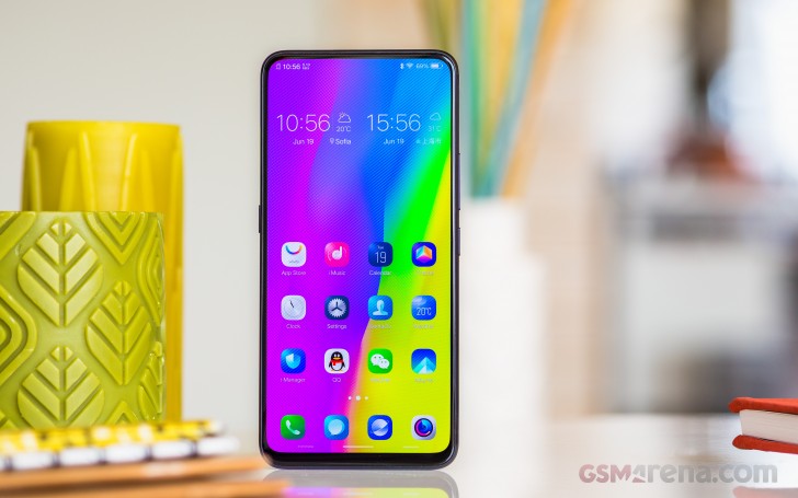
Overall, it has been a slow and steady grind, slimming down chins and side bezels systematically. However, on occasion, devices like the concept vivo APEX come along and with them, a major step forward in all-screen design. But there's more to it than meets the eye as well.
vivo NEX S specs
- Body: Glass back; 162 x 77 x 8mm, 199g; Black, Red color schemes;
- Display: 6.59" Super AMOLED display, FullHD+ 1080x2316 px, 19.3:9 ratio, 388ppi pixel density.
- Rear camera: Dual: 12 MP, f/1.8 aperture, 1/2.5", 1.4µm; Dual Pixel PDAF, 4-axis OIS; 5 MP, f/2.4 aperture, dual-LED flash. 2160p@30fps video recording.
- Front camera: Pop-up 8MP, f/2.0 aperture; fixed focus; 1080p/30fps video recording.
- OS/Software: Android 8.1 Oreo; Funtouch OS 4.
- Chipset: Qualcomm Snapdragon 845: 4x2.7 GHz Kryo 385 Gold & 4x1.7 GHz Kryo 385 Silver CPU, Adreno 630 GPU.
- Memory: 8GB of RAM, 128/256GB of non-expandable storage;
- Battery: 4,000 mAh Li-Po (sealed); 22.5 W charger in the box (likely Quick Charge 4+)
- Connectivity: Dual SIM; LTE Cat16 1024/150 Mbps; USB 2.0, Type-C port; dual-band Wi-Fi a/b/g/n/ac; GPS, BDS, GNSS; Bluetooth 5.0; 3.5mm jack.
- Misc: Under-display fingerprint reader; single speaker on the bottom; piezoelectric earpiece, Jovi digital assistant with dedicated button
Like the APEX, the NEX S actually marries quite a few interesting technological solutions. All screen and no chin kind of necessitated the intriguing motorized, periscope selfie camera design. A feature that has already become the main attraction of the NEX family. It's even stealing the spotlight from the gorgeous Samsung-made Super AMOLED display as well as the fingerprint reader hiding underneath it - all exciting features on their own.
In our mind, the most impressive aspect of the NEX S is that it even exists in the first place. In one impressive swoop, vivo managed to take what was initially showcased as a tech concept and actually polish and push it to an end-user release. Frankly, a move that took most of the industry by surprise definitely raised the collective bar, in more ways than one.
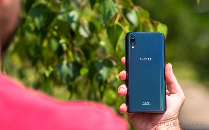
As such, the vivo NEX S is an important and monumental device. It will go down as a landmark in smartphone history. But, does that make it any good as an actual daily driver? One, usable and dependable enough to invest in and have by your side? Join us on the following pages as we try and look beyond the flashy exterior to find out.
Unboxing
Vivo is one of the manufacturers who still believe in a good presentation, as a solid first impression for a product. We can't exactly say we wholeheartedly agree with that logic, since a box is a box and spending more on one, doesn't really make much sense. Still, it is kind of fitting to do something flashy for a device as iconic as the NEX S.
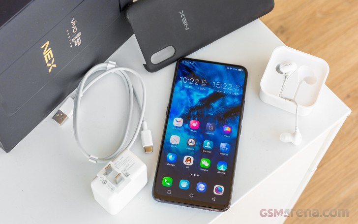
The box is a very thick and heavy, two piece affair in all back, complete with a stylish embossed silhouette of the phone on the front. A FIFA World Cup 2018 logo is stamped on the top of the box. After all, there is no harm in reminding us that vivo is the official smartphone sponsor of the most widely viewed sporting event in the world.
Inside the box - more thick cardboard and solid plastic cradles. No expense spared. The accessory bundle is impressively rich as well. It includes an impressively thin wall charger, rated for a solid 22.5W output. This seems to go beyond the Quick Charge 3.0 standard, capped at 18W. It could be some sort of Power Delivery implementation, which does make sense, since the Snapdragon 845, is compatible with Quick Charge 4+ and consequently up to 27W via the Power Delivery spec. In any case, you should hold on to the charger, just in case there is something proprietary about the tech. Plus, it's really compact.
Besides the brick itself, you get a nice, thick USB Type-A to Type-C cable. Also, a pair of white vivo earbuds. Actually, it's a wired hands-free set, since it does include a microphone. Last, but not least, vivo threw a very nice soft case into the box. And it's not your standard, transparent TPU affair. It is made of thicker and really nice-feeling rubber, complete with an internal plastic shell, that is strengthened around the edges, for better protection and then thinner around the sides, for an easier grip.
Design and 360-degree spin
The vivo NEX S is a looker. Like we already said, the end-goal is well defined - an all-display experience. Having a window into the digital world, without any obvious hardware getting in the way. We're not quite there yet. Plus, that sounds like a really boring reality to live, since mobile hardware has come so far and worked so hard, for the best possible hand-feel.
In this respect, the vivo NEX S subscribes to the current trends. Hence - a glass sandwich design and a strong metal frame in between. Nothing really out of the ordinary. The back surface is gently sloped, so the handset sits better in your palm. But, how well that works in reality is a pretty fair question to ask, given the NEX S' huge proportions - 162 x 77 x 8 mm and a hefty weight of 200 grams.

Well, it will come down to personal preference, but subjectively, the NEX S manages to remain pretty comfortable to handle. It is not unwieldy, despite outdoing the Samsung Galaxy Note8 in most dimensions. Sure, some thumb-stretching is required, but we would even go as far as to claim it is usable with one hand. Especially if you get accustomed to the trendy new gesture navigation scheme, that vivo included in their OS.
Hardware overview
The almost all-display front side of the NEX S is its calling card. Vivo would have you believe the gorgeous 19.3:9 display is surrounded by so little bezel, that the screen to body ratio is over 91%. In reality, that's just the PR department getting a bit ahead of themselves, since the real number is somewhere around 86%. That sure sounds a lot less impressive, but, in person, the NEX S offers a strikingly different experience from pretty much every other phone around.

When the Super AMOLED panel is off, you really can't appreciate just how impressively massive it is. Light it up, however, and you are sure to get some amazed gazes. In fact, unlocking the phone straight to selfie cam mode in front of an unsuspecting friend's face almost always produces an instant reaction of pure amazement. Combining the two in one go is almost like a sensory overload. We can't tell you just how happy it makes us to see such a reaction from what could have easily been yet another boring "slab" smartphone.
There are actually quite a few impressive things going on behind the scenes, to achieve this stunning nearly bezel-free look. Starting at the top of what is an uninterrupted sheet of Gorilla Glass, we can see there is no earpiece on the slim top bezel. It was ditched in favor of a piezoelectric speaker under the display.
Another thing that has been moved beneath the screen is the under display fingerprint reader. The whole module seems to be tucked away nicely behind the panel, although, it should be noted that the iPhone X still has a slimmer bottom chin. Apparently, Apple's circuit folding chops are still a few steps ahead.

Under-display fingerprint reader
Vivo didn't necessarily have to that to slim down the bottom chin. A back-mounted traditional reader solution, as found on the lower-end NEX A, would have also worked. But that would have meant skipping some of the impressive technological innovations the APEX concept presented. To be fair, the APEX featured a larger reader, encompassing the entire bottom half of the display.
The fingerprint reader on the NEX S is small and round, pretty similar, if not identical to the vivo X21 UD module. Some integration improvements have apparently been made, though, since we can't really spot the reader, no matter how hard we try to illuminate the NEX S' under different angles. The one on the vivo X21 UD was relatively easy to spot.
But those are minor details, and we're tiptoeing around the real issues. And the reader has plenty of those. Sure, this technology is still in its infancy and will surely get better. But in its current implementation, it is not really ready for the end-user market.
Speed is one of its weak points. We do get the complexity of the optical readout through an entire display assembly and won't really hold that against vivo. However, most average consumers likely will, seeing how even entry-level traditional fingerprint readers have gotten so speedy and accurate lately. Registering more than one fingerprint in the UI makes things worse. So, expect longer waiting times when unlocking this phone with the reader.
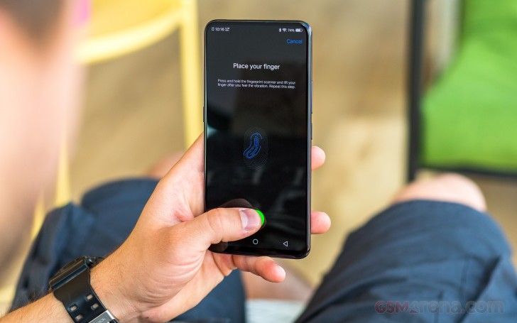
Frankly, we can live with a slow reader, as long as it is reliable. Sadly, the one on the vivo NEX S isn't. Different people around the office seem to have different unlock success rates, ranging from around 70% in the best of cases, all the way down to 0%. That means registering the fingerprint, verifying that it actually works and then having it fail every time once the phone has spent some time in a pocket and the screen is no longer perfectly clean.
At this point, the under-display reader remains a tech showcase more than anything else. Seeing how it is one of the major differentiating points between the NEX S and the cheaper NEX A if you can live with the slightly slower internals, don't go for the more expensive model just for the reader alone. You will be sorely disappointed.
In contrast to the fingerprint and selfie camera setup, the rest of the NEX S' control scheme and placement is somewhat standard. Despite offering a double-tap to wake feature to accompany the fancy under display fingerprint reader, vivo has still left a physical power button on the right side of the handset. Probably a good choice. Right above that, a volume rocker.
On the opposite side, vivo now has a dedicated Assistant button. The assistant itself is called "Jovi" and currently deals with searches and OS-level tasks and automation. Much like Samsung's own Bixby. In fact, even its interface looks quite similar. Currently, it is strictly targeted to the Chinese users, but vivo has confirmed that more third-party functionality and integration is coming in the future.
Most of the top bezel is occupied by the motorized selfie camera assembly. Still, vivo found enough space there to include the trusty old 3.5mm jack and a secondary, noise-canceling microphone.
The SIM card tray fit best on the bottom bezel. It seems a bit crammed there, but we won't complain. We will, however, take a few points off the NEX S' overall rating due to the lack of a microSD slot. Then again, even the base variant comes with 128GB of built-in storage, so most users should be covered.
Next to the SIM tray, we find the main microphone and the Type-C port. It offers OTG support, which is nice but is oddly only backed up by a USB 2.0 interface.
Next to that, the only speaker the NEX S has at its disposal. Unfortunately, Vivo didn't figure out a way to make a hybrid stereo setup in the absence of a traditional earpiece.


vivo NEX S nicely textured glass back
Last, but definitely not least, there is the back of the phone. Like we already mentioned, just like the front, it's one solid piece of Gorilla Glass. The underlying pattern does make for a great visual effect, though. Plus, the relative heft and bulk of the device make up for the slippery surface by providing a good, solid grip.
The back is quick to smudge with fingerprints as some other past vivo models. A case can patch that up nicely. The one vivo bundles in the box is actually very nice to the touch. Plus, it also protects the slightly protruding camera assembly from accidental scratching.
One thing we can't simply glance over is the text near the bottom, which reads "vivo Designed by vivo". Quite informative there vivo, indeed...
Display
It's hard to get over how good the 6.59-inch, OLED panel on the vivo NEX S actually looks. The almost total lack of bezels definitely plays a major part in the overall effect, but there is clearly more to it, as well. For one, the absence of a notch, or any other interruption of the entirety of the display enhances the visual appeal, in our opinion.
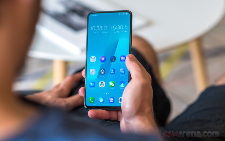
Also, at 6.59 inches in diagonal, the panel is, unquestionably huge. It also comes courtesy of Samsung, which translates to punchy colors, infinitely deep blacks, and equally infinite contrast levels. Arguably, you can't really do any better than a Super AMOLED panel on today's mobile scene. Plus, a quick check in our database reveals that Samsung, themselves, haven't really put out many models with a Super AMOLED of this size.
That being said, the display is not perfect. Depending on your criteria, you could find the FullHD+ 1080 x 2316 pixel native resolution sub-optimal. We can definitely understand such an argument. However, even at this massive diagonal, the math works out to 388ppi pixel density. This makes the vivo NEX amazingly sharp and with perfectly crisp visuals, in our book. Plus, it has the added benefit of better power efficiency for the panel.
In terms of display performance, the vivo NEX scores quite comparable to other recent Samsung devices. That, of course, means perfect blacks and infinite contrast. Maximum brightness in the default mode is just shy of 460 nits.
| Display test | 100% brightness | ||
| Black, cd/m2 | White, cd/m2 | ||
| 0 | 679 | ∞ | |
| 0 | 647 | ∞ | |
| 0 | 631 | ∞ | |
| 0.404 | 631 | 1562 | |
| 0.002 | 624 | 312000 | |
| 0.471 | 621 | 1318 | |
| 0.431 | 618 | 1434 | |
| 0.032 | 616 | 19250 | |
| 0.002 | 600 | 300000 | |
| 0 | 582 | ∞ | |
| 0.392 | 530 | 1352 | |
| 0.409 | 519 | 1269 | |
| 0 | 458 | ∞ | |
| 0 | 458 | ∞ | |
| 0 | 456 | ∞ | |
| 0.375 | 453 | 1208 | |
| 0.32 | 449 | 1403 | |
| 0 | 420 | ∞ | |
| 0.002 | 414 | 207000 | |
| 0 | 412 | ∞ | |
| 0 | 412 | ∞ | |
| 0 | 410 | ∞ | |
| 0 | 400 | ∞ | |
| 0.214 | 389 | 1818 | |
| 0 | 376 | ∞ | |
| 0.2 | 366 | 1830 | |
Funnily, we couldn't locate the ambient light sensor on the front of the phone although it clearly has automatic screen brightness.
Regardless, sunlight legibility on the NEX S is great. Certain Samsung Galaxy devices still manage to score higher, but in practical terms, the NEX S remains perfectly usable, even under direct sunlight.
Sunlight contrast ratio
- Apple iPhone X
5.013 - OnePlus 5T
4.789 - Samsung Galaxy S8
4.768 - Samsung Galaxy S8+
4.658 - Samsung Galaxy S9
4.63 - Samsung Galaxy S6 edge+
4.615 - Samsung Galaxy S9+
4.537 - Motorola Moto Z2 Play
4.459 - Oppo R11
4.454 - Samsung Galaxy S7 edge
4.439 - OnePlus 3
4.424 - Samsung Galaxy S7
4.376 - HTC One A9
4.274 - Oppo R15 Pro
4.251 - Samsung Galaxy Note7
4.247 - Samsung Galaxy A3
4.241 - Nokia 8
4.239 - Google Pixel 2 XL (pre-update)
4.234 - OnePlus 3T
4.232 - Google Pixel XL
4.164 - ZTE Axon 7
4.154 - Samsung Galaxy Note8
4.148 - Meizu Pro 7 Plus
4.147 - Samsung Galaxy S6 edge
4.124 - Samsung Galaxy A7 (2017)
4.124 - Huawei Mate 10 Pro (normal)
4.096 - Samsung Galaxy Note5
4.09 - Huawei P20 Pro
4.087 - Nokia 6 (2018)
4.052 - Google Pixel 2 (pre-update)
4.023 - LG V30
4.022 - Huawei Nexus 6P
4.019 - vivo NEX S
4.012 - Samsung Galaxy J7 Pro
3.998 - OnePlus X
3.983 - Vivo Xplay5 Elite
3.983 - Oppo R7s
3.964 - Apple iPhone 7
3.964 - Apple iPhone 8 (True Tone)
3.957 - Huawei P9 Plus
3.956 - Meizu Pro 6 Plus
3.935 - Lenovo Moto Z
3.931 - Samsung Galaxy A7 (2016)
3.918 - OnePlus 5
3.914 - Samsung Galaxy C5
3.911 - Samsung Galaxy C7
3.896 - Samsung Galaxy A5
3.895 - Samsung Galaxy J7 outdoor
3.879 - Samsung Galaxy J2 outdoor
3.873 - Motorola Moto G6 Plus
3.865 - Samsung Galaxy A8
3.859 - Samsung Galaxy A8 (2018)
3.842 - Sony Xperia XZs
3.818 - Samsung Galaxy A9 (2016)
3.817 - Motorola Moto X (2014)
3.816 - Samsung Galaxy J7 (2017)
3.812 - Samsung Galaxy A5 (2017)
3.804 - Samsung Galaxy J7 (2016) outdoor mode
3.802 - Xiaomi Redmi Pro
3.798 - LG V20 Max auto
3.798 - Sony Xperia XZ
3.795 - Samsung Galaxy A5 (2016)
3.789 - Apple iPhone 6s
3.783 - Meizu Pro 5
3.781 - Microsoft Lumia 650
3.772 - Xiaomi Mi 6
3.767 - Sony Xperia XZ1
3.765 - Samsung Galaxy J7 (2016)
3.756 - Nokia 8 Sirocco
3.745 - Sony Xperia XZ1 Compact
3.729 - Apple iPhone 8 Plus (True Tone)
3.725 - Oppo F1 Plus
3.709 - Vivo X5Pro
3.706 - Samsung Galaxy A3 (2017)
3.688 - Huawei P20
3.683 - Apple iPhone SE
3.681 - Huawei Mate 9
3.68 - Samsung Galaxy A7
3.679 - Sony Xperia XZ2 Compact
3.675 - Meizu PRO 6
3.659 - BlackBerry Priv
3.645 - Sony Xperia XA1 Ultra
3.597 - Apple iPhone 7 Plus
3.588 - Sony Xperia XZ2
3.58 - LG G6
3.556 - Apple iPhone 6s Plus
3.53 - Motorola Moto Z Play
3.526 - Samsung Galaxy J3 (2016)
3.523 - Samsung Galaxy J3 (2016) outdoor mode
3.523 - Acer Jade Primo
3.521 - Microsoft Lumia 950
3.512 - Oppo R7 Plus
3.499 - Nokia 7 plus
3.479 - nubia Z11
3.466 - Huawei P10 Plus
3.456 - HTC U Ultra
3.453 - Motorola Moto G6
3.448 - Sony Xperia XA2 Ultra
3.445 - Samsung Galaxy J7
3.422 - Motorola Moto G6 Play
3.419 - Meizu MX5
3.416 - LG V20
3.402 - Samsung Galaxy A6 (2018)
3.397 - Xiaomi Redmi Note 5 AI Dual Camera
3.393 - Huawei P10
3.379 - Samsung Galaxy J5 (2016)
3.378 - Oppo R9s
3.352 - Honor 8 Pro
3.341 - Oppo F7
3.333 - Oppo R7
3.32 - Lenovo P2
3.316 - Archos Diamond Omega
3.305 - Honor 9
3.289 - Xiaomi Mi 5s
3.276 - Nokia 5
3.261 - Nokia 6 (Chinese version)
3.244 - Nokia 6 (Global version)
3.238 - Samsung Galaxy J2
3.235 - Sony Xperia X Performance
3.234 - Xiaomi Mi Note 2
3.228 - Motorola Moto X Play
3.222 - Oppo F3 Plus
3.218 - BlackBerry KEY2
3.212 - Huawei Mate 9 Pro
3.206 - Huawei P9
3.195 - Xiaomi Mi Mix 2
3.19 - ZTE Nubia Z17
3.159 - Oppo R11s
3.153 - Lenovo Vibe Shot
3.113 - HTC U11 Life
3.108 - Motorola Moto X Force
3.105 - LG Nexus 5X
3.092 - HTC U11
3.089 - HTC U12+
3.085 - Xiaomi Redmi S2 (Y2)
3.077 - Huawei Mate S
3.073 - Microsoft Lumia 640 XL
3.065 - Apple iPhone 6 Plus
3.023 - Asus Zenfone 4 ZE554KL
3.019 - Sony Xperia XA1
3.012 - Motorola Moto X4
3.012 - Sony Xperia L1
2.994 - Sony Xperia X
2.989 - LG Q6
2.987 - Huawei P10 Lite
2.974 - Samsung Galaxy Note
2.97 - Huawei P20 Lite
2.952 - Xiaomi Redmi 5
2.951 - Huawei Mate 8
2.949 - Sony Xperia XA2
2.938 - Oppo Realme 1
2.932 - Xiaomi Redmi 4
2.92 - Xiaomi Redmi 3S
2.913 - Xiaomi Redmi 5 Plus
2.913 - Sony Xperia XA Ultra
2.906 - LG G5
2.905 - Huawei Honor View 10
2.896 - Xiaomi Redmi 3s Prime
2.893 - Xiaomi Mi 5s Plus
2.884 - Sony Xperia XZ Premium (sRGB)
2.877 - Sony Xperia XZ Premium
2.877 - Sony Xperia Z5
2.876 - Nokia 3
2.871 - Microsoft Lumia 550
2.851 - Lenovo Moto M
2.813 - Xiaomi Redmi 3 Pro
2.803 - Sony Xperia Z5 compact
2.784 - Honor 10 (Vivid)
2.757 - Nokia 2
2.752 - Meizu MX6
2.751 - LG V10
2.744 - Huawei Mate 10 (normal)
2.742 - Motorola Moto G5S Plus
2.737 - Xiaomi Redmi 3
2.735 - Huawei Honor 7X
2.734 - Xiaomi Redmi Note 4 (S625)
2.714 - Meizu M5
2.71 - Sony Xperia M5
2.69 - Xiaomi Mi A1
2.689 - Huawei P9 Lite
2.679 - Xiaomi Redmi 4 Prime
2.679 - vivo V7+
2.671 - Vivo V3Max
2.659 - Xiaomi Mi Mix
2.658 - Huawei Mate 10 Lite
2.654 - Oppo F5
2.653 - Doogee Mix
2.642 - Xiaomi Mi 4i
2.641 - Xiaomi Redmi 4a
2.635 - Xiaomi Mi 5X (Standard)
2.616 - Sony Xperia XA
2.609 - Motorola Moto G4 Plus
2.582 - Motorola Moto G4 Plus (max auto)
2.582 - Meizu M5s
2.58 - Xiaomi Mi 4c
2.574 - LeEco Le Max 2
2.567 - Microsoft Lumia 640
2.563 - Asus Zenfone 3 ZE552KL
2.563 - Huawei P Smart
2.563 - Xiaomi Mi Max 2
2.561 - HTC U11+
2.556 - Xiaomi Redmi Note 5A (Y1)
2.556 - LG Aka
2.145 - Xiaomi Redmi Note 4 (X20)
2.145 - Archos 50 Diamond
2.134 - Xiaomi Redmi Note
2.119 - Xiaomi Mi 4S
2.095 - Acer Liquid X2
2.084 - Huawei P8lite
2.078 - vivo V5
2.059 - Moto G 3rd gen max manual
2.026 - Xiaomi Mi 3
2.001 - Xiaomi Mi Max
1.996 - Sony Xperia E4g
1.972 - OnePlus One
1.961 - Sony Xperia Z2
1.944 - Meizu m3 note
1.923 - BlackBerry Leap
1.892 - Meizu m2 note
1.892 - HTC Butterfly
1.873 - ZTE Nubia Z9 mini
1.759 - Sony Xperia U
1.758 - Asus Zenfone Selfie
1.68 - Motorola Moto E (2nd Gen)
1.675 - ZTE Nubia Z9
1.659 - Jolla Jolla
1.605 - Motorola Moto E
1.545 - Sony Xperia M
1.473 - Sony Xperia L
1.351 - Xiaomi Redmi 2
1.311 - HTC Desire C
1.3 - Nokia X
1.291 - Meizu MX
1.221 - Sony Xperia E
1.215
Color reproduction is somewhat of a mixed bag. If you value color accuracy on your devices, then the NEX S might not be the ideal choice. At least in the current state of Funtouch OS, that is, since it doesn't offer any custom white point or color adjustments. Vivo also decided to show off the AMOLED goodness, increasing most color saturation, especially red and yellow.
Still, even with the rather extreme color profile, the panel has an average deltaE of 6 and a maximum of 9.6 - not what we would consider properly calibrated, but not horrible either.
Battery
Despite all the extra hardware, crammed inside the NEX S, vivo still managed to fit a 4,000 mAh battery. To be fair, it is an 8mm thick phone but we've seen far less juice go into thicker units in the past.
So, adding thing up, we get a large battery, an efficient 10nm manufacturing process on the Snapdragon 845 and an equally efficient Super AMOLED display. The vivo NEX S, thus, has all the makings of an excellent battery performer. And our standardized tests indeed painted an impressive battery life picture.
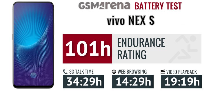
Even considering the big 4,000 mAh battery, 101 hours of endurance is still an accomplishment in its own right. In most regards, the Snapdragon 845 and its X20 LTE modem performed as expected. 3G call time is at the upper end of the spectrum, while standby time is right around the average for this chip.
We have to commend vivo for optimizing the default player app particularly well since nearly 20 hours of consecutive, offline video playback are no small feat. On the flip side, though, the default web browser had a few issues with seemingly random redirects to non-existent pages, while running our standard website browser script. Hence, we ran this portion of the test using Chrome instead.
Like we mentioned earlier, the NEX S comes bundled with a surprisingly compact charger, given its solid 22.5W output. This seems to go beyond the Quick Charge 3.0 standard, capped at 18W. It could be some sort of Power Delivery implementation, which does make sense, since the Snapdragon 845, is compatible with Quick Charge 4+ and consequently up to 27W via the Power Delivery spec. In real-life terms, that allows you to get the massive 4,000 mAh battery up from 0% to about 50% in half an hour.
Our endurance rating denotes how long a single battery charge will last you if you use the vivo NEX S for an hour each of telephony, web browsing, and video playback daily. We've established this usage pattern, so our battery results are comparable across devices in the most common day-to-day tasks. The battery testing procedure is described in detail in case you're interested in the nitty-gritties. You can also check out our complete battery test table, where you can see how all of the smartphones we've tested will compare under your own typical use.
Loudspeaker
The vivo NEX S only has a single loudspeaker at its disposal. Unfortunately, with all the other things going on, the design team apparently hasn't figured out a way to enable a hybrid setup. Come to think of it, that might not even be possible with the piezoelectric under-display speaker.
| Speakerphone test | Voice, dB | Ringing |
Overall score | |
| 65.0 | 67.8 | 75.0 | Average | |
| 67.8 | 69.5 | 71.5 | Good | |
| 66.0 | 71.6 | 76.4 | Good | |
| 66.2 | 70.4 | 78.2 | Good | |
| 70.2 | 74.7 | 70.0 | Good | |
| 66.1 | 71.8 | 78.1 | Good | |
| 68.9 | 74.0 | 76.2 | Very Good | |
| 68.1 | 70.1 | 81.5 | Very Good | |
| 69.7 | 73.5 | 76.6 | Very Good | |
| 65.1 | 70.5 | 86.6 | Very Good | |
| 68.4 | 74.0 | 80.1 | Very Good | |
| 68.1 | 72.3 | 82.2 | Very Good | |
| 66.9 | 72.3 | 84.5 | Very Good | |
| 66.6 | 69.8 | 90.0 | Very Good | |
| 69.3 | 72.6 | 87.3 | Excellent | |
| 76.0 | 74.6 | 79.0 | Excellent | |
| 71.8 | 69.2 | 91.0 | Excellent | |
| 71.3 | 74.5 | 91.0 | Excellent | |
| 76.0 | 73.6 | 88.5 | Excellent | |
| 83.6 | 76.4 | 80.7 | Excellent | |
| 77.0 | 73.8 | 91.1 | Excellent |
In any case, the NEX S is pretty loud. It also has a few equalizer and audio optimization options to play around with. However, these seem to have very little effect on the actual output through the speaker. As far as quality goes, both music and voices come out pretty clean, with little to no distortions. But, as expected, the sounds stage is nothing to rave about.
Audio quality
The vivo NEX S did well in the active external amplifier part of our audio output quality test through the jack. It delivered average loudness matched with perfect clarity.
Plugging in the headphones brought the volume down to just below average but ot caused little in terms of distortion. Stereo crosstalk rose an average amount but the overall output remained solid.
| Test | Frequency response | Noise level | Dynamic range | THD | IMD + Noise | Stereo crosstalk |
| +0.01, -0.02 | -93.6 | 93.7 | 0.0009 | 0.0069 | -93.8 | |
| +0.17, -0.10 | -92.9 | 93.2 | 0.0043 | 0.158 | -61.3 | |
| +0.02, -0.15 | -94.3 | 94.3 | 0.0021 | 0.0069 | -94.3 | |
| +0.18, -0.13 | -93.7 | 93.6 | 0.0024 | 0.104 | -52.7 | |
| +0.44, -0.12 | -90.1 | 90.2 | 0.0056 | 0.016 | -88.7 | |
| +0.51, -0.12 | -89.8 | 89.9 | 0.0097 | 0.043 | -39.9 | |
| +0.01, -0.03 | -92.6 | 92.5 | 0.0012 | 0.0076 | -93.4 | |
| +0.03, -0.03 | -92.2 | 92.2 | 0.0017 | 0.042 | -76.3 | |
| +0.02, -0.01 | -93.2 | 93.1 | 0.0008 | 0.0069 | -94.2 | |
| +0.03, -0.02 | -92.9 | 92.9 | 0.0057 | 0.051 | -68.1 |
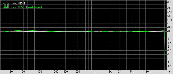
vivo NEX S frequency response
You can learn more about the tested parameters and the whole testing process here.
Funtouch OS 4.0
Funtouch OS has always been one of the more "out there" custom Android ROMs. Throughout the years of development, two core concepts seem to be constant: "More is better" and "Apple knows best". As such, Funtouch OS is bursting at the seams with added features and pre-installed apps. Some, outright bloat, while others genuinely useful.
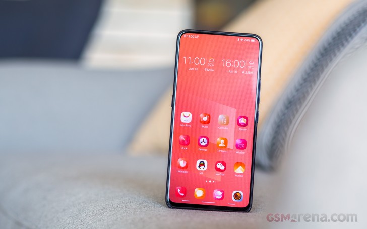
As for the iOS "inspiration" part of the mix, Funtouch OS is currently in a weird place. With things like a Command Centre, instead of a quick toggles bar and app settings, scattered within the main settings menu, it is definitely as close to iOS as you can get from an out-of-the-box Android UX, no modding involved. On the flip side, Apple's style might be pretty much copied over, but Cupertino's insistence on simplicity and minimalism definitely haven't been carried over.
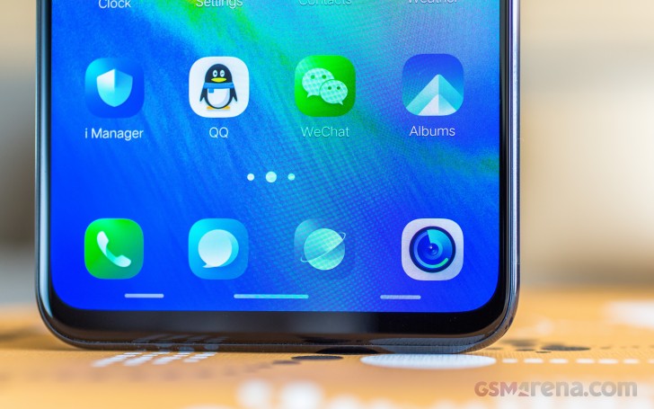
But let's not get ahead of ourselves here. One thing at a time. Starting off with the lock screen. vivo offers quite a bit of customization, including a "Lockscreen Poster" option. It cycles through a set of pre-defined images, so every time you wake up the device, you get to see something different. Images from the internal storage can be used and there is also a cloud-based repository, with various topics you can subscribe to and fetch images automatically. Outside of China, however, contacting these servers is a hit and miss, which is often the case with a few other vivo features.
There is also an Always on display option, which pairs nicely with the Super AMOLED panel. It is quite convenient as well since it lends itself to some customization and can be put on an auto timer. If you opt to use the fancy under-display fingerprint reader, you will be spending quite a bit of time on the lock screen, so you might as well set it up to have something entertaining to look at.
We do mean it, the reader is horribly unreliable and inconsistent. Even registering a new print takes an annoyingly long time and feels sketchy. Trying to hold the phone naturally and mimicking various potential scan angles for your thumb during setup seemingly helps consistency later on (at least to some extent).
On the plus side, there are three different animations to choose from and enjoy while the reader attempts to scan your finger. These have a distinct Sci-Fi vibe, almost making up for the failed lengthy fingerprint read attempts. At least the first couple of times, that is. And before you say we're not using the reader correctly, we did re-register the prints multiple times and followed vivo's guidelines closely. Yet, even in a dark room, with a steady thumb and a solid press, consistency was spotty, at best. Mind you, we even received a total of 3 OTA updates during the review, which explicitly claimed to improve the reader performance with no noticeable improvement in the end.


Fingerprint read attempts • Passkey fallback
On the flip side, at least vivo offers quite a few gestures in its "Smart motion" settings. Use these correctly in combination with a good Always on display setup and proper lockscreen notification permissions and you could actually get by without having to unlock the vivo NEX S on many occasions.
Air unlock is a particularly neat trick, if you tend to leave your phone on a desk or table, a lot. We also appreciate the addition of both double-tap to wake and lock.
For even more convenience, there is "Smart click," which boils down to the ability to map a custom feature or action to a long press of the volume down button. This works surprisingly well and is one of those little features that we really do wish could be more common in the smartphone realm.


Smark click • Jovi personal assistant
Before you get overly excited about custom key mapping possibilities, it should be noted that the Jovi hardware key can not be reassigned out-of-the-box. This is just one of the similarities we found between vivo's new AI assistant and Samsung's own Bixby. The UI, as well as the main functionality look kind of reminiscent. Currently, Jovi only works in Chinese and is very regionalized in its feature set.
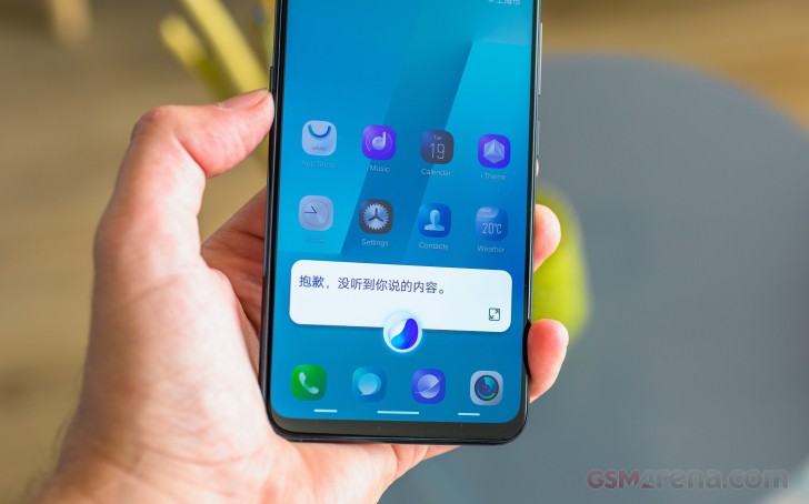
As far as we managed to gather, just like Bixby, it can understand simple commands to set alarms, event and reminders, also toggle and switch certain phone settings. It also seems to have a few visual components. One for recognizing objects and people, through the main or selfie cameras, while the other is for analyzing the on-screen content and doing searches based on it or providing suggestions.
Understandably, the entire thing is in Chinese, including the settings menu, which does mean there is a language barrier for us. Jovi also has its own separate pane, on the far left side on the homescreen.
It is card based, again not dissimilar to Bixby and from what we managed to make out, it provided a nice mix of online data, mixed with information, sourced from the device itself and certain user apps. Unfortunately, we can't judge as to how well it all fits together and works on a daily basis. If this is relevant to your interests and geographical location, though, we will mention that vivo confirmed it will be expanding Jovi's functionality with third-party support pretty soon.


Jovi QR scanner • System-wide search
The Jovi pane and the Jovi hardware button can be disabled entirely. Some of the AI's functionality does appear to creep-up within the system-wide unified search interface as well. However, it is much more comprehensible and probably universally useful. International users just need to ignore the embedded QR core scanner, which is meant to simplify the mobile payments, currently popular in China.
Now, just because something is meant for an Eastern market definitely doesn't make it intrinsically bad. Confusing to a western audience - definitely, but not necessarily bad. That's why we can't really take offense with Jovi in any way. We just chose to ignore it.
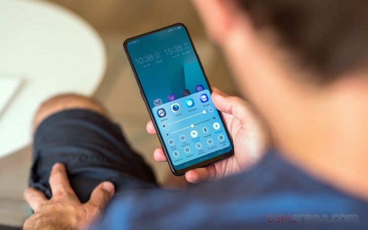
Vivo didn't miss to take a page out of the iOS design book as well. Current Funtouch users will already be familiar with the Control Centre, but it does come as a shock to most newcomers. This is where all the quick toggles live, instead of the notification shade. There is also a recent app row of icons.
Looking through the otherwise standard, app-drawer free home UI, we did, however, stumble upon quite a few apps.
Funtouch OS has an excessively large default app package. Since there are no Google Play Services or apps in the Chinese ROM, vivo had to develop quite a few things by itself. For the most part, the standard apps, the necessities looks clean and behave well. The Phone and contacts app, File manager, Reader, as well as tools like Notes and Calculator are awesome.
That being said, bloat is abundant. We can kind of understand throwing in the Weibo and Baidu maps apps. Perhaps AliPay as well. But beyond that, there is actually an entire folder chock-full of random apps. It is labeled as "Application Recommendations", but you never actually get the option not to install these, like many ROMs do, upon initial setup. Even more stuff is hidden away under the scenes, as various services. Thankfully, most can be uninstalled.
The default multimedia apps are somewhat of a mixed bad for us. The Album app looks and behaves great. All the options are well translated. Editing tools are abundant. You can even call on some of Jovi's image recognition features from here. The AI also takes the liberty to automatically tag and organize your photos into albums. It's not as good as Google Photos, but still pretty impressive.
The same straightforward approach has been applied to the video player as well. It is simple yet full-featured, including options from stretching and cropping on the extra-tall display, subtitles and a floating window player.
The browser is where things start to get a little confusing. Some pages work well, while others break down for no apparent reason. The app itself seems to be really feature-rich, even throwing in plug-ins and automatic ad blocking. After investigating some of the web errors we experienced during testing, though, it seems that the browser funnels most of the traffic through some Chinese servers. That slows down performance quite a bit and also raises quite a few privacy concerns for us. Plus, some features tend to go down, from time to time or are not really reachable from Europe.
The Music Player is just as odd and chaotic as the browser, but also not entirely translated. Still, most basic offline features are pretty self-explanatory and there are some added features here to be enjoyed, like DeepField sound effects and an advanced equalizer.
There is, however, an extensive online portion to the player, that sometimes works and is quite interesting, in that it seems to offer access to cloud-streaming for free.
Just to reiterate, all the data is coming from Chinese servers, so latency and even server availability are an issue. The same goes for the otherwise rich Theme Store. When it does manage to connect, you can fetch some pretty good-looking skins. The level of customization seems to run deep as well. Though we didn't manage to switch the UI to a darker mode for some extra battery endurance gains on the OLED display. It's not an option in settings and themes don't seem to have the ability to change the settings menu. Bummer!
Just for the sake of thoroughness, without getting into any detail, we will also mention that vivo has its own Gaming Centre app, which acts like a Game store/community hub.
Also, there is a pretty extensive Child mode. It comes with a simplified UI, with a pre-determined set of allowed apps and even the ability to set time and data limits.
All these extra options sure sound great, but navigating them and properly setting everything up is a time-consuming and very confusing affair.
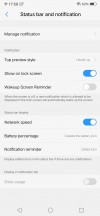
Settings upon settings everywhere you look. There is extensive navigation management, including on-screen controls, in various configurations and trendy new gestures, with customizable UI elements.
An extensive battery management platform that constantly monitors activity and lets you limit apps in both foreground and background.
It as all well past the point of confusing. To bring some order to the mix, vivo did include a centralized management centre. I Manager, however, is, in itself, a whopping mess of system-level tools, as well as separate "utility tools".
While we do appreciate granular permission and notification management, as well as the occasional security suggestion and analysis report, vivo took security too far. We found the elevated app installation and sideloading policies particularly annoying. Trying to side-load an app typically results in a lengthy security check process, including, but not limited to, fetching data on the APK from a cloud service.
If vivo finds something it doesn't like, or you are simply trying to sideload via an ADB connection from a new computer, it prompts for a security exception, which can only be confirmed after logging into a vivo account. Registering one, however, seems to require a Chinese phone number.


Installation manager and restrictions
And if you do manage to install an app from outside vivo's app store in some way, the OS is really stingy about permissions, often time requiring you to authorize an app every time you launch it. Funtouch also does this odd thing, where it monitors what subsequent apps each app is trying to launch. While we do see the potential benefit of such a system, it's not exactly convenient that apps get denied the launch permission, by default.
This, for instance, prevents things like the auto sync feature of Google Drive from kicking in. And yes, on a much more positive note, there is an automated Google Play Services installer within the vivo app store. It simply installs the framework, including the sync and account services and the Play Store. From there, you can proceed as usual. However, it should be noted, that just like the browser, some of the Play Store and Play Services traffic does get diverted to Chinese servers.
Performance
It's pretty clear vivo set out to create a fully decked-out flagship with the NEX S. Granted, there is a pretty valid argument to be made in defence of the NEX A and its more value-conscious approach to internals. Then again, if you really want to make a noticeable splash and leave a lasting impression on the industry, you can't really have inferior internals muddy-up your overall presentation.

Vivo is keeping things pretty safe with the NEX S. Under the hood there is a Snapdragon 845 chipset. It is paired with either 128GB or 256GB of storage and a whopping 8GB of RAM. Still gruesome overkill for a modern Android device in our view, but that's what a fully maxed-out configuration currently looks like. Coincidentally, we have the top-tier configuration in for review.
Starting with GeekBench and its pure CPU workloads, there are little to no surprises to observe. The Snapdragon 845 inside the NEX S appears to be adequately cooled and properly powered to maintain its expected levels of performance. In single-core runs, we see it only lose out to the Exynos 9810 inside the Galaxy S9+ and the chart-topping Apple A11 Bionic.
GeekBench 4.1 (single-core)
Higher is better
- Apple iPhone X
4256 - Apple iPhone 8 Plus
4232 - Samsung Galaxy S9+
3771 - Xiaomi Mi MIx 2S
2468 - vivo NEX S
2466 - HTC U12+
2456 - Sony Xperia XZ2
2454 - OnePlus 6
2450 - Xiaomi Mi 8
2431 - Samsung Galaxy S9+ (Snapdragon)
2199 - Samsung Galaxy Note8
1987 - Nokia 8 Sirocco
1934 - Google Pixel 2 XL
1915 - Huawei P20 Pro
1907 - LG V30
1901 - Honor 10
1894 - Samsung Galaxy Note8 (SD 835)
1862 - Oppo R15 Pro
1612
Multi-threaded runs leave the vivo NEX S actually leading the Snapdragon 845 pack, but not by much. Definitely not enough of a delta to notice with any real-world task.
GeekBench 4.1 (multi-core)
Higher is better
- Apple iPhone X
10215 - Apple iPhone 8 Plus
10037 - vivo NEX S
9160 - Xiaomi Mi MIx 2S
9158 - OnePlus 6
9011 - HTC U12+
9001 - Samsung Galaxy S9+
8883 - Xiaomi Mi 8
8494 - Sony Xperia XZ2
8466 - Samsung Galaxy S9+ (Snapdragon)
8349 - Samsung Galaxy Note8
6784 - Nokia 8 Sirocco
6725 - Huawei P20 Pro
6679 - Honor 10
6591 - Samsung Galaxy Note8 (SD 835)
6590 - Google Pixel 2 XL
6428 - LG V30
6365 - Oppo R15 Pro
5809
The Geekbench 4 Compute test appears pretty similar, only with an even wider score gap. We have to wonder whether Geekbench isn't benefiting in some way from the ridiculous amounts of RAM, the vivo NEX S has at its disposal.
Geekbench 4 Compute
Higher is better
- vivo NEX S
12564 - Sony Xperia XZ2
12440 - Xiaomi Mi MIx 2S
12360 - HTC U12+
12338 - Samsung Galaxy Note8
8193 - Samsung Galaxy Note8 (SD 835)
7709
This is clearly what is happening with AnTuTu 7. Not only is the amount of RAM considered as a part of the final score calculation, but the actual memory chips could potentially be a bit snappier as well. We are kind of running off assumptions here, as to the quality and source of the RAM modules, but, generally speaking, solid state RAM gets faster, as the individual chips grow in capacity.
AnTuTu 7
Higher is better
- vivo NEX S
287081 - Xiaomi Mi MIx 2S
270814 - OnePlus 6
264200 - Samsung Galaxy S9+ (Snapdragon)
264044 - HTC U12+
263696 - Sony Xperia XZ2
259244 - Samsung Galaxy S9+
246660 - Xiaomi Mi 8
217298 - Huawei P20 Pro
209884 - Nokia 8 Sirocco
209577 - Google Pixel 2 XL
203119 - Samsung Galaxy Note8
201065 - Honor 10
200440 - LG V30
182374 - Oppo R15 Pro
146526
Again, while this could partially explain the chart-topping AnTuTu score, the extra points don't really translate to a snappier real-world performance. Unless, your idea of "real-world" involves aimlessly crunching integrals on your phone.
BaseMark OS 2.0 is a bit less generous towards the NEX S. It should serve as a good illustration of our previous point. A few points more or less, here and there have little meaning outside isolated benchmark runs. The takeaway here is that the Snapdragon 845 inside the vivo is just as powerful as the same flagship Qualcomm chip found in its rivals.
The exact same logic applies to the Adreno 630 GPU as well.
GFX 3.0 Manhattan (1080p offscreen)
Higher is better
- Apple iPhone 8 Plus
85 - vivo NEX S
83 - Samsung Galaxy S9+ (Snapdragon)
83 - Xiaomi Mi MIx 2S
83 - Sony Xperia XZ2
82 - Apple iPhone X
81 - Samsung Galaxy S9+
74 - OnePlus 6
71 - Huawei P20 Pro
66 - HTC U12+
64 - Xiaomi Mi 8
64 - Samsung Galaxy Note8 (SD 835)
63 - Google Pixel 2 XL
61 - LG V30
60 - Honor 10
57 - Samsung Galaxy Note8
51 - Nokia 8 Sirocco
46 - Oppo R15 Pro
22
GFX 3.0 Manhattan (onscreen)
Higher is better
- vivo NEX S
59 - Apple iPhone X
59 - Apple iPhone 8 Plus
59 - Sony Xperia XZ2
59 - Xiaomi Mi MIx 2S
59 - OnePlus 6
59 - Xiaomi Mi 8
57 - Huawei P20 Pro
55 - Honor 10
53 - Samsung Galaxy S9+ (Snapdragon)
51 - HTC U12+
50 - Samsung Galaxy S9+
45 - Samsung Galaxy Note8
42 - Samsung Galaxy Note8 (SD 835)
37 - Google Pixel 2 XL
36 - LG V30
35 - Nokia 8 Sirocco
27 - Oppo R15 Pro
19
Again, we see the NEX S perform identically to the similarly-equipped competition. Still, it is interesting to explain its apparent (even if often alphabetical) superiority in the on-screen tests, considering it seems to have a bigger resolution to drive.
GFX 3.1 Manhattan (1080p offscreen)
Higher is better
- Samsung Galaxy S9+ (Snapdragon)
61 - Xiaomi Mi MIx 2S
61 - vivo NEX S
60 - HTC U12+
60 - OnePlus 6
58 - Sony Xperia XZ2
55 - Xiaomi Mi 8
53 - Samsung Galaxy S9+
47 - Apple iPhone X
44 - Samsung Galaxy Note8 (SD 835)
43 - Samsung Galaxy Note8
42 - Google Pixel 2 XL
42 - LG V30
41 - Huawei P20 Pro
40 - Honor 10
37 - Nokia 8 Sirocco
34 - Oppo R15 Pro
15
GFX 3.1 Manhattan (onscreen)
Higher is better
- vivo NEX S
55 - Xiaomi Mi MIx 2S
55 - OnePlus 6
55 - Apple iPhone X
51 - Sony Xperia XZ2
51 - Xiaomi Mi 8
50 - Huawei P20 Pro
37 - Honor 10
37 - Samsung Galaxy S9+ (Snapdragon)
34 - HTC U12+
33 - Samsung Galaxy S9+
24 - Samsung Galaxy Note8
23 - Google Pixel 2 XL
21 - Samsung Galaxy Note8 (SD 835)
20 - LG V30
19 - Nokia 8 Sirocco
18 - Oppo R15 Pro
12
Yes, indeed, the more hawk-eyed among you might have noticed that due to its very tall, 19.3:9 aspect ratio, the vivo NEX has a few more pixels to serve than the likes of other FullHD+ devices, like the Xiaomi Mi Mix 2S or the OnePlus 6.
That's just the problem with PR notations, like FullHD+. We have to wonder, what resolution actually merits some other nonsensical buzzword, like FullHD++. But, we digress and we definitely don't want to give anybody any bright ideas. In reality, for most of these benchmarks, the vivo NEX S is actually running with a small navigation bar on the side. Coincidentally, one just wide enough to compensate for the higher resolution.
GFX 3.1 Car scene (1080p offscreen)
Higher is better
- vivo NEX S
35 - Samsung Galaxy S9+ (Snapdragon)
35 - Sony Xperia XZ2
35 - HTC U12+
35 - Xiaomi Mi MIx 2S
35 - OnePlus 6
35 - Xiaomi Mi 8
33 - Samsung Galaxy S9+
28 - Samsung Galaxy Note8 (SD 835)
25 - Samsung Galaxy Note8
25 - Nokia 8 Sirocco
25 - Google Pixel 2 XL
25 - LG V30
24 - Huawei P20 Pro
23 - Honor 10
23 - Oppo R15 Pro
9
GFX 3.1 Car scene (onscreen)
Higher is better
- vivo NEX S
34 - Xiaomi Mi MIx 2S
34 - Sony Xperia XZ2
33 - Xiaomi Mi 8
33 - OnePlus 6
33 - Huawei P20 Pro
21 - Honor 10
21 - Samsung Galaxy S9+ (Snapdragon)
20 - HTC U12+
20 - Nokia 8 Sirocco
15 - Samsung Galaxy S9+
14 - Samsung Galaxy Note8 (SD 835)
13 - Samsung Galaxy Note8
13 - LG V30
13 - Google Pixel 2 XL
13 - Oppo R15 Pro
7.6
This is a pretty normal situation to observe. And, like with the CPU, the takeaway here is that the Adreno 630 is performing as expected. Nothing more, nothing less.
Basemark X actually seems to give a more balanced report of the actual graphical prowess of the vivo NEX S.
Basemark X
Higher is better
- HTC U12+
44390 - Xiaomi Mi MIx 2S
44267 - OnePlus 6
44229 - Sony Xperia XZ2
44097 - Samsung Galaxy S9+ (Snapdragon)
44013 - vivo NEX S
43810 - Xiaomi Mi 8
43285 - Samsung Galaxy S9+
42134 - Samsung Galaxy Note8
40890 - Huawei P20 Pro
39945 - Google Pixel 2 XL
39143 - Nokia 8 Sirocco
38476 - Samsung Galaxy Note8 (SD 835)
37211 - LG V30
36704 - Honor 10
29435 - Oppo R15 Pro
20693
And for the sake of thoroughness, here is a Basemark ES 3.1 run as well, stacked up against the competing Apple Metal API.
Basemark ES 3.1 / Metal
Higher is better
- Apple iPhone X
1854 - Apple iPhone 8 Plus
1644 - Samsung Galaxy S9+
1481 - Samsung Galaxy Note8
1268 - vivo NEX S
1208 - Xiaomi Mi MIx 2S
1179 - Samsung Galaxy S9+ (Snapdragon)
1177 - HTC U12+
1177 - Sony Xperia XZ2
1176 - OnePlus 6
1164 - Nokia 8 Sirocco
876 - Samsung Galaxy Note8 (SD 835)
875 - Google Pixel 2 XL
874 - LG V30
860 - Oppo R15 Pro
352
Not much else to say about the vivo NEX S and its performance, really. It is just as potent as any other current top-dog, name-brand or not. Despite its overcrowded nature, Funtouch OS also doesn't appear to adversely affect performance in any way.
Come to think of it, that does make a lot of sense given vivo's overly strict measures against misbehaving apps and background activity. Raw performance definitely won't be an issue, but battling the OS to allow your apps to run properly, when and for as long as you want, might just be.
Camera and image quality
The main camera perhaps isn't among the major selling points for the NEX S. The phone comes with a dual camera setup. The primary one is 12MP, f/1.8. It is likely based on the IMX363 Exmor RS sensor, given some of the other official vivo specs, including a 1.40µm pixels size and Dual Pixel PDAF.
Working alongside that - a 5MP, f/2.4 snapper, used for depth information. The entire setup is topped-off with a 4-axis OIS stabilization and a dual-LED, dual-tone flash. Yes, it doesn't sound like much by 2018 flagship standards, that is.
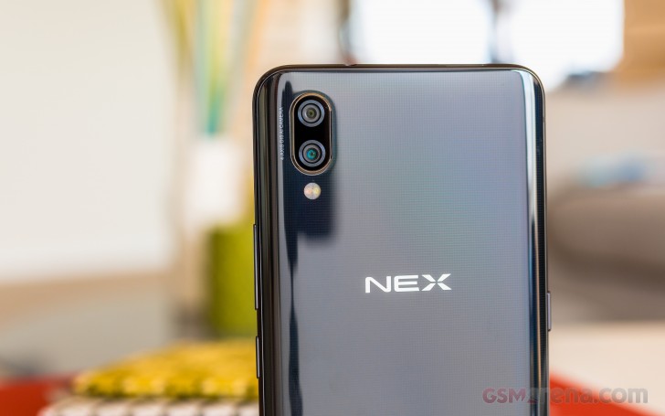
That's clearly not the case with the motorized selfie cam. But still, its allure is not directly correlated to the camera module. But, before we get to some selfie action, let's take a step back and examine the vivo camera UI.
In tune with the rest of the Funtouch OS, the camera interface is a bit overcrowded. On the left side, a settings wheel hides away most of the important stuff. Vivo still refuses to include proper photo resolution controls. Instead, you get an aspect ratio selector, and you have to know that the sensor has a native one of 4:3 to get the maximum resolution. Technically, you could get higher-res photos using the 24MP toggle.
It uses interpolation, so you can't really expect any additional detail. On a more positive note, all the camera settings are now within the camera app - no more toggles separated out into the main setting menu, iOS style.
Also on the left - an HDR toggle and the portrait mode. The latter comes with a manual focus selector, just in case the autofocus doesn't cope well enough. There is also a professional mode for stills, a full-featured one, no less. It has ISO, shutter speed, white balance and manual focus.
Photo quality on the vivo NEX S can best be described as okay, which is to say, we expected more of a flagship device.
It is simply not on par with other competing flagships. Even some current mid-rangers, to be honest. Resolved detail is rather low, and there is a general softness all throughout the frame. This appears to be at least partially tied to noise and noise suppression.
For some reason, the vivo NEX S has plenty of both. Even in good lighting conditions, large chunks of the frame end up noisy and we can really see the suppression algorithm at play, brushing things over and killing finer detail in the process.
Everything gets particularly blurry and fuzzy in low light. Often shots came out of focus, even though the Dual Pixel PDAF system appeared to be working correctly and quite snappy.


vivo NEX S low-light camera samples
But even without the challenge of low-light photography, the vivo NEX S offers a surprisingly limited dynamic range in its shots. Most cloud and shadows tend to get clipped regularly.
The HDR effect does help, to some extent, but its effect is rather subtle. Typically, that would be a bonus, but in this case, these photos need all the help they can get. The Auto HDR setting is also spotty and sometimes fails to trigger, when needed.


vivo NEX S camera samples HDR: Off • On • Off • On • Off • On
The HDR filter is, in fact, AI-backed. So it's likely Jovi's fault for missing certain optimization opportunities. The future might bring improvements, however, namely vivo's "Super HDR" feature. It has been around for a few months now, but, interestingly enough, it's still absent from the vivo NEX S. Perhaps a software update can fix that at some point.
The secondary 5MP camera on the NEX S seems to have one primary purpose in life - capturing depth information for better portrait performance. We wouldn't go as far as to say it's not doing its job, but the end results are not really all that impressive.
In fact, we recall devices like the Google Pixel 2 doing a better job with a single camera helped by software magic. We'll just leave it at that.
Since we had a lot of fun at the vivo NEX unveiling event in Shanghai, here are some more picturesque photos from the trip for you to enjoy.
And here are some close-ups.
Panorama shots on the vivo NEX S looks quite decent, with practically no signs of stitching. A little bit more detail couldn't hurt, though.
Last, but not least, we shot our standard test posters with the vivo NEX S, so you can pixel-peep tou your heart's content and see how it stacks up against the competition.
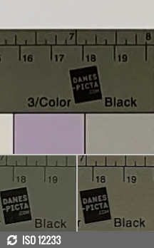


vivo NEX S (12MP) vs. Apple iPhone X (12MP) vs. Samsung Galaxy S9+ (12MP) in our Photo compare tool
Selfie camera
The motorized, 8MP selfie camera is undoubtedly one of the star attractions on the vivo NEX S. Before we get to quality, a few words about the mechanics of the cool "party trick" are definitely in order. The up and down motion is incredibly smooth and very satisfying. It can even be accompanied by an optional sound effect, which definitely tickles our inner-nerd. Disable the sound, and you are left with a practically inaudible servo motion.
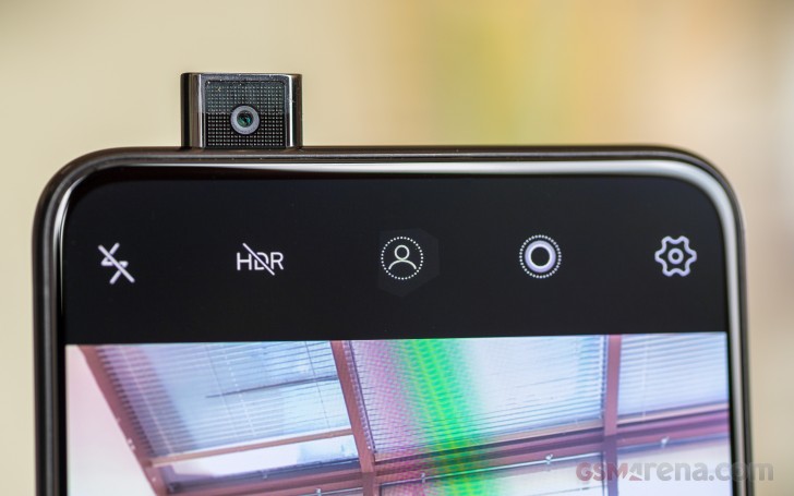
Naturally, our first concern was durability. Now, we can't say for sure how the pop-up camera will fair in time, but out of the box, the assembly feels very tight. No wobble whatsoever. It is also spring-loaded, so bumping into things won't immediately snap off a gear or lever. Vivo employees seemed very confident of its build qualities, while purposefully hitting the poor camera with a palm at the unveiling event.
One thing we did already observe is the module's tendency to accumulate dirt. You might want to wipe it down frequently.
While we applaud vivo for the cool mechanics and their innovator's courage, the actual performance of the 8MP, f/2.0, fixed-focus snapper is rather disappointing. By flagship standards, that is. It is also plagued by a general softness, limited dynamic range and is really prone to over-exposing shots.
Noise and suppression are also noticeable, although, interestingly enough, not as much as on the main camera. This makes us that extra bit more hopeful that whatever vivo messed up with the main camera, it is potentially fixable in software.
Naturally, there is portrait mode on the selfie side as well. It is entirely done through software and looks about as convincing as that on the main camera. Still perfect for social media purposes, though.
As far as additional effects go, there is a dedicated beauty mode, with manual effect intensity controls, as well as an AI mode. The results are subtle enough to be usable. Vivo also threw in AR stickers. These are quite reminiscent of Samsung's collection and track and look equally well. Despite the confusing lack of a video recording button in this mode, you can use these in clips as well and show off their animations by holding the main shutter key down.


Beauty mode: Lowest setting • Highest setting
Video
The vivo NEX S can capture videos at up to 4K@30fps. Straight off the bat, there is the potential issue of an absent 4K@60fps mode, which the chipset is definitely capable of and other competitors do offer. Even 1080p is capped at 30 frames. No fancy HEVC format either.
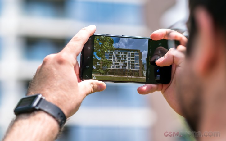
Videos get captured in a standard AVC, plus AAC combo, within an mp4 container. The 4K video feed stays steady at around 42 Mb/s, while the 1080p one, sits around 18 Mb/s. Both have 48kHz stereo audio. So, nothing particularly bad so far.
Looking at the sample videos, the NEX S actually does a pretty good job, capturing video.
There is some noise to note, here and there and the tendency to overexpose is clearly visible. Still, both 4K and 1080p videos fit within what we would consider current flagship-grade quality.
The NEX S does feature 4-axis OIS on its main camera and you can clearly see its benefits while shooting hand-held. Since the stabilization is optical, it works regardless of resolution. However, it might be worth noting that FullHD clips seem to have occasional issues with the OIS and, weirdly, come out with more sudden jitters.
The NEX S can also film slow motion clips. Nothing quite as fancy as Sony's 960fps, but still interesting, in their own right. Again, you get zero control over frame rate, but the rough math shows that the phone is recording in 720p HD resolution at a rate of 240 frames. That, then, gets encoded into a 720p@30fps clip, for convenience. The cool part is that you don't have a duration cap. The Snapdragon 845 feels comfortable enough doing all the recording and transcoding in real-time, so you could keep filming until you run out of space. Which, on the 256GB model, will definitely take some time.
You can also download these unedited samples: 2160p@30fps (13s, 68MB), 1080p@30fps (10s, 22MB), taken straight form the vivo NEX S.
Finally, we filmed our standard test posters in both 4K and 1080p. Just like with stills, the video frame grabs ended up really noisy, when the light went down. The FullHD sample looks a bit better, but a lot of that is due to the lower resolution, which hides the noise and the suppression artifacts better. The vivo NEX S simply has some issues with low-light photography.


2160p: vivo NEX S vs. the Apple iPhone X and the Samsung Galaxy S9+ in our Video compare tool


1080p: HTC U12+ vs. the OnePlus 6 and the Samsung Galaxy S9+ in our Video compare tool
Competition
The vivo NEX S is, without a doubt, envisioned and designed as an ultimate flagship offer. As such, it commands a flagship price, somewhere in the CNY 4,498 ($700) ballpark for the base 8GB/128GB version and CNY 4,998 ($780) for the decked-out 8GB/256GB model we got. That, effectively, puts it right in the middle of the 2018 flagship crowd. You can find pricier competitors out there, as well as a few noticeably cheaper offers like the OnePlus 6.

That being said, the NEX S was never meant to captivate as a good value offer. The NEX A might have a better chance in that respect. But at the end of the day, the NEX family represents the ambitious APEX concept, making it to the end-user market, despite all odds. As such, we can't really pick out any truly viable competitors, that bring quite the same level of hardware excitement to the table. Perhaps, the Honor X, but, as of writing this review, it hasn't stopped by the office yet.
So, assuming that money is no object, the first and probably closest alternative, that comes to mind is the Samsung Galaxy Note8. Its 6.3-inch, curved panel comes off as the closest thing to get to the massive 6.59-inch panel, on the NEX S. As with any Galaxy Note, you do also get the added bonus of advanced productivity features and an S Pen, if you are into that sort of thing. Also, an IP68 rating and wireless charging. No under-display fingerprint reader, though there is a special home button, hidden under the Note8's panel. Plus, a retina scanner, for added security. Of course, the more mainstream Galaxy S9+ offers, pretty much the same package, minus a bit of screen.


![]()
Samsung Galaxy Note8 • Xiaomi Mi 8 • Huawei P20 Pro • LG V35 ThinQ • Google Pixel 2 XL
Just like vivo, Xiaomi did a bit of display shopping, from Samsung for the Super AMOLED unit on the Mi 8. At 6.21-inches and complete with a notch, it's not nearly as big as the NEX S. Still, the Mi 8 has already written quite a few checks, most of which, successfully cashed. Aside from some thermal-throttling, we found it to be an overall excellent device.
Our next logical phablet of choice has to be the increasingly popular Huawei P20 Pro. Opting for it, instead of the NEX S, means you do have to live with a smaller, 6.1-inch, notched panel. Still, it is also a crispy and punchy AMOLED unit. But probably the main reason to go for the P20 Pro would be the exquisite triple main camera setup. It's approach to low-light hand-held photography and the corresponding results are kind of revolutionary.

Continuing down the list of the impressive phablets with OLED screens, there is the LG V35 ThinQ. Essentially, a refresh on the V30, this time, complete with a Snapdragon 845. Not much else has changed in hardware, though, so you could also potentially save a few bucks and opt for an older V-series as well.

Verdict
The vivo NEX S is nothing short of a monumental device. A cornerstone on the smartphone design roadmap. In a sea of "slab" design sameness, we really wanted to fall in love with vivo's design concept, turned mainstream. After spending quite a bit of time with it, we find it distinctly polarizing.

From a purely hardware standpoint, there are only a few issues. The lack of an IP rating and wireless charging come to mind. Also, the absence of a microSD card slot or NFC. A stereo setup would have been greatly appreciated as well. Even so, just one look at that seemingly endless 6.59-inch Super AMOLED panel and most nitpicks seem to almost fade away.
Pros
- Futuristic nearly bezel-free design
- Innovative and entertaining motorized selfie camera and under-display fingerprint solutions
- Amazing 6.59-inch notch-free Super AMOLED display
- Great battery life, fast charging
- Very loud speaker
- Good audio quality
- A lot of value-added features in Funtouch OS
- Good, if not really impressive, image quality
Cons
- No ingress protection rating
- No expandable storage
- No NFC
- No wireless charging
- Very unreliable performance on the under-display fingerprint reader
- Funtouch OS is badly organised, chaotic and difficult to use. Many features are not regionalized
- The camera has noticeable issues with noise, especially in low-light conditions
- No 4K@60fps or 1080p@60fps video capture
That being said, you should only seriously consider the vivo NEX S, if you are willing to live with the controlled chaos, that is Funtouch OS. It is filled to the brim with proprietary features. But most of these are so scattered, that the overall picture tends to get overwhelming. The Chinese ROM we tested, in particular, also doesn't win any extra points for including a whole lot of regional bloat and having large chunks of the UI and experiences, like the new Jovi AI assistant, entirely untranslated. Pile on vivo's continued insistence on copying iOS design and functional choices and integrating them in Android and you end up with an OS most users will have to continually battle with, to make "normal", familiar and usable.

Sadly, in its current state, Funtouch OS will keep us from recommending this device. We can liken the experience to climbing aboard a fancy, futuristic alien spaceship, only to quickly discover your inability to operate it properly and likely quickly crashing into a tree.
Perhaps, after a few software updates, or a proper international ROM release. Perhaps, once a second revision comes along. One thing is for sure, the vivo NEX S might be first in many respects, but it likely won't be the last.






No comments:
Post a Comment