Introduction
It's that time of the year again, when Google drops a brand-spanking new and improved version of Android onto the laps of (un)suspecting Pixel owners. The release came a month later than in 2018, which hopefully means the company has added some extra polish to what is now the finalized Android 10 release, but we're not planning on making assumptions here - let's dive in and see for ourselves just what's what.
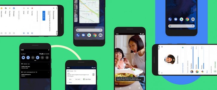
Android 10 represents a big departure from Google's past versions of the OS, especially when it comes to naming. Gone is any mention whatsoever of a yummy (or just plain weird) dessert, something that was a staple of every Android iteration since 1.5 Cupcake. Then again, there aren't a lot of desserts that start with the letter Q anyway, so maybe Google just decided, based on that, that this would be the perfect time to let that concept go.
There's also a new Android brand and logo to go with this release, with the famous (to a probably not huge extent of the public at large) Bugdroid mascot having a slightly different color... and no body. It's just a disembodied head now, which makes for an interesting look - don't call it disturbing.
The OS is simply "Android 10" now, which makes us think the company wants to imply that it's all grown up and doesn't need anything playful in its name anymore. It's all serious business, further solidified by it reaching the double-digit version space for the first time.
Aside from the naming and branding changes, the new release packs some highly anticipated features (can you say Dark Theme?), as well as some highly controversial ones (yes, we're thinking of the new gesture navigation system), so why don't you join us over the next few pages as we roll our sleeves and dig into what makes Android 10 tick. We'll let you know if it's as big on new features as it is on naming scheme changes, by showing you what's new and already available, and what's coming in the future.
This article is a refreshed repost of our earlier review of Android 10 beta. It has been updated to the best of our knowledge based on the recent final release of Android 10 for Google Pixel phones.
New gesture navigation
One of the biggest new features packed into Android 10 is the revamped navigation system. Last year with Pie, Google introduced its first take, which could really only be described as a half-baked attempt, at best.
Gesture navigation is anything but new in the mobile world. Many Android device makers have already been shipping their own interpretations in the past couple of years, following Apple's lead. But one of the main benefits of using gestures over navigation buttons is the added usable screen real estate. Except Google's version in Pie didn't actually get rid of the navigation bar, which makes that point moot.
Better luck this time? Well, it's complicated. The new system, called "Fully gestural navigation" in Settings, is an improvement, although Google's implementation has managed to complicate in-app navigation a lot, making for an unreliable and unpredictable user experience, because of two things: how it chose to go about marrying the new Back gesture to the concept of slide-out navigation drawers in apps (which are still very prevalent), as well as the issues with third-party launchers.
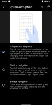
First things first. Here's what you get if you enable the new system: swipe up from the bottom to go home, swipe up and pause to get the multitasking menu. If you want to reach the app drawer, swipe up again after you've paused. In the Recents view the Google search bar shows up at the bottom with five suggested apps under it, if you move this panel up you'll get the full drawer. To go back at any point, you swipe from either the left or right edge of the screen.
To quickly switch between apps, either swipe up then right (or left), or simply swipe right or left on the line that shows up at the bottom of the screen at all times once you enable the new gesture navigation system.
There's an obvious conflict between the new Back gesture and the one that brings out an app's hamburger menu-enabled navigation drawer. Before, swiping from the left to the right in an app with such a menu would reveal that navigation drawer every single time. Now though, the phone needs to realize what you're trying to actually do - that, or simply go Back?
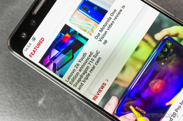
This has been an ongoing headache for Google ever since it launched the first public beta of Android 10 (then still referred to as Android Q), and the company has tried to 'fix' the problem in various ways that make little sense.
We still can't fathom why it wouldn't just ape Huawei and Xiaomi's gesture systems entirely - and especially the way those handle this conflict. It's a pretty simple solution, and one you get used to in no time: swiping from the left triggers the app's navigation drawer if the swipe originates in the top part of the screen, while if you start it lower you get the Back action. That's it.
Google could even have chosen to have the Back gesture only trigger from the right side, if it wanted to simplify things even more. But no, the company's solution to the problem it created is to give you a slider that lets you adjust how 'sensitive' the Back gesture is. And you can also tap and hold the left edge of the screen to make an app's slide-out navigation drawer pop out without any swiping required. We have exactly two words for this: needlessly complicated.
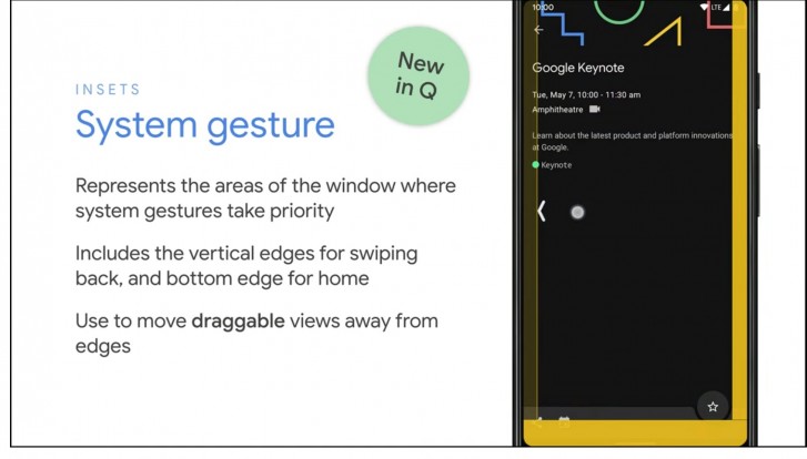
But wait, it gets worse: Google plans to let app developers set 'exclusion zones' for the new system, for areas in which the app's own navigation might conflict with the Back gesture. So if an app has a slide-out navigation drawer, its developer can override the Back gesture on the left side (where the drawer resides) or just parts of it. RIP consistency, then - not that Android's 'Back' action has ever been consistent, but still. Think about it: different apps may choose different behaviors, so the same gesture would yield different results - which aren't obvious from the get-go. You'll basically have to swipe and see what happens. Hope for the best.
You can still tap on the hamburger itself, of course, but since most people are right handed and that is in the hardest-to-reach place on a screen for someone holding and operating a phone with the right hand, that's not ideal.
And then there's the fact that third party launchers don't support the new fully gestural navigation system, through no fault of their developers. Essentially, because the app drawer is tied to the navigation system (invoking it requires two swipes from the bottom), and the app drawer is part of the launcher you're using, the launcher has to be able to work together with the new system. Except developers of third-party launchers can't get this to work because Google isn't allowing them to, yet. A fix is supposedly coming later this year, which should allow your favorite launcher that isn't the built-in one to work with the new gestures, but until then you need to pick: either use a third party launcher, or the gesture navigation. If you go with the former you can't enable the latter, the option is greyed out in Settings.
A smaller nitpick we have is that while the huge navigation bar of old is indeed gone, there's still a tiny version of it, with a big pill/line-shaped element in the middle, sitting pretty at the bottom of the screen. This reminds us of Apple's similar UI cue to get people to realize they're supposed to use gestures, but we're not convinced anyone has ever seen that and went "oh, yeah, I totally need to swipe from there to go somewhere". Not to mention that Back isn't a gesture that's initiated from that space.
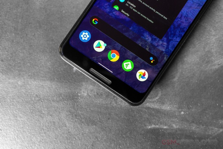
If you're wondering how you can quickly bring up Google Assistant since there's no more Home key to long press, you can swipe diagonally from the bottom left or right corner and it will show up. To make this discoverable you'll get some thin curved lines show up in those corners - don't call them 'love handles'. And of course on six out of eight Pixel models there's also the option of squeezing the frame to accomplish the same thing.
Interestingly, after last year's Pixels came with only the gesture navigation system and no three-button navigation option, in Android 10 you have three options for how to go about the UI: the new gestures, the old gestures (why?), as well as the fixed navigation bar with Home, Back, and Recents buttons. If that sounds more messy than choice-y, it definitely is.
Notifications
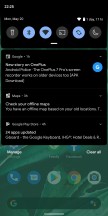
The running joke that it can't be a new Android version without a change in notifications still holds true in 2019. Google has once again tinkered with notifications, and while it hasn't done so as much as in some previous versions, the changes are still pretty significant.
First off, Smart Reply is now built into the notification system, and as such it will work for any messaging app you have installed. What's more, it does its magic of suggesting a reply for you in the app's notification without requiring an Internet connection - it's all powered by on-device machine learning. Oh, and Smart Reply now also suggests actions you may want to take based on the contents of a message, not just replies - so if you receive an address, you'll get a suggestion for viewing that in Maps. Tap the suggestion in the notification, and you're instantly shown it in Maps - without the need to tap the notification first to get to the messaging app and then tap the address. The amount of time this will save you can quickly add up.
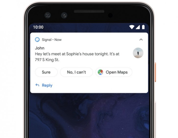
When you tap and hold on a notification you get a new menu that lets you select whether that app's specific notification channel that triggered that notification serves you Alerting or Silent notifications. The former will make a sound and show in the notification drawer, status bar, and on the lock screen, while the latter are, well, silent and appear only in the shade.
You can change whether notifications from an app are Alerting or Silent on a per-channel basis, but this new setting means snoozing notifications is no longer possible. A new "Notification assistant" will by default automatically prioritize notifications for you, so manual adjustments will only be needed where it goes wrong.
Dark theme
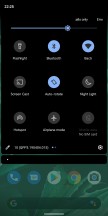
After many years of cries from lovers of all things black and dark all across the globe, Google finally caved. Android 10 has a fully baked, fully functional, manually selectable dark theme. No more need to pick a dark wallpaper to invoke it, just go to Settings > Display > Theme and enable it. Its backgrounds are true black, by the way, not just dark gray, which should help with battery life on phones that have OLED screens. The Dark Theme even has its own Quick Setting tile, which you can use to switch it on and off whenever you feel like it.
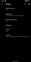

Changing theme in Display Settings
Although this will probably end up being the most celebrated new feature in Android 10 (which tells you something about how many exciting consumer-facing things this release is coming with), there isn't a lot to say about it. Everything system-related turns dark - the Settings, the Quick Settings, the Notifications, the Google Discover feed that you reach by swiping right when you're on the leftmost home screen, it's a color inversion bonanza, this.
What's more, some of the built-in apps turn black too when the Dark Theme is enabled. But not all of them yet, for example, Gmail is still a holdout in this regard, and its newest UI being very white means you may have to brace yourself (and your eyes) when you go into it from another app that is in fact dark. Third-party app developers can support the Dark Theme too, which means if they add the required code it will also obey the system-wide dark or light UI setting.
If you're impatient, Google has helpfully built in a trick to force apps to dark mode, even if they don't yet support it. You'll need to first enable the hidden Developer options menu for this (you can Google how). Then head over to Settings > System > Advanced > Developer options, scroll way down, and toggle Override force-dark to be on.
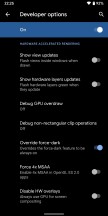
"Override force-dark" in Developer options
The forcing of dark mode seems to work reasonably well from what we've experienced, although in most apps doesn't give you real black, just dark grey. And it's not all smooth sailing - for example, in a lot of apps the interface does turn dark, but while you're in the app, the status bar shows black icons on a dark grey background. Such issues are probably why forcing the dark theme is a setting hidden in Developer options.
Settings reshuffled
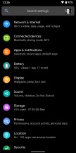
There's no joke about this one (or maybe there is, and we just haven't heard it?), but every year, with every new Android version, Google changes something about Settings. It's just compulsive like that.
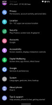
With Android 10 we get a new top-level Settings entry for Privacy because Google keeps being accused it's not focusing on that enough. So now it made it a separate item in Settings, what more could you want? Kidding aside, this menu item incorporates the new Permission Manager, which groups apps by the permissions they are granted.
Other privacy-related things that used to be housed elsewhere in Settings have thankfully been added here too, such as everything about Google's Autofill service, links to your location history, and Activity controls - where you choose the activities and info that Google can save. The Google Ads settings have moved here too, and the toggle for sending usage and diagnostic data from your phone to its servers is the last in the list.

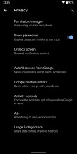
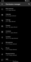
The Privacy menu and Permission manager
Location and Security are once again individual top-level entries in Settings, and there has been a change in the way you grant apps permission to access your location. Previously, this was a simple yes/no switch, but now you get another option - letting an app know your whereabouts only while you're actively using it. Additionally, when apps use your location in the background, you'll get a system notification (this was already a feature in many OEM skins).
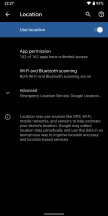
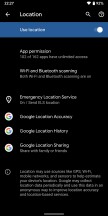

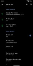
New Location and Security menus
Speaking of permissions, if you make an app the default for something (browser, email client, messaging app, the likes), it will automatically be granted permissions based on what it is the default for. This happens through a new system of the OS giving specific apps "roles", and the list of those, for now, comprises browser, dialer, SMS app, launcher, music app, gallery app, and your emergency information handler.
So, when you set something as your default phone dialer, it will automatically be granted permissions to handle calls as well as send SMS messages - no more of those pesky permission request pop-ups. Similarly, the default SMS app can read and send SMS messages and access your contacts. The default music app has control over files in the Music folder, while the default Gallery is granted permission to oversee the Photos & Videos media folder. You get the idea. It's a neat little user experience improvement, this, since it's rather apparent that if you want an app to be your default dialer you trust it enough to grant it permission to make and receive phone calls.
Share menu
Probably the most painfully slow part of Android so far has been the Share menu. And that's a huge shame given how useful it is - nevermind the fact that it introduced the world to the concept of sharing things from one app into another way before Apple ever had something similar in iOS. For years it used to be a key usability differentiator between Android and iOS, but all this time it's been slow and inconsistent.
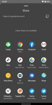
In Android 10, Google finally decided to fix the Share menu, by switching from a pull to push methodology - so the app shortcuts are ready when you engage the menu, and don't all have to load after you tap the Share icon, as before.
If you're wondering whether Google has pulled it off - yes, the new menu is significantly faster than the old one in Pie. We still feel like there's room for improvement, speed-wise, but maybe that's coming in Android 11? There's also a functional difference between the new Share menu and the old one: you now get 8 Direct share targets at the top instead of 4 as it was before.
To give you an example of what these are, they should show up and allow you to share something not just with an app, but a specific recipient. So if you want to send an image to Sally on WhatsApp, the Direct share part of the menu will (hopefully) surface her name (and this should happen if you message each other a lot) and then you're saving a tap by not first choosing WhatsApp as a share target.
Finally in Share menu news, you can no longer pin apps to the top. This used to be a workaround a lot of people employed in older Android versions because every time you'd want to share something the menu would pick a different placement for the same app - and this led to a lot of hunting, especially if you usually share things to only a few apps. For whatever reason, pinning is no longer possible. Does the faster speed of the new Share menu alleviate that issue somewhat? Sure, but it is odd to see this feature cut out anyway. Perhaps it just wasn't working well with the new push system.
Note that all of this (rather obviously) only applies to the native Android Share menu. A lot of apps, even some made by Google (YouTube, Maps, News, Photos), have their own custom share sheets, and maybe those need to go away now that the default one is finally reaching a usable speed?
Digital Wellbeing: Focus Mode and upgrades to Family Link
Last year Google launched its Digital Wellbeing suite, that gets its own top-level placement in Settings but rather confusingly isn't necessarily updated at the same time as Android. Its beta got launched after Pie dropped, and was opt-in for Pixels. This year Digital Wellbeing gets a new Focus Mode, which is available to Pixels but also other Android handsets running Android 9 Pie or Android 10 - that is, if their maker has added Google's Digital Wellbeing suite to their skin.
Focus Mode's name is pretty self-explanatory. Once you activate it, the apps you have pre-selected as being distracting will no longer be able to show you notifications - until you decide to come out of Focus Mode, of course.
Google's Family Link set of parental controls is now accessible through Settings on every handset that runs Android 10 and has the Digital Wellbeing suite, and these two will share a top-level Settings slot because they're philosophically connected.
The company is also expanding its parental controls to add top requested features such as giving your kids bonus time for phone usage before bed, and the ability to set app-specific time limits for them.
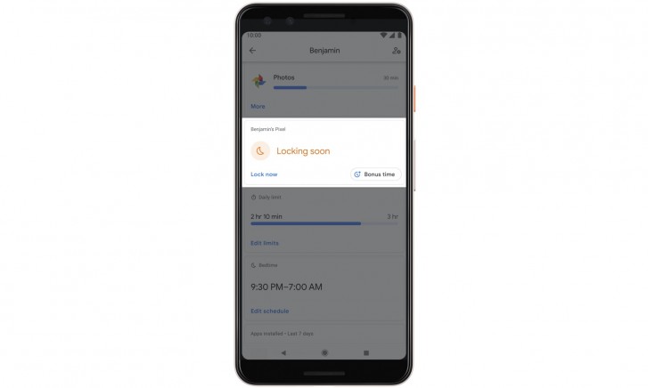
A further improvement to the Digital Wellbeing suite, coming with updates to both itself and the default Pixel Launcher, means you'll be able to quickly 'pause' apps by long-tapping their icons on a home screen. An additional option will show up when you do that, and when you hit the hourglass that app will be paused for the remainder of the day, so you won't be able to use it until the clock strikes midnight. This complements Digital Wellbeing's ability to add app timers per day, so you are only allowed to use a specific app for whatever amount of time you set. The point of all this is to help with distractions, but obviously, whether you use app timers or app pausing is entirely up to you. It will be interesting to see if third-party launchers will follow the Pixel Launcher's lead and support quick app pausing too.
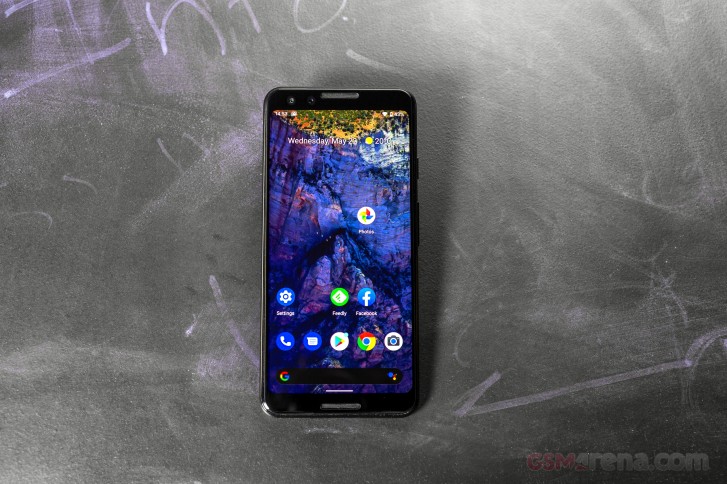
A key thing to note here is that Digital Wellbeing doesn't seem to be part of the core Android OS Google offers to third-party manufacturers, so whether it will ever make it to your particular smartphone remains to be seen.
Other new stuff
You can now easily share the Wi-Fi password to a network from Settings. You get a barcode to show other people, which they can scan to connect, and below it, you even have the Wi-Fi password in good 'ol plain text if the barcode isn't working for some reason. Because of how sensitive this information is, accessing the Wi-Fi network sharing menu requires authentication with your fingerprint or password.
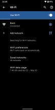
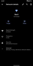
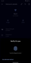
New Wi-Fi menu with easy barcode sharing of networks
You can customize vibration strength separately for calls, notifications, and screen touches if you go to Settings > Accessibility > Vibration. Some Android OEMs have been offering something similar for ages; and it's good to see this finally added by Google too. Still no control over how your phone vibrates, though. Maybe that will be another feature for Android 11.
If you use Battery Saver, note that you can now choose whether it will automatically turn itself off when the phone reaches 90% charge, or stay on until you turn it off manually. You can also set up a routine, having it turn on automatically based on how you use your phone (if the battery is likely to be depleted before your next typical charge), or based on a percentage value (which you can adjust from 5% to 75%).
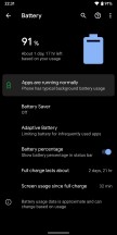


Battery menu with new Battery saver options
When you aren't connected to anything, and Wi-Fi networks are available around you, you may see a card with three suggestions at the top of the Settings UI. In previous Android versions, you'd sometimes see tips here, and this is an expansion upon that feature set. If you have Wi-Fi off for a while, you could see a reminder to turn it back on, and there's also a card with info about connected Bluetooth devices which may show up in the same place. The latter only appears when you are connected to a device. Unlike with Wi-Fi, there's no toggle to turn on or off Bluetooth.
Your Google account photo now shows up in Settings, in the top right inside the search bar (with the search icon being symmetrically on its other side).
A new Audio balance slider is found in the Accessibility settings letting you adjust the left/right audio channel balance when you have stereo audio source.
If you use a PIN to lock your screen, the previous check mark icon in the bottom right of the keypad is now an Enter key.
There's an Emergency button in the power menu (that shows up when you long press the power button), which, when engaged, shows you a huge keypad (supposedly to quickly call emergency services) as well as a link to the Emergency information you saved in Settings - this should be useful for emergency responders.

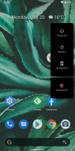


Enter key on lock screen, Emergency button in Power menu
The uptime of your handset since the last shutdown/reboot is now proudly displayed in Settings > About phone.
Also the last three Bluetooth devices you connected to now show up directly in the Connected devices Settings section, you no longer have to tap on "Previously connected devices" unless you want to see more than three. Search results in Settings can have toggles and sliders, so you can quickly adjust things like the brightness level or whether adaptive brightness is on.
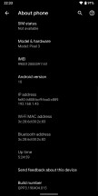
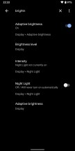
Uptime counter, search results with toggles
Android 10 blocks clipboard access to apps that aren't in the foreground or aren't the default input method. The privacy advantage here is clear since a lot of people copy and paste sensitive information like passwords and credit card numbers, but this unfortunately also means that clipboard manager apps no longer work.
If you enable showing the battery percentage in the status bar, when you pull down the Quick Settings shade you'll see an estimate of how much longer your device will last based on your current usage.
Media notifications gain a seekable progress bar which lets you seek around without having to open the corresponding app.
Although Android 10 is out, a couple of features aren't ready yet, and it looks like Google is going to make both of these exclusive to the Pixel 4 family when that launches later this fall. At least at first. These might eventually roll out to older Pixels, but don't hold your breath because both seem to require a lot of on-device processing power, which older models may simply not have.
On-device Google Assistant
The Google Assistant made its debut on the original Pixel phones in 2016, and since then it's grown into the best virtual assistant there is. On its third anniversary, a massive update is coming, but we have to warn you, Google said this is launching on the Pixel 4 phones first. So like the original rollout of the Assistant, it might be limited to the upcoming Pixels for a while, until the company is ready for a rollout across all Android devices.
The big news is that the Assistant will be fully contained on your phone, so it will no longer send your queries to the Google servers to interpret your speech. The company has managed to develop completely new speech recognition and language understanding models that don't need the cloud to function anymore because they take up as little as half a gigabyte of space. Hence, these will live on your handset, replacing the 100GB models that the company has so far been using in the cloud.
This means the new Assistant will process requests with near-zero latency since there's no waiting around for the round-trip the data makes to the cloud and back. So its answers should feel much more like they are part of a natural conversation - Google says it will reply up to ten times faster than before. And of course, since it's all on-device, it will understand your query even when there's no internet connection - although the lack of connectivity will still prevent it from showing you results on the web.
Live Caption
Live Caption was announced on stage at Google I/O, and its name is very descriptive. Thanks to the new on-device machine learning capability and audio playback capture API, you'll get support for live captions of any media right on your phone, with no internet connection required.
It will automatically caption media playing on your device - videos, podcasts, audio messages, you name it - across any app. It even works with stuff you record yourself. As soon as speech is detected, captions will just automagically appear. The captions and audio never leave your phone. This is going to be helpful for the deaf and hard of hearing people, 466 million across the world, according to Google's numbers. But it will also help those who watch video without sound out of privacy reasons.
Foldable phones, 5G
Since foldable smartphones are now a thing, Android 10 is also introducing official support for these new and exciting form factors. It's designed to enable seamless switching between an inner and an outer display, better multitasking on larger screens, and adapting to different screen dimensions.
Android 10 also has 5G support built-in, not that that was a prerequisite for us to see 5G capable smartphones - these already exist and they all run Pie. Yet Android 10 offers developers tools to build apps with faster connectivity use cases in mind, with enhanced AR and gaming experiences.
Google Play system updates
Like clockwork, not a year goes by without Google triumphantly announcing that it's improving the dire update situation in the Android world. Spoiler alert: while some of its past initiatives in this domain have helped somewhat, the improvements so far have been extremely small. Maybe this time it will be different?
Don't bet your life on it. So now that we got modular Android OS feature updates out of the way (those launched with Pie and someone should tell OEMs about them, perhaps), the next bullet point is obviously security patches. Like with all updates, some third party manufacturers are better at pushing these out in a timely manner than others, but seeing a security patch per month from all OEMs is still a pipe dream.
Enter Google Play system updates, formerly known as Project Mainline. This lets Google (with an OEM's permission, and this is important to keep in mind) update some parts of the underlying OS in the background, like an app update. The updates will come through Google Play, as the name implies, and they will patch some core OS components.
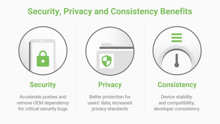
So, in theory, Google could be pushing these to your non-Google phone and it'll get more secure without you having to wait for a full-blown system update from its manufacturer. This should accelerate the delivery of security fixes, privacy enhancements, and consistency improvements across the ecosystem, though by how much remains to be seen.
According to Google, last year's Project Treble resulted in a 2.5x acceleration in the adoption rate of Pie compared to Oreo, but that's Misleading Phrasing 101 because the timely update situation used to be horrendous and now it's graduated to just dire.
With Play system updates, Google says it will be able to deliver fast fixes for critical security bugs, like those relating to media components, which have been modularized (and media-related bugs accounted for 40% recently patched Android vulnerabilities).
This all sounds fine and dandy, but given Google and Android's history around such highly touted improvements to updates, we're still skeptical. Also note that while such updates will happen in the background, you'll still need to reboot your device to see the new improvements after each one.
Encryption for everyone
Every device that will launch running Android 10 will be required to encrypt user data storage up to the Advanced Encryption Standard (AES) - phones, tablets, TVs, automotive devices even. So far, low-end phones have not had encryption turned on because of the performance cost that their processors simply couldn't handle given the lack of support for hardware acceleration of encryption.
Google now has a solution: it's called Adiantum and it's a new encryption method that runs about five times faster on an old Cortex-A7 CPU than a standard AES compliant method. It can run efficiently without specialized hardware, on anything from a smartwatch to an internet-connected medical device. This should provide a huge security boost to users of cheap smartphones across the world, starting at whatever point affordable low-end handsets running Android 10 will appear on the market.

Storage encryption is only half of the picture, in Android 10 Google is also enabling support for TLS 1.3 by default. This is a major revision of the TLS cryptographic protocol for network communications security, and it's faster, more secure, and more private.
Conclusion
Android 10 presents us with a weird dichotomy between what it's called and what it actually packs inside. The name makes this release seem momentous, anniversary, big and even grown up because of the lack of a dessert tacked on at the end. But if you look at the new features it introduces, it seems more like an evolution than any type of revolution. And in use, it feels neither momentous, nor worthy of the anniversary number, or of being referred to as "big". It's just a new Android version, with plenty of neat improvements here and there, but nothing really special - aside from the Dark Theme, of course. And while Android has definitely grown up in most areas, the new gesture navigation system feels anything but.
It's great that Google has realized that its first attempt at a gesture navigation system was fundamentally broken and decided to fix it, but the way it chose to do that has introduced a couple of big new problems that relate to a conflict with accessing apps' navigation drawers and essentially not allowing third-party launchers to play. To alleviate the former developers could just get rid of the slide-out drawers entirely, but we don't seen that happening anytime soon. For now, you're stuck with a very imperfect system, choosing between tapping the hamburger icon to get to the slide-out navigation drawer in an app or tapping and holding on the left edge of the screen to accomplish the same thing.
Alternatively, you can just go back to the other navigation gestures, introduced in Pie, though in that case you don't gain any screen real estate. And the traditional three-button navigation bar has returned too, bafflingly. So at least you have options, even if neither of the two gesture systems is well thought through and the three-button bar just feels ancient in this day and age.
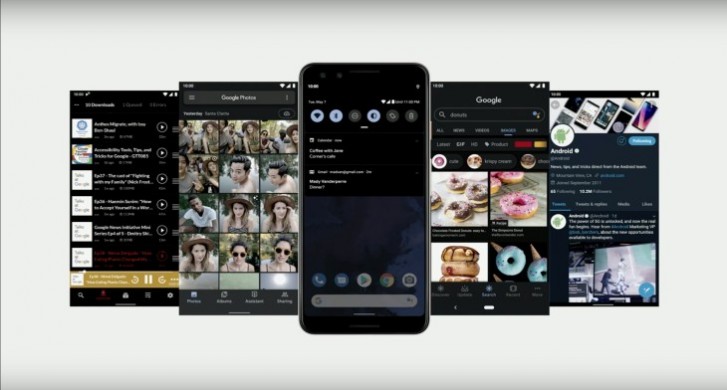
So with that in mind the Dark Theme is the headline new feature, as it's long been requested, but also because it just works. That said, there are still some Google apps (Gmail being the worst offender) that don't support it, which is pretty head-scratch-inducing. Hopefully that will be fixed soon, and we're looking forward to third-party developers adding support for the Dark Theme in their apps, so that when you flip that switch literally everything on your phone goes black.
The faster Share menu is a very welcome (and highly overdue) change, while Digital Wellbeing keeps on expanding, though it's still confusing that other OEMs aren't adding it into their skins wholesale. Google keeps modifying notifications with every new release, and shuffling things over in Settings, but if you update your Pixel from Pie to 10 the new version will definitely not feel very different and the learning curve, if there will even be one for you, is bound to be minimal.
If your phone isn't a Pixel you're still going to be in for quite a wait, as usual. Unless, that is, you happen to own an Essential Phone, in which case you are very lucky to already be able to play with Android 10. That handset aside, the unfortunate tradition in the Android world is that how many of the new user-facing improvements you'll actually get to experience when your device's manufacturer decides to issue the update to Android 10 is debatable.
Android One phones should be the closest to Pixels in this regard, and are supposed to be next in line, timeline-wise, to actually see the update - although that's the theory, in the past it hasn't always held true. Next come the skins that are customized but still don't stray far from the stock experience, like OnePlus' OxygenOS or Asus' new ZenUI 6, which should also come with almost all of these improvements, even if it could take months for the update to actually appear.
Now, we have to note that a few Android device makers have promised very quick updates this year, but we'll believe that when we see it. We're only skeptical because we've been burned before by such promises, and it's unfortunately still true that if you want to get a new Android version on day one, you need to own a Pixel - or an Essential Phone, as it turns out. Sure, OnePlus has already made betas based on the final Android 10 build available for its most recent phones, but who knows when the stable update will actually hit.
The heavier your OEM's skin, the less chance you'll have any of Google's UI changes built-in. With the heaviest of skins, such as MIUI, it doesn't even make a lot of sense to wait for a new Android version to reach you, because any new design or functional change you may see usually comes as part of a MIUI update. Regardless of which phone you have, though, all of the under the hood enhancements that Google has built into Android 10 are definitely coming your way once the update is available for you, if that's any consolation.
So, you should at least benefit from the new Google Play system updates, which in theory will make any device running Android 10 much more likely to get important security fixes quickly, as they're coming straight from Google and not the OEM. Support for TLS 1.3 being enabled by default means better security and privacy, something that's also made possible by the new location permission system. And perhaps the on-device Google Assistant and the Live Caption feature will at some point make it to non-Pixel 4 phones, if they are high-end enough to support these. If this happens, Assistant replies will be much faster, and you'll also have the added benefit of your queries not being sent to Google for processing - another privacy win.
As it stands today, Android 10 might not make your jaw drop, but it's still an update you should definitely install on your Pixel or Essential Phone, because while it's not as big as its name implies, it's still packed with a lot of added polish and neat improvements that should make your life easier, for the most part.



No comments:
Post a Comment