Introduction
The OnePlus 7T and the OnePlus 7T Pro are the successors to the very recently launched 7 and 7 Pro. If you are wondering why these devices exist so soon after the release of the 7 and 7 Pro it's because OnePlus seems to no longer be following its self-imposed six month release cycle. It's also possible the OnePlus 8 and 8 Pro may already be here before you finish reading this.
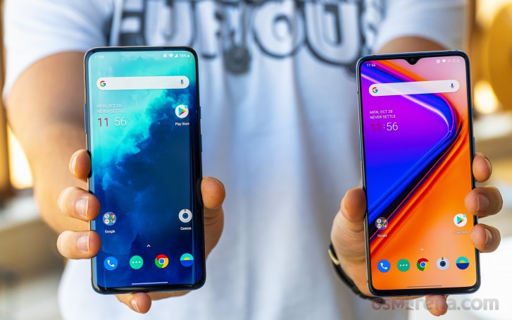
Jokes aside, the OnePlus 7T and 7T Pro are iterative updates over two already very good phones. The OnePlus 7T Pro, in particular, is a much smaller update over the 7 Pro, while the 7T is a lot more noteworthy. So noteworthy, in fact, that there is now some confusion whether you should go for the 7T or the 7T Pro.
You see, when the 7 and the 7 Pro released, there was a very clear delineation between the two. The 7 Pro had everything under the sun, from the curved 90Hz display, triple camera and higher memory options. The 7, on the other hand, was a more modest proposition with smaller ambitions. It was a very capable smartphone, just not the very best.
OnePlus 7T specs
- Build: Aluminum frame, Gorilla Glass 6
- Dimensions: 160.9 x 74.4 x 8.1 mm, 190g
- Display: 6.55-inch, 2400x1080 AMOLED, 402PPI, notched
- Rear wide camera: 48MP f1.6 26mm, PDAF, OIS, laser AF, 4K60 video
- Rear ultra-wide camera: 16MP f2.2, 17mm, 4K30 video, macro mode
- Rear telephoto camera: 12MP f2.2, 52mm OIS, 1080p30 video
- Front camera: 16MP f2.0, 25mm, fixed-focus, 1080p30 video
- Chipset: Snapdragon 855+
- Memory: 8GB RAM, 128/256GB storage
- OS: Android 10, OxygenOS 10
- Battery: 3800mAh, 30W charging
- Misc: In-screen fingerprint sensor, stereo speakers, alert slider, haptic feedback
OnePlus 7T Pro specs
- Build: Aluminum frame, Gorilla Glass 6
- Dimensions: 162.6 x 75.9 x 8.8 mm, 206g
- Display: 6.67-inch, 3120x1440 AMOLED, 516PPI, curved
- Rear wide camera: 48MP f1.6 26mm, PDAF, OIS, laser AF, 4K60 video
- Rear ultra-wide camera: 16MP f2.2, 17mm, 4K30 video, macro mode
- Rear telephoto camera: 8MP f2.4, 78mm OIS, 1080p30 video
- Front camera: 16MP f2.0, 25mm, fixed-focus, 1080p30 video
- Chipset: Snapdragon 855+
- Memory: 8/12GB RAM, 256GB storage
- OS: Android 10, OxygenOS 10
- Battery: 4085mAh, 30W charging
- Misc: In-screen fingerprint sensor, stereo speakers, alert slider, haptic feedback
With the 7T and 7T Pro, things are a bit different. The 7T now gets a 90Hz display, a triple camera setup on the back and the same basic internals as the also updated 7T Pro. The 7T Pro, meanwhile, only gets minor bumps in specs over the 7 Pro but nothing that distances itself from the 7T quite as much as its predecessor did with the 7. However, the price has now gone up for the cheapest 7T Pro, making the gap between the 7T and 7T Pro even larger in terms of cost.
All of this begs the question, why even buy the OnePlus 7T Pro anymore when you can just get the 7T and call it a day? Well, it certainly seems that way on paper but maybe there's more to the story than what might appear at first glance. So let's break it down to the basics and see if the 7T Pro pulls ahead in a meaningful way to justify its cost, or if you should indeed just trust your instincts and go with the cheaper 7T.
Design
Despite being from the same family, the 7T and the 7T Pro do look quite a bit different from each other.
The 7T design continues the evolution of the design that started with the OnePlus 6 last year. With the 6T, the phone got larger while the notch shrank. The OP 7 which came after that was essentially the 6T with a bigger camera bump.
The 7T now is notably different in looks, to the point where it looks very little like the 6 and 6T. The phone now has a taller design with a 20:9 aspect ratio display and the notch has also been made smaller, all of which makes for an impressive screen to body ratio.
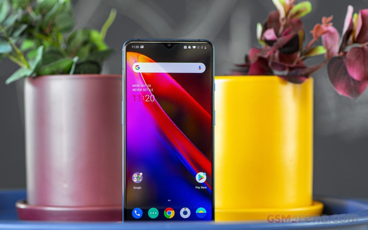
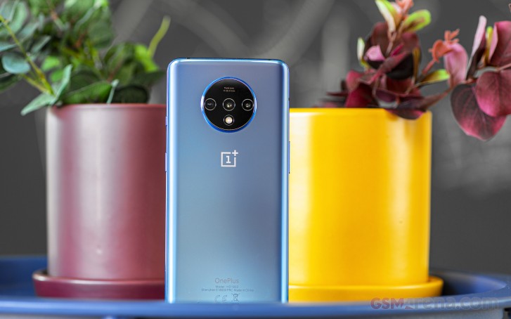
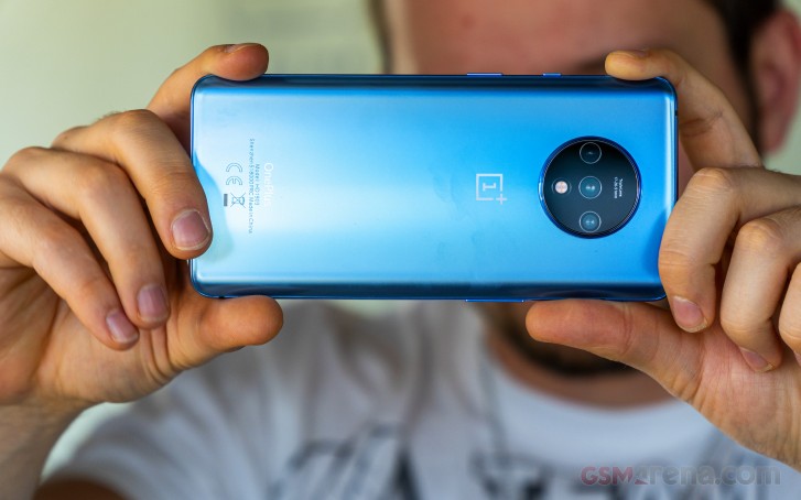
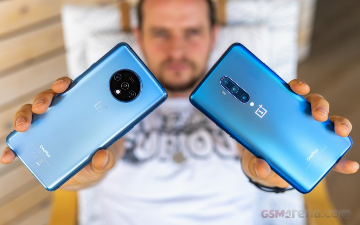
The back of the OP 7T has one of the most easily identifiable camera modules on any smartphone. This massive hubcap houses the new triple camera system with the laser AF and LED flash. As long as the design remains exclusive to this phone, you're never going to confuse this phone for anything else in public.
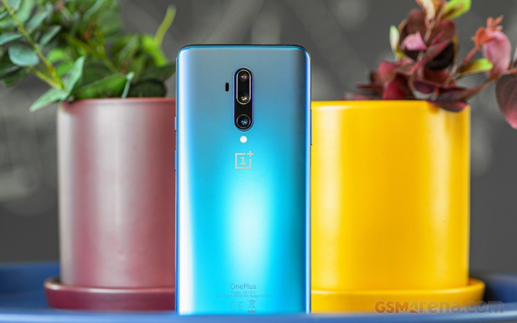
The 7T Pro design isn't nearly as distinctive, despite the stunning Haze Blue color on the back, it's still a fantastic looking phone. The curved display glass that melts into the sides, the two-tone color frame, the lack of any notch and barely any chin and a more reasonably sized camera on the back ensures this phone looks properly good in hand in a way many more expensive phones do not.
Unlike the 7T, the 7T Pro design didn't receive any changes from its predecessor. The only visual differences is the color, which is now a lighter shade of blue, and the laser AF sensor on the back, which now sits outside of the camera module.
The laser sensor probably had to be moved to work properly with the new macro mode, which requires the camera to be extremely close to the subject, and the previous position of the laser AF sensor probably didn't work very well. However, the relocation of the sensor means you can't use any of the cases designed for the previous 7 Pro on the 7T Pro without covering it.
Aesthetically, it does bother us slightly that the two phones don't look all that much alike. One has a notch; the other doesn't. One has a camera module that can be seen from space; the other - a more reasonable size. Even the shade of blue for the back is different, and the 7T doesn't get the two-tone metal frame like the 7 Pro and 7T Pro that gets gradually darker from the bottom to the top.
When we look at the Pro and non-Pro models from other manufacturers, they usually seem to have the same or similar design, but the 7T and 7T Pro look like two different phone models. This is, of course, nitpicking of the highest order but we would still like the designs of the two phones to become more congruous in future releases (which should be launching any minute now).
The phones also feel quite different in hand. The 7T is nearly as tall as the 7T Pro but narrower and thinner. More importantly, it's also lighter than the 7T Pro. This makes the 7T far more comfortable to hold and carry around.
The 7T Pro, unfortunately, is just as massive and heavy as its predecessor. Even though the curved edges and the smooth matte glass on the back feel great in hand, the phone is just too big and also too heavy. You really start feeling the bulk after holding the phone just for a few minutes, and it gets tiring pretty quickly. This is another area where we would like OnePlus to improve in the future by making the phone lighter, if not smaller.
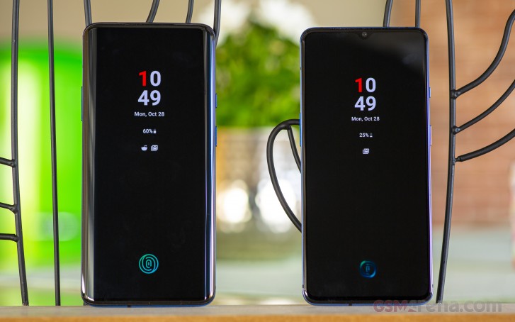
Which phone you like depends mostly on your taste, although we do personally like the 7T Pro design more. However, there's no denying that the 7T is the more ergonomic of the two.
In terms of build quality, both phones feel exceptionally nice in hand due to the metal and glass construction. However, neither phone has any ingress protection certificate. That's not to say that the phones aren't protected, and we know there's enough protection built into both phones to prevent dust and water from going in, but the lack of an IP-rating doesn't inspire a lot of confidence. OnePlus opts out of the certification process to reduce costs but with the cost of both phones rising - especially the Pro model - we think it's time OnePlus starts including this basic feature into their phones.
Winner: OnePlus 7T. While the design is subjective, there's no denying that the 7T is more ergonomic to use and carry while the 7T Pro feels excessively large and heavy.
Display
The display is perhaps the biggest differentiating factor between the two phones. While the 7T does get a new and improved display over the 7, the 7T Pro carries over the already excellent display of the 7 Pro.
The 7T has a 6.55-inch, 2400x1080 resolution AMOLED display while the 7T Pro has a 6.67-inch, 3120x1440 resolution AMOLED display. The display on the 7T is flat while the 7T Pro has curved edges. Both screens are capable of refreshing at 90Hz. Both feature a fingerprint sensor built-in and haptic feedback.
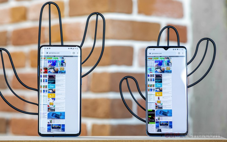
The display on the 7T isn't dramatically improved in terms of image quality, but it does have more vertical resolution and a taller aspect ratio. The notch has also been reduced in size, and the chin is still quite small. All of this results in an excellent 86.5% screen to body ratio.
The 7T Pro does even better. It has no notch, and due to the curved edges, it occupies more of the front surface of the phone. This results in an even more striking 88.1% screen to body ratio.
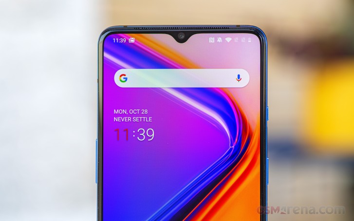
Both phones ship with high-quality AMOLED panels manufactured by Samsung. The 7T is capable of slightly higher 1000 nits of brightness than the 7T Pro, but both get adequately bright under the sun even without enabling auto brightness. If you do, the display also adjusts the colors and contrast to make it more visible under direct sunlight while also boosting brightness.
Both displays also have excellent color accuracy in their respective sRGB (Natural) and Display-P3 (Vivid) modes. Both high-resolution are capable of playing back content in HDR10 and HDR10+ formats with wide color gamut support. Unfortunately, HDR performance remains underwhelming since neither gets always to appreciate bright during HDR playback.
Both displays offer a silky-smooth 90Hz refresh rate. Both let you switch down to 60Hz if you want to save some battery or keep it in 90Hz mode.
The 90Hz mode doesn't work in every application, and aside from the built-in apps and some whitelisted third-party apps it often tends to go down to 60Hz mode, which feels a bit jarring. Games in particular are notorious for not even supporting 60fps in many cases and we didn't come across a single game that can match the 90Hz refresh rate with 90fps on either phone.
Still, for just improving the responsiveness and fluidity of the UI in general usage, we really appreciate the feature being there. It's a great way to put all the GPU horsepower available at your disposal to good use, and we wish more manufacturers implemented higher refresh rates.
Both phones also have a fingerprint sensor built-into the display. OnePlus confirmed to us that the sensors on the 7T series are similar to the previous ones but not identical. One of the visual differences is that on the 7T series the display shines a white light to illuminate your finger whereas on the 7-series and 6T, the light was green. Our little research led us to believe it's actually the latest generation of FP sensors that requires green light so you are at least getting the latest hardware.
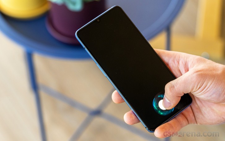
In terms of performance, the new sensor seems slightly improved over the previous one. We did have issues with the previous ones, where it often failed to read fingerprints and was also easy to catch it off guard by trying to scan a less frequently used thumb. The new one seems faster and more reliable in general, but on some occasions it's still possible to catch it scanning at your thumb for a second longer than it should.
One area of difference between the 7T and the 7T Pro is the resolution. While the FullHD+ resolution of the 7T display is perfectly adequate for all intents and purposes, the 7T Pro goes a bit further into the indulgence territory with its QHD+ resolution.
Realistically, it is difficult to always appreciate the extra resolution the 7T Pro brings over the 7T unless you are looking at high resolution images or videos side by side. So we do appreciate the extra pixel density on the 7T Pro display but we also don't think you're missing out on a lot with the 7T.
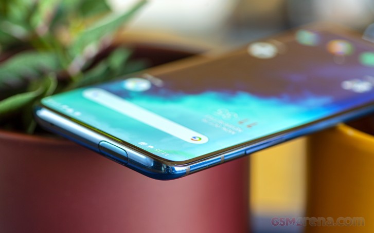
Another area where the 7T Pro differs from the 7T is in having a curved display. One could argue about the aesthetic impact of this design decision, and we do begrudgingly agree it looks much nicer than a flat display.
However, a curved display has some drawbacks compared to a flat display, including image distortion around the edges, increased glare around the edges and the increase in false touch reported by the screen when simply holding the phone. We don't think the subjective improvement in the design is worth these very objective drawbacks.
Speaking of false touches, the standard 7T was also strangely not immune to these. If we used a full palm grip (as opposed to being held just with the fingers) and using the phone with the same hand, we often found the edges of the screen getting triggered by the base of our thumb. It gets worse when using the phone in bed over your head as you have no choice but to use the full palm grip and the screen is constantly going off all the time by your palm.
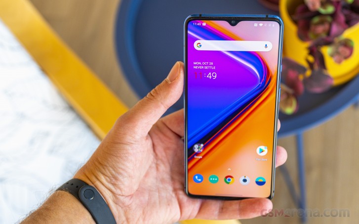
Both phones also have this annoying problem where the bottom chin is too thin for usability now. If you use the standard three-button navigation controls and prop up the phone with your pinky finger in a finger-style grip, then your pinky will actually touch and activate the home button when you tilt the top of the phone towards you while reaching for the notifications. We have noticed this issue on some other devices as well, but it's especially pronounced on these two due to their extra thin bottom bezel.
We think OnePlus needs to spend more time on the usability of the touchscreen on its devices, especially as it's implementing thinner and thinner bezels, and perhaps look into palm rejection methods employed by some other devices. Of course, if you use a case, this issue isn't as severe, but we don't think a device should be designed around being used in a case all the time.
Moving on, let's talk about the haptic feedback. The OnePlus 7 Pro introduced excellent haptic feedback to OnePlus devices, which was strong and precise. The OnePlus 7, however, just used a standard vibration motor, and the haptic feedback was mostly just vague buzzing.
Now, the 7T incorporates a new haptic motor, which feels stronger and more precise. However, for some reason, it's still not as strong as the motor inside the 7T Pro, which uses the same motor found in the 7 Pro. The 7T Pro still has some of the best haptic feedback on a smartphone with the 7T trailing a bit behind.
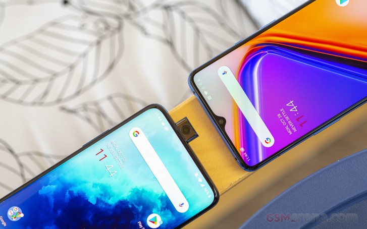
Finally, we have to chime in on the notch-vs.-no-notch debate. The OnePlus 7T is definitely Team Notch, although it is noticeably smaller than the one on the 7. We don't really mind or notice it most of the time while using the phone in portrait mode, but it can get in the way when watching videos or playing games in landscape mode.
The 7T Pro, meanwhile, has no notch and just this big, beautiful sheet of glass in your hand, almost all of which lights up. Watching content on the 7T Pro is an absolute please as it feels like you're directly holding just the display in your hands with barely any bezel around. It's truly one of the best content consumption devices out there right now.
Winner: OnePlus 7T Pro. While we appreciate the flat screen on the 7T, the higher resolution, larger size, and the notch-less design of the 7T Pro are hard to resist.
Battery Life
The OnePlus 7T has a 3800mAh battery, a small increase over the 3700mAh battery on the OnePlus 7. Meanwhile, the 7T Pro has a 4085mAh battery - a more modest increase over the 4800mAh on the 7 Pro.
While the difference in capacities isn't huge and the 7T Pro does have a larger, higher-resolution display to power, the 7T still posted lower battery life figures in our testing, with an average endurance of 90 hours versus 100 hours for the 7T Pro. Looking at the numbers individually, however, the difference in 3G talk time isn't huge at around 5 hours and the web browsing and video playback differences are even smaller.
Realistically, both phones are perfectly capable of getting you through an entire day on a single charge. And when the time does come to charge the devices, OnePlus' excellent Warp Charge 30T is available on both, with incredibly blazing-fast charge times.
In our testing, we found that the OnePlus 7T managed to charge 0-64% of its 3800mAh battery in 30 minutes. The 7T Pro, on the other hand, managed to charge 0-60% of its 4085mAh battery.
A full charge on the OnePlus 7T takes 1:16h, while the OnePlus 7T Pro was marginally faster clocking in 1:09min.
The charging on both phones is fast enough that we don't actually recommend charging them overnight as that would just be a waste of power. Instead, we recommend you set them to charge after you wake up, and they should be fully charged by the time you are ready to head out. We even wish OnePlus offered the option to turn off rapid charging for the cases when you're charging overnight, and you'd rather have a more battery-friendly charging speeds.
It's unfortunate that neither phone supports wireless charging. OnePlus' rationale has always been that the super fast wired charging negates the need for wireless charging. However, wireless charging has never been about the speed but rather the convenience. Besides, the real reason the feature was never included in the past on OnePlus devices was to save on cost. With the ever increasing prices for these devices, we do expect to see more in terms of such features.
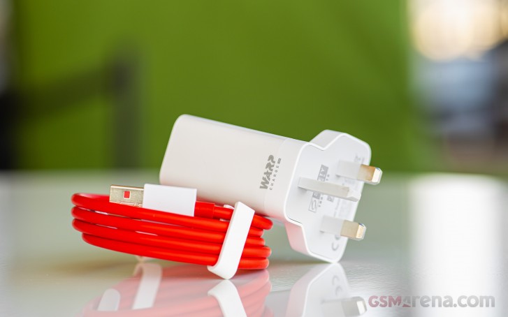
Another thing to note is that OnePlus' Warp charging is only really supported by its own wired charger along with its own proprietary charging cable based on USB-C. You cannot get these charging speeds with any other fast charger. This pretty much rules out all the fast charging power banks on the market, most of which use Qualcomm's Quick Charge. OnePlus still doesn't make a portable power bank with Warp charging. This means outside of bed/desk side wired charging with the supplied charger and cable, expect to get standard charging rates everywhere else.
Winner: OnePlus 7T Pro. The two phones charge at the same rate but the 7T Pro definitely lasts longer.
Speakers
Both the 7T and the 7T Pro come with a set of stereo loudspeakers that use the earpiece and a speaker at the bottom of the phone in tandem. Both phones also support Dolby Atmos surround sound effect, which is optional for headphones but permanently On for the speakers.
In terms of sheer loudness, the smaller 7T actually beats the larger 7T Pro. Even if you don't look at the decibel meter, there is a small but noticeable difference in sound level when both phones are at their respective max volume.
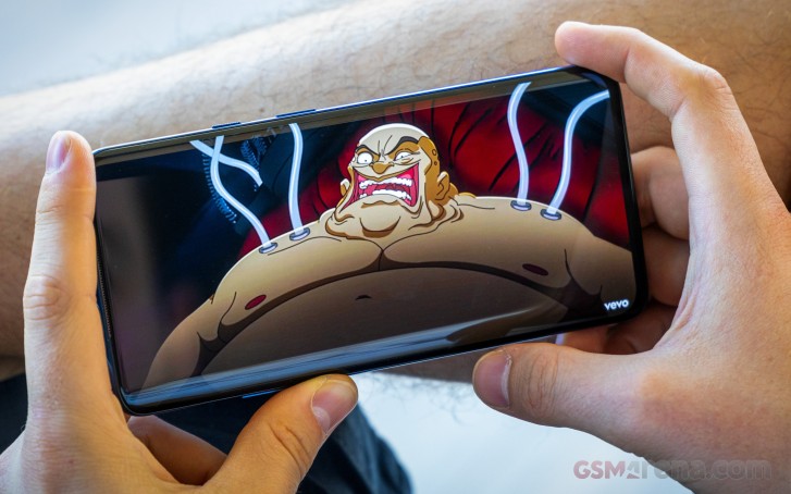
However, in terms of audio quality, the 7T Pro sounds better. Both the speakers on the 7T Pro are perfectly tuned and sound very balanced throughout the volume range and there is no change in the audio characteristic as you increase the volume all the way to the max.
On the other hand, the speakers on the 7T are mismatched. The earpiece speaker has a significantly higher frequency response than the speaker on the bottom. Due to higher frequencies, just generally sounding louder and more direct to the human ear, during the first 80% of the volume range, the earpiece speaker noticeably sounds louder than the bottom firing speaker.
It's only when you push the volume to the limit does the bottom speaker gain its voice and the sound it starts pushing out finally matches the earpiece speaker in terms of sheer audio output. Unfortunately, the sound still seems imbalanced, not due to the audio level this time but rather due to the difference in frequency response, as the earpiece speaker is still very treble-heavy and the bottom speaker is more focused on the mids and the lows.
Overall, we didn't enjoy the speakers on the 7T much. They sound fine in portrait mode or if the phone is not directly in front of you, and they are more than adequate for ringtones. But for watching videos or playing games in landscape, we find the imbalance in the sound from the two speakers distracting. We much prefer the speakers on the 7T Pro, which sound really good with no issues whatsoever.
Winner: OnePlus 7T Pro. Great sounding audio with none of the imbalance issues of the 7T.
Software
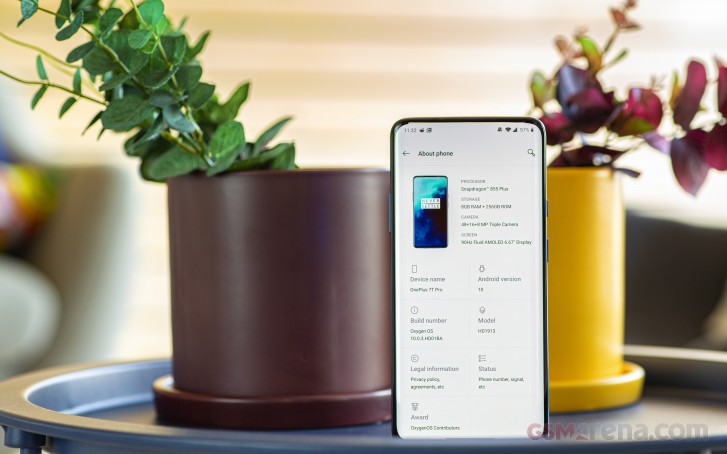
This is really the easiest part of the comparison as there is not much to compare at all. Both the OnePlus 7T and the 7T Pro ship with the exact same software and aside from slight differences in version numbers at any given time due to different release cycles, they pretty much have identical features.
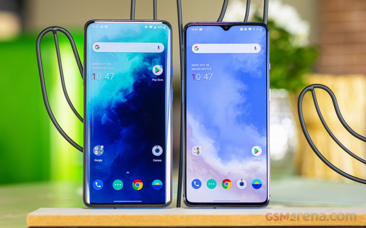
Both the 7T and the 7T Pro run on OxygenOS 10.0.3 at the time of writing, which runs on top of Android 10. Both devices were also running the September security patch, with only the Pixel devices running the newer October release.
The OnePlus Launcher has been an integral part of the OxygenOS experience since the beginning. The design is very similar to the standard Google launcher but with several features thrown in.
You can swipe up to access the app drawer, which also houses a second, hidden drawer on the left that can be accessed by a longer right swipe and can also be password protected. Here you can hide app icons that you don't want others to see (although they still show up in the Settings app and other parts of the OS).
A Shelf feature on the left of the homescreen contains widgets that provide quick access to relevant functions. The launcher supports custom icon packs, so you don't need to install another launcher if all you want to do is change the stock icons. You can swipe down to bring down the notification shade or you can double-tap on the screen to turn off the display.
The UI design is customizable to a degree. You can change the theme to light, dark, and a third one, which is something in between. You can change the accent color, which includes presets and also full RGB color sliders. You can now also change the shape of the icons.
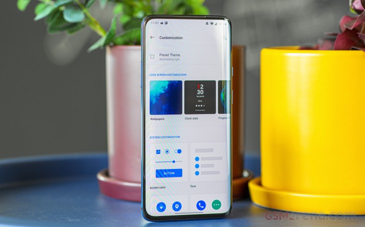
The OS supports gesture navigation. OnePlus has ditched its older system that lets you go back by swiping up from the bottom of the display to a newer system that's more like what you find in stock Android 10 (and iOS). You have a bar at the bottom that you swipe up to go home or switch apps, and you swipe from the left or right edge of the screen to go back. It works reasonably well, but if you don't want that, you can also have the standard buttons at the bottom.
There are other gestures too, such as flip to mute, three finger screenshot, and raise to answer. You can also double tap the display to wake or draw patterns on the screen when it's off to control the music or launch specific functions like the camera or the flashlight. Another feature lets you keep holding the fingerprint sensor once the phone is unlocked to access additional shortcuts, which you then slide your finger to and release to launch.
Of course, one of the best software features in OxygenOS is a hardware button. The alert slider has been around since the OnePlus One and is still the most convenient way to switch sound profiles on Android. It's such a shame that outside of the iPhone and OnePlus, no one else has implemented this feature.
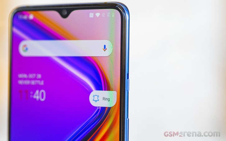
But perhaps what OnePlus does the best with software more than any other Android OEM is drawing the line at what's truly useful and what's merely a gimmick. Most of the features included in OxygenOS fall in the useful category, and there's very little fluff. All the UI decisions seem practical and purposeful, with nothing added simply for the heck of it. The design itself is largely modeled after stock Android but with several minor refinements. You still feel like you're using an Android phone, just slightly altered in a good way.
OnePlus has also been extremely consistent with software updates in recent years. Their phones get regular OxygenOS updates, which always bring improvements and further refinement. They are also among the first to get major Android updates. The only thing we would like OnePlus to do is move from bimonthly Android security updates to monthly like the Pixel phones, but bimonthly is still better than most other Android OEMs, who don't update their phones for months at a stretch.
The software has also largely been quite stable in our use. Very minor issues aside, we haven't come across anything that constantly annoyed us on a daily basis. And this is despite the fact that we have been using these devices since before they launched and thus had an earlier version of software than what most users would experience.
It's for all of these reasons and more that we consider OxygenOS one of the best ways to experience Android currently on any device. It is well-designed, customizable, has just the right amount of features, no bloatware or ads, and gets regular updates. There's not a lot more that we can ask for from an Android OEM in terms of software.
Winner: Tie. Both devices ship with excellent software, making them both winners.
Performance
Performance is another area where there isn't much to choose from between the two phones. Both the OnePlus 7T and the 7T Pro ship with the latest and greatest Qualcomm Snapdragon 855+ with 8GB of LPDDR4X memory. The 7T offers the choice of 128GB or 256GB of storage while the 7T Pro only comes in 256GB. Both feature fast UFS 3.0 storage.
In terms of actual everyday performance, there is no difference between the two phones. They are both phenomenal in everyday use. Both phones feel fast, fluid and effortless. It's only when they switch to some app that doesn't support 60Hz does it feel a bit jittery, but that's mostly because your mind easily gest used to the fluidity provided by the 90Hz refresh rate. Outside of that, the performance is faultless.
When it comes to gaming, again, both phones perform equally well. However, the larger 7T Pro has a better cooling solution, which distributes the heat from the chipset better over the expanse of its larger body. You really need to be playing at full brightness to get the 7T Pro to go hot. Meanwhile, the smaller 7T gets a lot warmer during gaming and more quickly, even at medium brightness.
There is no real issue with either device heating up; we didn't see any real performance loss even after several minutes of playing as whatever performance the device lost due to thermal throttling was still not enough to put a dent in the sheer GPU power either device has. The heating was also noticed only in graphics-intensive games like PUBG running at the absolute maximum visual quality settings. If you want the device to run cooler, you can always turn down the graphics settings a bit or play at a lower brightness level.
Winner: OnePlus 7T Pro. While both phones perform incredibly well, the larger size and a better cooling solution on the 7T Pro makes it run cooler during heavy gaming sessions.
Camera
When it comes to the cameras, the OnePlus 7T and the 7T Pro are nearly identical. Both phones have a triple camera layout on the back, two of which are identical on both devices. On the front is a single selfie camera and while the mechanism is different, the camera itself is again identical on both.
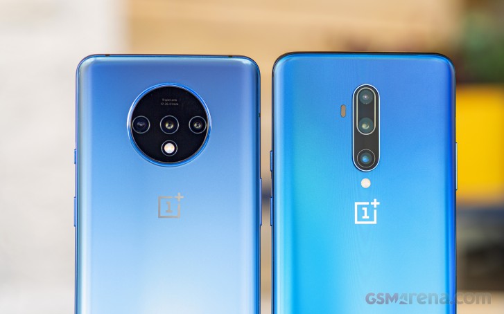
To list off all the modules, we have the now famous Sony IMX586 as the primary rear camera on both phones, with 48 megapixel resolution, 7P lens, f1.6 aperture, and optical image stabilization. Complementing it is a 16 megapixel ultra-wide camera with f2.2 aperture, again common on both phones. The third camera is the one that differs on both phones; the 7T has a 12 megapixel f2.2 camera with OIS that offers 2x optical zoom over the standard wide-angle lens. Meanwhile, the 7T Pro has an 8 megapixel f2.4 camera that offers 3x optical zoom over the standard wide-angle camera. Or does it?
In reality, the 7T Pro - like the 7 Pro before it - has a 13 megapixel sensor for the telephoto camera. This lens provides roughly 2.2x the optical zoom factor over the standard wide-angle lens. To achieve the 3x zoom, OnePlus only uses the center 8 megapixel portion of the lens, which has a field of view roughly 3x narrower than the main wide-angle lens. However, when you shoot portrait images with the telephoto camera, it captures a 12 megapixel image, meaning it uses more of the sensor. The field of view is obviously wider but that's fine for portrait images.
Earlier, with OxygenOS 9 on the OnePlus 7 Pro, the telephoto camera captured the full 13 megapixel resolution in portrait mode. However, with the OxygenOS 10 update, that camera has now been slightly downgraded to only capture 12 megapixel images in portrait mode on the 7 Pro. Since the 7T Pro ships with OxygenOS 10 out of the box, it has only ever been able to capture 12 megapixel images in portrait mode and the standard 8 megapixel in telephoto mode.
The point of all this is that while the 7T and 7T Pro don't have the same sensor for their respective telephoto cameras, they have roughly the same specs and the 7T Pro is merely cropping the image to achieve the extra zoom factor. You can probably crop the 12 megapixel 7T image to 8 megapixel manually and get roughly the same field of view as the 7T Pro but that's obviously extra work. Both cameras capture Portrait mode images in 12 megapixel but while the 7T does it at 2x the main lens, the 7T Pro does it at around 2.2x.
Lastly, the front-facing cameras on both phones are identical, with 16 megapixel resolution and f2.0 aperture. There is an electronic image stabilization but no autofocus. The 7T has the camera placed inside the notch while the 7T Pro has it in a sliding mechanical module. The mechanical module does give the camera some additional protection as a scratch or a smudge on the display doesn't end up hurting the camera performance. Also, in the year since we have had these sliding cameras, we haven't heard of any widespread terminal failures with them so maybe they aren't such a bad place to put the front camera.
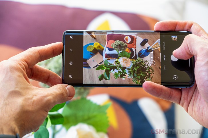
Moving on to the camera software, both phones ship with the same version of the OnePlus Camera app (v3.8.69 at the time of writing). The OnePlus camera app has gone through a few iterations over the years but the current one is easily the best with very well laid out options and camera modes. The app puts the most used modes within direct access and others are in a slide out tray at the bottom. The zoom controls are also within each reach whether in portrait or landscape mode. You also get all the features, including HDR, Nightscape, panorama, slow motion, time-lapse and a pro mode.
The 7T series also adds a new macro mode, which uses the ultra-wide lens to capture really close images of subjects. The only thing missing right now is a hyperlapse option and a super slow-motion mode. The latter is expected to arrive at a later date, so we will have to keep an eye out for that.
Winner: OnePlus 7T Pro. While both phones have nearly identical cameras, the 7T Pro has a longer 3x optical zoom that provides better reach.
Daylight images
Now, coming to the actual image quality, let's start with the main 48-megapixel wide lens. The main camera on both phones captures excellent quality images with great detail, color, contrast, and dynamic range. The images are some of the most natural-looking we have come across recently, with no exaggerated colors, contrast, or sharpness. The only issue we had with some of our daylight samples was a slight green tint, which isn't that noticeable and is easy to correct.


OnePlus 7T Pro daylight samples
The images you get by default in the Auto mode are in 12 megapixels. If you want 48-megapixel images, then you will have to switch to the Pro mode. But this has a couple of problems. First of all, the Pro mode lacks some of the image processing of the Auto modes, so unless you plan on manually dialing in the settings and shooting in RAW (which, oddly, is also limited to 12 megapixels), we don't recommend using the Pro mode. Secondly, the 48-megapixel images obtained in this mode aren't native 48-megapixel images but rather blown up 12-megapixel photos, so there is no point in switching to this mode.
When it comes to the telephoto image quality, we generally preferred the images from the 7T Pro. This wasn't just because the images had greater magnification than the 7T images, but the images themselves were usually better quality.


OnePlus 7T 2x daylight samples


OnePlus 7T Pro 3x daylight samples
The telephoto images from the 7T Pro had excellent detail, color, exposure, dynamic range, and noise reduction. We usually don't see such high-quality levels from the telephoto camera, but the one on the 7T Pro is one of the best out there.
The 7T camera does capture a great amount of detail with good colors, but the images had a lot of noise to them, even when shot in bright daylight. Some of the photos we took also weren't exposed correctly, and the dynamic range is worse than the 7T Pro camera. The images also lacked contrast and appeared flatter than the 7T Pro images.
Finally, we have the ultra-wide images. Once again, we are dealing with the same camera on both phones. Both phones capture decent quality images, considering the nature of the lens. There's not a lot of detail in the images, but they have good color, contrast, and dynamic range. Both phones offer correction for the lens distortion, which reduces the field of view slightly but is worth it in our opinion to reduce some of the more exaggerated fish-eye effect. All images below have the feature enabled.


OnePlus 7T ultra-wide daylight samples


OnePlus 7T Pro ultra-wide daylight samples
A new feature of the 7T series is the macro mode. When enabled, the camera app still shows the three zoom modes, which might lead you to believe you are using the macro mode on all three lenses, but in reality, it only works on the ultra-wide lens, and the zoom levels are digital-only. The macro mode allows you to get quite close to the subject and you can then use the zoom to blow up the image further.
You can get some really interesting images with this feature, but it's more of a novelty than something you are bound to use all the time. Regardless, we are glad the feature has been added, but if you have a 7 or 7 Pro then you aren't missing out on a lot.
Winner: OnePlus 7T Pro. Both phones take identical images from the main and ultra-wide camera, but the 7T Pro takes better quality telephoto images that also have higher zoom factor.
Lowlight images
Moving on to the low light images now, both phones are capable of capturing good quality low light images from the main rear camera. The images have a good amount of detail in them and the colors and white balance generally look quite accurate. There is some noise in the images but it's not too distracting and we prefer OnePlus' level of noise reduction, which isn't too overbearing and still maintains a good level of detail while reducing some of the noise. The Quad Bayer sensor definitely helps in reducing some of the noise.


OnePlus 7T Pro lowlight samples
Switching on Nightscape definitely helps bring out more detail in the shadows while also bringing down the bright highlights. The images do look a bit artificial at times as the processing has a tendency to get a bit ahead of itself at times but generally the results are quite pleasing as long as you don't zoom in too close. And when the light levels are really low, Nightscape definitely helps in producing a usable image, which otherwise wouldn't be possible. It's not the best night mode around but it works reasonably well and it keeps improving regularly.


OnePlus 7T Pro Nightscape samples
As for the ultra-wide lens, the images captured without Nightscape aren't particularly good. The detail, colors and noise levels are below par and things get worse as the light levels fall.


OnePlus 7T ultra-wide lowlight samples


OnePlus 7T Pro ultra-wide lowlight samples
Fortunately, the Nightscape feature does work with this lens as well and it's a lot more impactful with this lens as the images captured without it are generally unusable.


OnePlus 7T ultra-wide Nightscape samples


OnePlus 7T Pro ultra-wide Nightscape samples
Lastly, there are the respective telephoto lenses. Their differences are less important in lowlight as neither camera uses their telephoto camera when the light levels fall below a certain threshold and reverts to using the main camera instead. They still maintain their respective 2x and 3x zoom level, though, which means the 7T Pro is digitally zooming in a lot further than the 7T.


OnePlus 7T 2x lowlight samples


OnePlus 7T Pro 3x lowlight samples
Fortunately, the 48-megapixel sensor has enough headroom to accomodate such requests, so the results aren't too unflattering. Having said that, neither phone captures particularly good looking telephoto images in low light. There's also no Nightscape available in this mode to make things better.
Winner: Tie. Both phones take nearly identical images in lowlight.
Selfies
Lastly, there's the matter of selfies with the front camera. Both phones have the exact same camera; a 16 megapixel sensor with f2.0 aperture and fixed focus. The only difference is that the 7T has the camera placed on the display while the 7T Pro hides it in a pop-up mechanism.
Image quality is understandably identical. Both phones take good quality images from the front camera with good skin tones and dynamic range. The images aren't oversharpened as is usually the case with most front camera images, which results in the images looking a bit soft.
The images are especially soft if the HDR mode kicks in, as it seems the camera captures in a lower resolution in this mode and then upscales them. This also results in a bit of fringing. However, all of this is only really noticeable if you look really close. Most people aren't really looking at extremely sharp and high resolution images of their faces for obvious reasons, so the level of detail on offer here is perfectly acceptable.
The only real issue we have with the camera is the lack of autofocus, which we think is important. The camera is also just wide enough for one person but if you take group selfies often then you might need to resort to a selfie stick.
This is aggravated in video mode, where there is a heavy crop applied, which barely even contains the user, let alone anyone else. Speaking of video, it is only limited to 1080p while some other phones with similar hardware are now doing 4K with the front camera.
The front camera doesn't have a lot of effects and gimmicks like on other phones but you do get the basic skin smoothening effect with three levels of control. You can also turn it off entirely, which is how it ships out of the box. Off does mean entirely off, unlike some other phones, which keep some level of skin smoothening on at all times, even in third party apps.
Winner: Tie. Both phones have the same camera that are equally good.
Conclusion
The OnePlus 7T Pro is an excellent phone. It has a great design, a fantastic display, powerful hardware, great software, great speakers, good battery life with fast charging and a great set of cameras. It's the best phone OnePlus has ever made and one of the best phones you can buy today.
But the OnePlus 7T is also a very good phone. It has a good design, a fantastic display, powerful hardware, great software, a decent battery life with fast charging and a good set of cameras, too. More importantly, it's also a good deal cheaper than the OnePlus 7T Pro and that automatically makes it better value for money.
For most people, the OnePlus 7T really is the phone to buy. And we don't just mean that over the 7T Pro but over practically anything in that price range. It ticks all the right boxes and we can't imagine most people will have a lot to complain about.
To us, the 7T Pro seems more like a prestige product now. You don't buy it because it makes sense (because it doesn't) but just because you want it. It's for people who walk into a shop and ask for the best one. This is the phone OnePlus makes for those who want the best OnePlus phone available. And it costs more, a lot more, than it probably should but a lot of people wouldn't mind. It's similar to what Apple has done with its Pro and non-Pro iPhone branding. One for the 'masses', and one for those who want something more special.
But if special is what you're after, then we would actually recommend the 7T Pro McLaren edition. Like we said in our review of that phone, we actually think it makes sense to go all the way and get the special edition device over the standard 7T Pro. You're already spending extra over the 7T so you're not really looking for the best value, so why not go the extra step and get something that truly stands out? The design might be a bit polarizing but there's no denying the 7T Pro McLaren edition is a more unique and interesting device.
In the end, we think both the 7T and the 7T Pro are great phones for a different set of people. The best part about them is that despite everything, they are still significantly cheaper than flagships from Apple, Samsung and Google. One could argue that they aren't as cheap as they used to be, but then again, they're also a lot better than they used to be too.


No comments:
Post a Comment