Introduction and specs
First, it was the Moto G 5G Plus about a year ago, and now it's the Moto G50. What do they have in common? Well, they are both Motorola's attempts to undercut the competition's 5G offerings.
Moto G50 arrives with a launch price of about €210 as it's positioned in a new affordable segment which is ruled by cheap devices with up-to-date connectivity.
The Moto G50 is almost a 5G version of the Moto G10. The 5G connectivity was enabled via the Snapdragon 480 chipset (as opposed to SD460 on G10). But the ultrawide camera had to go to achieve the relatively low launch price.
Motorola Moto G50 specs at a glance:
- Body: 164.9x74.9x9.0mm, 192g; Glass front, plastic back, plastic frame; Water-repellent design.
- Display: 6.50" IPS LCD, 90Hz, 720x1600px resolution, 20:9 aspect ratio, 269ppi.
- Chipset: Qualcomm SM4350 Snapdragon 480 5G (8 nm): Octa-core (2x2.0 GHz Kryo 460 & 6x1.8 GHz Kryo 460); Adreno 619.
- Memory: 64GB 4GB RAM, 128GB 4GB RAM; microSDXC (uses shared SIM slot).
- OS/Software: Android 11.
- Rear camera: Wide (main): 48 MP, f/1.7, 26mm, 1/2.0", 0.8µm, PDAF; Macro: 5 MP, f/2.4, 1/5.0", 1.12µm; Depth: 2 MP, f/2.4.
- Front camera: 13 MP, f/2.2, (wide), 1/3.1", 1.12µm.
- Video capture: Rear camera: 1080p@30/60fps; Front camera: 1080p@30/60fps.
- Battery: 5000mAh; Fast charging 15W (10W charger in the box).
- Misc: Fingerprint reader (rear-mounted); NFC; FM radio; 3.5mm jack.
On the other hand, we expect a better 13MP camera on the front and faster charging due to the 15W charging support instead of the slower 10W charging on the G10. And perhaps more importantly, the seemingly identical display of the G50 gains a faster refresh rate at 90Hz, making the whole user experience just a tad smoother.
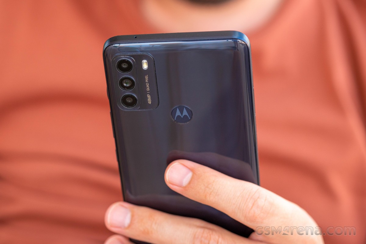
Aside from offering 5G on the cheap, the Moto G50 also brings a burden-less Android experience with a sprinkle of Motorola-specific features without ruining the vanilla Android feel. A generous 5,000 mAh battery combined with the Snapdragon 480 5G (the first phone in Europe to have it) should yield excellent battery runtimes too. The water-repellent design, the base 4GB/64GB memory combo and the higher than usual resolution of the macro camera are welcomed bonuses at this price.
So let's see what else the Moto G50 has in store for us that the specs sheet can't reflect.
Unboxing the Motorola Moto G50
The Moto G50 comes in a standard box containing the usual user manuals, a charging brick and a USB-A to USB-C cable. Motorola has also included a handy transparent silicone case that wraps around the device.
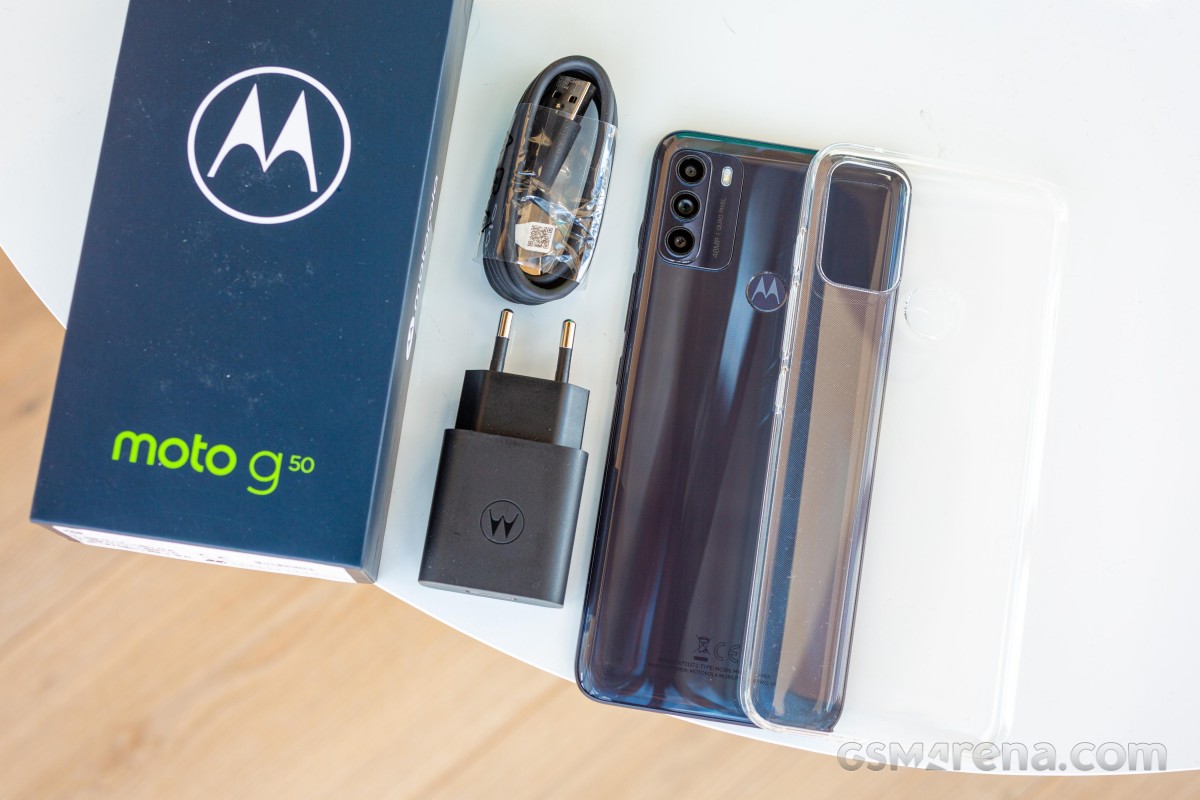
However, the charger is rated at just 10W while the handset itself supports up to 15W wired charging. And the USB-A to USB-C cable is a cheaper variety that can only be used for charging and doesn't work for data transfer. We've seen this with other Motorola devices, and it's quite the bummer.
Design and ergonomics
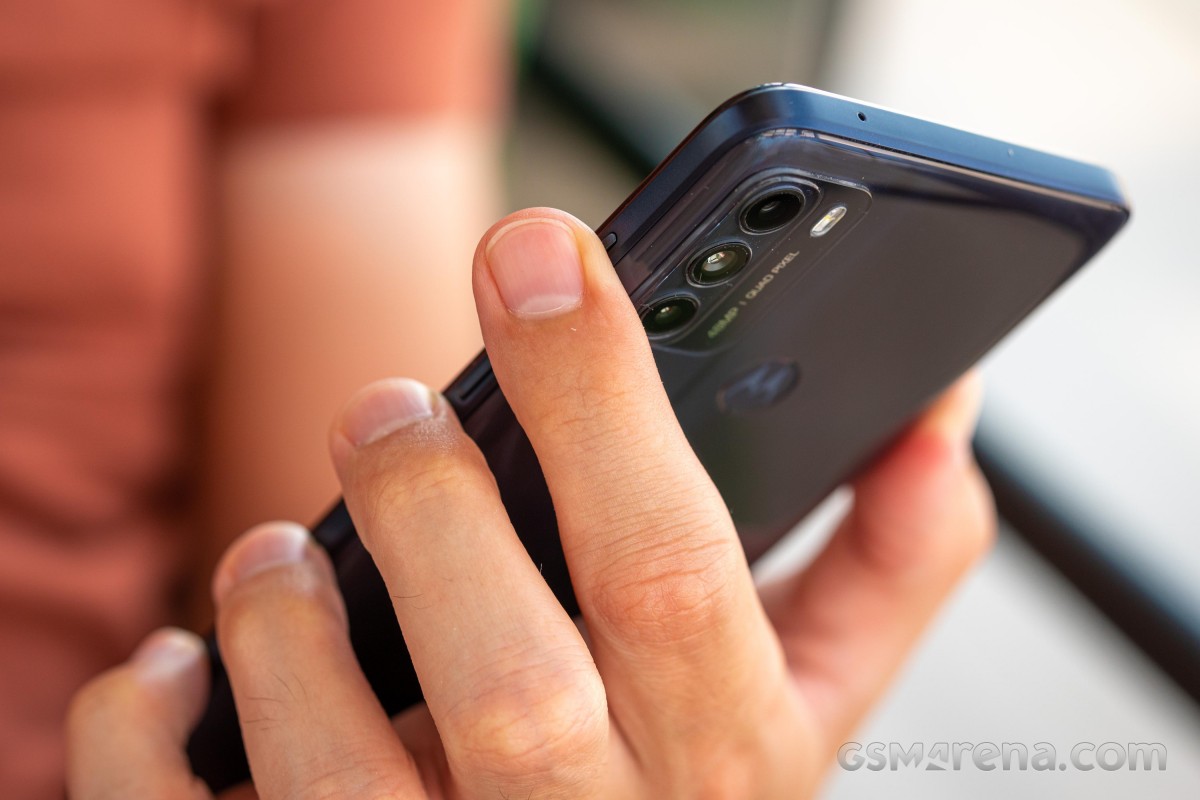
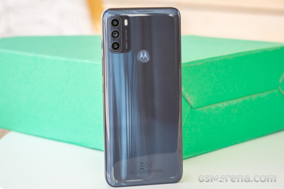
The Moto G50 is entirely made of plastic (except the screen, of course), which isn't a surprise given the price point but it does boast a water-repellent coating as most Motorola handsets do. This doesn't mean you can submerge it in water, it means that a big splash or rain won't pose any issues.
The available colors are just two - Steel Gray and Aqua Green, with the former one being shown in the photos. Naturally, the glossy surface is a fingerprint magnet but the Steel Gray color makes the smudges a tad less visible. The chassis is slippery - no way around it. The matte side frame doesn't help with the grip either.
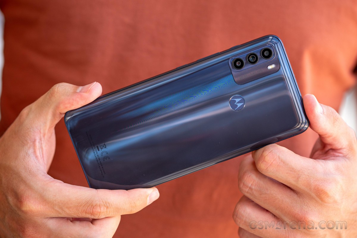
While the Moto G10 has a patterned, matte plastic back, this one adopts a glossy one, whereas the camera module and its placement are quite similar. We've noticed that the bump is considerably smaller, and perhaps Motorola was able to shave a couple of millimeters off with the G50.
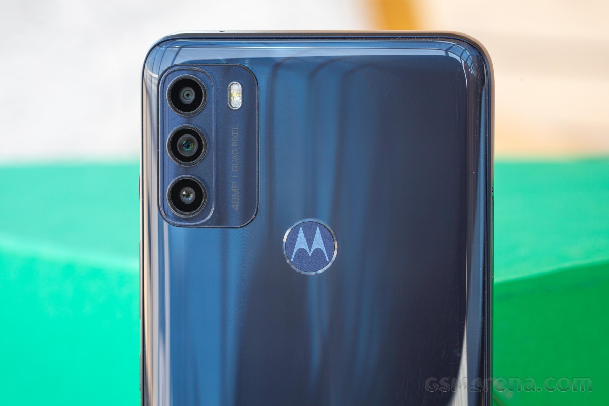
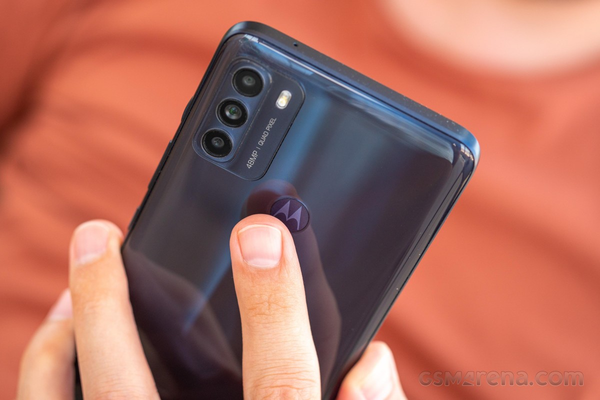
The fingerprint reader placement is a bit off - it's positioned a bit higher than it should, so you'd have to stretch your index finger to reach it, even if you have average-sized hands. Motorola should have accounted for the 6.5-inch display plus the borders.
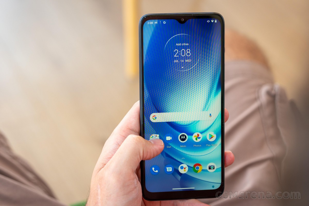
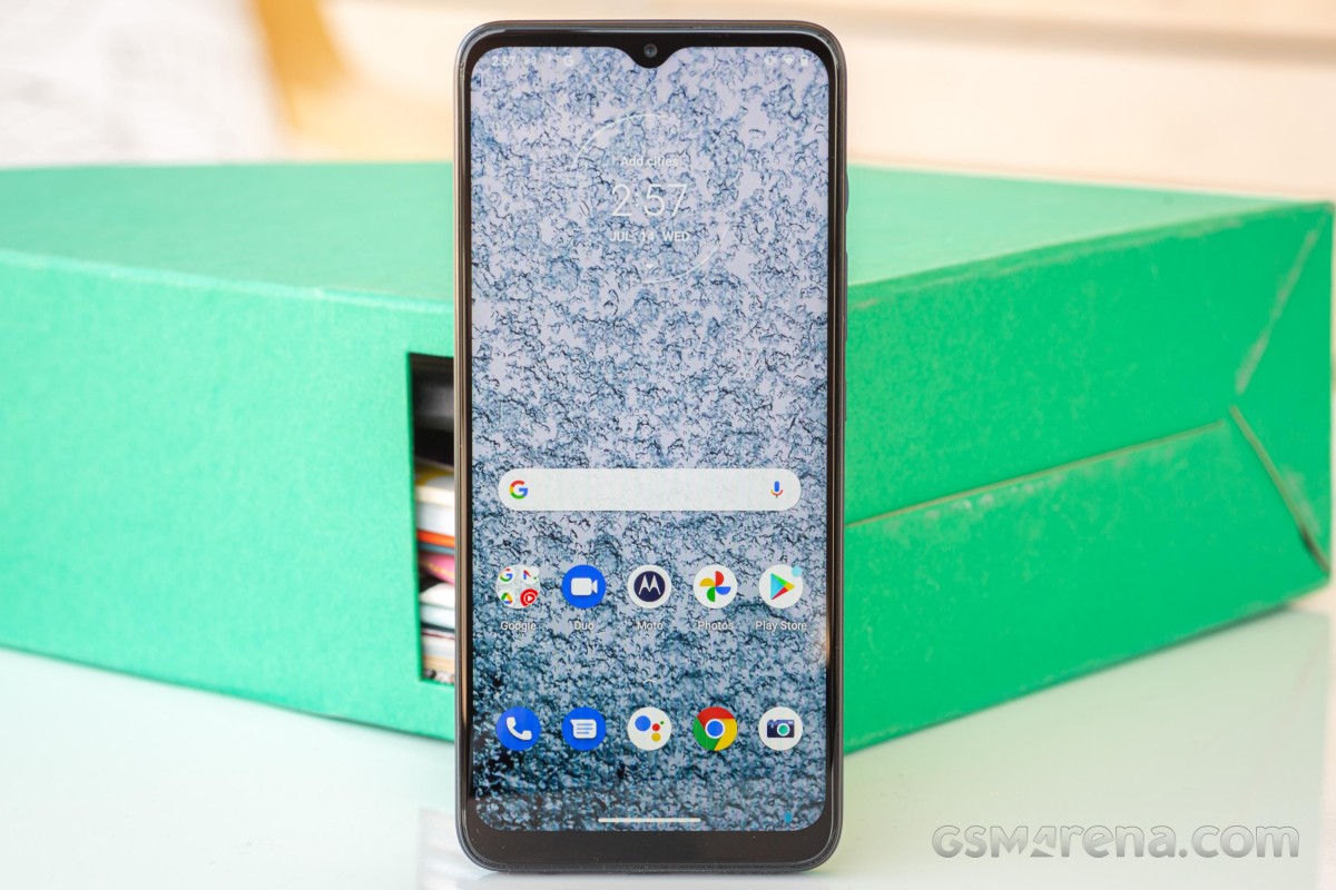
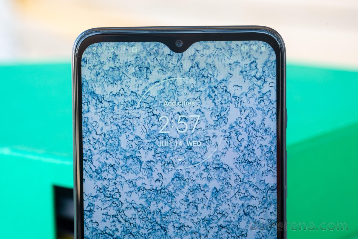
Speaking of the borders, the front panel has some thick bezels around, with the bottom one being particularly noticeable. To our surprise, the front-facing camera sits on a good old waterdrop-styled notch instead of a punch-hole type of cutout. Don't get us wrong, though, as the bezels fit the price of the handset, we didn't expect razor-sharp borders to begin with.
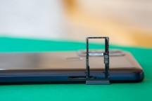
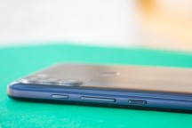
As opposed to the glossy body, the frame has a matte finish, but it's still plastic, and it's rather slippery. The left side holds the hybrid SIM + microSD card slot (you can either put two SIM cards or a SIM card + microSD), while the right has all the buttons. The power button is placed lower, and it's textured, so you can't miss it. The next one is the volume rocker, and then comes the dedicated Google Assistant key. All of those keys are convenient and can easily be reached with your right thumb.
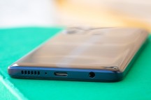
As for the bottom, we have the speaker grille and the USB-C connector.
A good build overall with a bonus water-repellent design. There's nothing inherently wrong with the chassis except for the slightly inconvenient fingerprint reader placement. One could make a case that 192g for a 6.5-inch device is maybe a little too much for an all-plastic body, although the G50 feels bottom-heavy and sits comfortably in the hand.
Budget IPS panel but with a small notch
Moto G50 ships with a 6.5-inch IPS LCD screen with a relatively low 720 x 1600px resolution. Many similarly-priced phones, as well as even cheaper ones, offer a 1080p display as a standard so it was surprising to see this level of display here but we guess, something had to give to make for the advancements in connectivity.
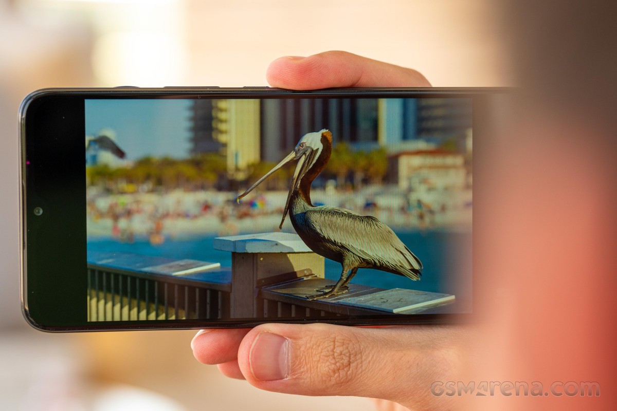
Motorola tries to compensate for the lack of sharpness with a higher refresh rate. And yes, the 90Hz display does make a difference but the rather slow response time of the presented IPS LCD panel produces a smearing effect with fast-moving images (e.g. when scrolling). Not a big issue for most users, though, especially at this price range where such tiny details don't matter all that much.
| Display test | 100% brightness | ||
| Black, |
White, |
||
| 0.199 | 362 | 1819:1 | |
| 0.197 | 370 | 1878:1 | |
| 0.349 | 443 | 1269:1 | |
| 0.466 | 543 | 1165:1 | |
| 0.341 | 484 | 1419:1 | |
| 0.236 | 385 | 1631:1 | |
| 0.327 | 458 | 1401:1 | |
| 0.4 | 534 | 1335:1 | |
| 0.21 | 377 | 1795:1 | |
| 0.275 | 492 | 1789:1 | |
| 0.334 | 472 | 1413:1 | |
| 0.408 | 577 | 1414:1 | |
What matters more, however, is the maximum brightness achievable, and that seems to be an issue, too. There's no Max Auto mode to boost the brightness in bright outdoor conditions, so you are stuck with the manual boost of up to 362 nits. And since this is an IPS panel, which tends to offer lower sunlight legibility compared to its OLED counterparts at the same brightness, the Moto G50 is pretty hard to use outside on a sunny day.
Color accuracy is another small annoyance, which we would have probably skipped if it wasn't for the blatant blue-ish whites and grays. You can make things a tad better if you opt for the Natural color preset.
We still want to end this section on a high note, and luckily, Motorola gives us a reason to do so. Motorola's refresh rate control works in a simple and yet elegant way. Leaving the refresh rate at Auto is probably your best bet because you get the best of both worlds. The software tones down to 60Hz while you are not interacting with the screen and will always switch back to 90Hz once you touch it. This eliminates the need for Motorola to track individual apps and set parameters on per app basis, such as video playback apps, for example. Once you enter full-screen mode and stop touching the display, the refresh rate scales back to 60Hz to save on power. We've tried this successfully on both Netflix and YouTube.
Battery life
Moto G50 is equipped to offer some great battery life. It has a modern 8nm chipset with generally low power consumption. Then it has a low-res 720p display, and it packs a battery with the respectable capacity of 5,000 mAh.
The Moto G50 posted an impressive overall score of 133h with excellent screen-on times. The numbers appear very similar to the Moto G10's. The standby power draw probably needs a bit more optimization, which is the reason for the lower overall score compared to the Moto G10.
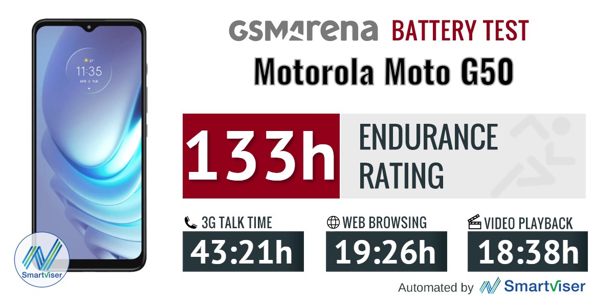
Our battery tests were automated thanks to SmartViser, using its viSerDevice app. The endurance rating denotes how long the battery charge will last you if you use the device for an hour of telephony, web browsing, and video playback daily. More details can be found here.
Video test carried out in 60Hz refresh rate mode. Web browsing test done at the display's highest refresh rate whenever possible. Refer to the respective reviews for specifics. To adjust the endurance rating formula to match your own usage patterns check out our all-time battery test results chart where you can also find all phones we've tested.
Charging speed
Charging is quite slow, at least with the included charger. Remember, the Moto G50 ships with a 10W charger, while the phone itself supports up to 15W charging. Not only does the G50 drag behind the competition in this respect, but it also posts objectively poor scores in our charging tests.
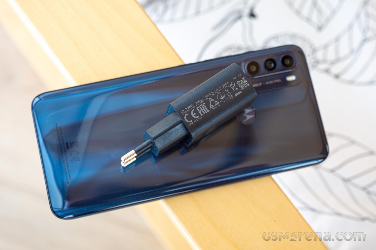
Getting from flat to 100% takes about 2 hours and 35 minutes. A 30-minute charge from 0% would give you only 23% of charge.
30min charging test (from 0%)
Higher is better
- Poco X3 Pro
50% - Motorola Moto G 5G
36% - Motorola Moto G 5G Plus
35% - Xiaomi Redmi Note 10 5G
33% - Realme 8 5G
29% - Motorola Moto G50
23% - Samsung Galaxy A22 5G
23%
Time to full charge (from 0%)
Lower is better
- Poco X3 Pro
1:08h - Xiaomi Redmi Note 10 5G
2:00h - Motorola Moto G 5G Plus
2:10h - Motorola Moto G 5G
2:11h - Realme 8 5G
2:20h - Samsung Galaxy A22 5G
2:29h - Motorola Moto G50
2:35h
Speaker
As almost all budget phones in this price segment, the Moto G50 lacks stereo speakers, so it relies on a single, bottom-firing loudspeaker. It didn't do all that impressively in our loudness test, but it's enough to gain a "Good" score.
Sound quality-wise, the speaker isn't impressive either. Expect rather flat-sounding music without any bass, and distortion starts to creep in when you get in close to the maximum loudness level.
Clean, close-to-stock Android 11
The clean and almost stock Android experience remains one of Motorola smartphones' key selling points. We say almost stock because Motorola has introduced a couple of custom features on top. Almost all of these are organized in a single settings app that lets you toggle them on and off.
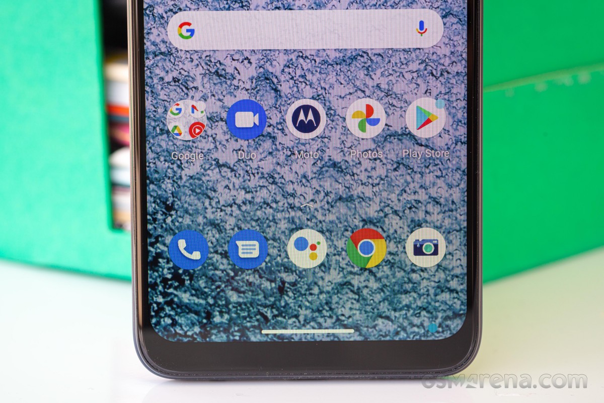
All of the settings can be accessed through the general settings menu, but there's also the Moto app that greets you on the home screen. Starting it up for the first time will prompt you with a quick guide around the features. The personalization options are the first in focus, allowing you to choose between a wide selection of stock wallpapers, some of which are interactive. The Styles sub-menu offers a choice of app icon packs and shapes, fonts, accent colors and even quick toggle icons for the notification shade.
Speaking of which, it has the brightness slider positioned on top of the toggles, and there's no quick switch between adaptive and manual display control, which is kind of annoying. We are also used to seeing the slider below the toggles for easier reach with your thumb. We found the slider to be used quite often, so why not make it more accessible?


Home screen, recent apps, notification shade, general settings menu
The Gesture section stems back to earlier days of the Moto G series as some of the available screen-off gestures are well-known to the Motorola user. A karate chop motion turns on the flashlight, a twisting motion with the wrist starts up the camera, and a lift to wake gesture seems to be working pretty well in combination with the face unlock. You don't even have to touch the fingerprint reader in most cases when reaching for your device.


Screen-on and screen-off gestures
This leads us to the display-related features named Peek Display and Attentive Display. The former allows for the lock screen to wake up once the phone detects motion, and it's enabled by default. It would display the clock and notifications. Depending on the settings you choose, you can interact with the said notifications, perform a quick reply, or dismiss the said notification. You just have to tap and hold on to the app icon from the lock screen to interact with the notification.
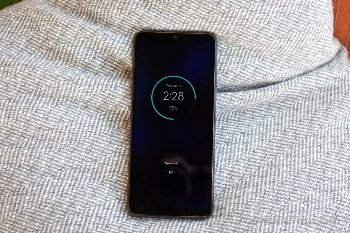
As for Attentive Display, the system uses the front camera to detect your face and keep the display up and running, ignoring the screen timeout timer. It's quite useful when reading long articles, for example, and you've set your screen timeout a bit short.


Attentive display and Peek display
Having Android 11 means that some of the basic features from Google's OS are at hand. Even though these features are not Motorola-specific, the company has organized them in a neat way inside the Moto app itself. The slideshow explains the new chat bubbles, the Nearby Share function, the new power menu design, one-time permissions and notification segregation for ongoing conversations in the notification shade.


Android 11-specific features, chat bubbles
Arguably the most important feature from the ones above is chat bubbles. You can open up the chats in small, interactive bubbles as an overlay on top of your apps and home screen. Essentially, Messenger's Chat Heads for all messaging apps that support it, which should be pretty much all of them by now.
A rather new feature is the Overcharge protection toggle in the Battery menu, and it's different from the Optimized charging. The latter learns from your charging habits and adjusts the charging curve accordingly, so the battery doesn't spend too much time in a fully charged state before you unplug the device in the morning, for example. The Overcharge protection, on the other hand, will cut off charging once it detects that the phone hasn't been unplugged for 3 days straight. It will then keep the battery charged at a much healthier 80% mark.
Lastly, we can't miss mentioning the fast and responsive fingerprint reader. Even with this low-end chipset, the device unlocks with a light and a brief touch of the scanner. As we've already pointed out in the Design section of the review, our only complaint is the high positioning of the reader.
Otherwise, the OS ran pretty smoothly with no major hiccups. We didn't even notice any big slowdowns except for launching some apps in particular. Perhaps the well-optimized Snapdragon 480 is enough to run Motorola's almost stock take on Android. The UI doesn't feel heavy on the eye, nor does it take a toll on the hardware with excessive effects or animations.
Performance
The Moto G50 proudly carries the Snapdragon 480 5G - a low-end 5G-enabled chipset for the masses built on a modern 8nm manufacturing process. It employs an octa-core CPU that consists of two clusters - 2x Kryo 460 Gold cores (Cortex-A76 derivatives) clocked at 2.0 GHz and 6x Kryo 460 Silver cores (Cortex-A55 derivatives) ticking at 1.8 GHz. The Adreno 619 takes care of the graphically intensive tasks.
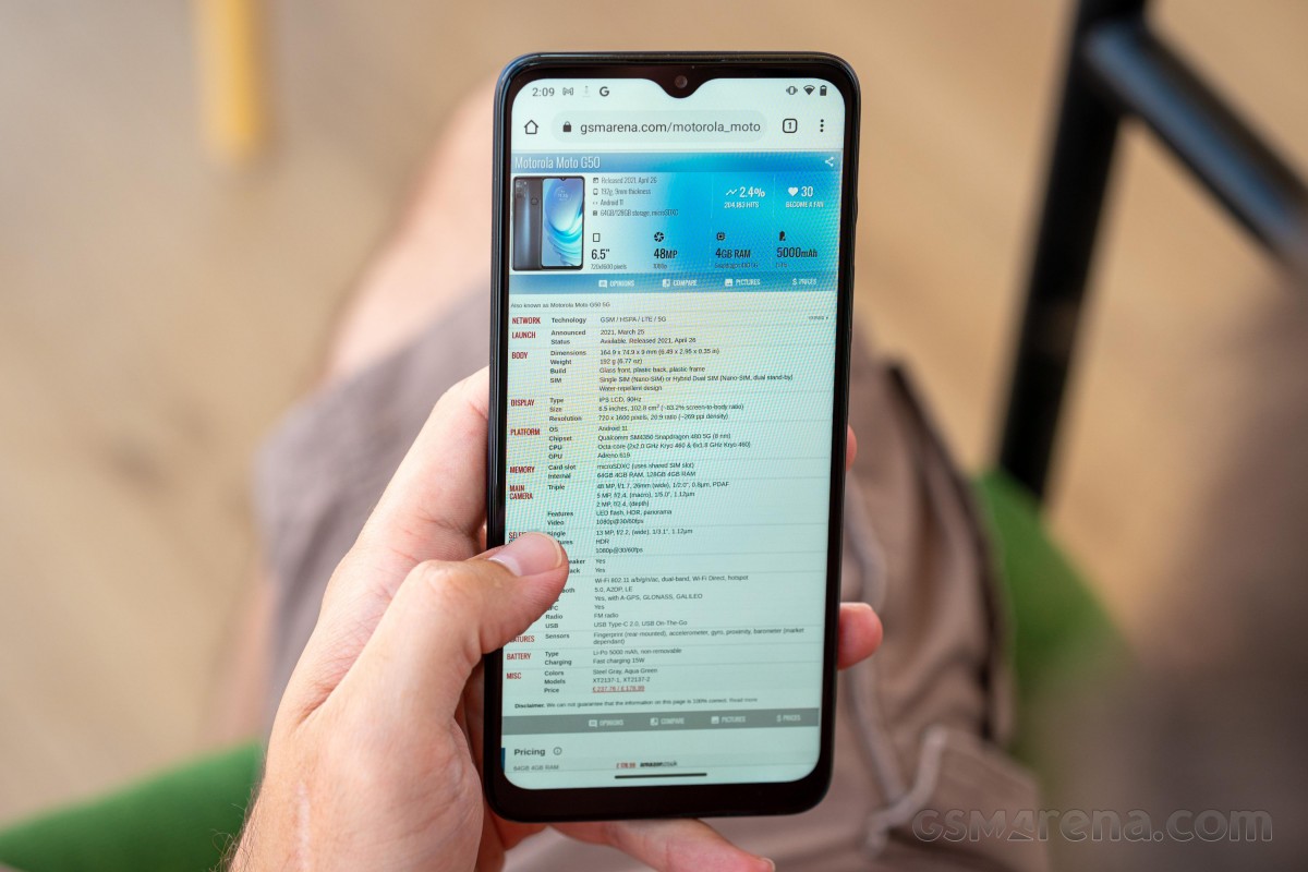
The unit can be configured with either 4GB/64GB memory combo or 4GB/128GB, and in both cases, the storage can be expanded via a microSD card.
And as for the benchmark results, while the Moto G50's scores are rather low, keep in mind that there's nothing inherently wrong with the Snapdragon 480 5G, it's just that this phone competes against considerably more powerful alternatives in the same price bracket.
GeekBench 5 (multi-core)
Higher is better
- Poco X3 Pro
2574 - Motorola Moto G 5G
1980 - Motorola Moto G 5G Plus
1898 - Realme 8 5G
1784 - Samsung Galaxy A22 5G
1719 - Motorola Moto G50
1620 - Motorola Moto G10
1139
GeekBench 5 (single-core)
Higher is better
- Poco X3 Pro
735 - Motorola Moto G 5G
659 - Motorola Moto G 5G Plus
589 - Realme 8 5G
569 - Samsung Galaxy A22 5G
560 - Motorola Moto G50
505 - Motorola Moto G10
247
AnTuTu 9
Higher is better
- Realme 8 5G
361505 - Motorola Moto G50
286916 - Samsung Galaxy A22 5G
223188
GFX Manhattan ES 3.1 (offscreen 1080p)
Higher is better
- Poco X3 Pro
75 - Motorola Moto G 5G
34 - Motorola Moto G 5G Plus
33 - Motorola Moto G50
29 - Realme 8 5G
25 - Samsung Galaxy A22 5G
24 - Motorola Moto G10
9.4
GFX Manhattan ES 3.1 (onscreen)
Higher is better
- Poco X3 Pro
67 - Motorola Moto G50
53 - Motorola Moto G 5G
30 - Motorola Moto G 5G Plus
29 - Realme 8 5G
22 - Samsung Galaxy A22 5G
21 - Motorola Moto G10
19
GFX Aztek Vulkan High (onscreen)
Higher is better
- Poco X3 Pro
27 - Motorola Moto G50
20 - Motorola Moto G 5G
12 - Motorola Moto G 5G Plus
11 - Samsung Galaxy A22 5G
7.8 - Motorola Moto G10
6.3
GFX Aztek ES 3.1 High (offscreen 1440p)
Higher is better
- Poco X3 Pro
17 - Motorola Moto G 5G
7.4 - Motorola Moto G50
6.4 - Samsung Galaxy A22 5G
5.5 - Motorola Moto G10
2
The phone does particularly well in onscreen GPU-intensive benchmarks because the low 720p resolution works in the Adreno 619's favor. Fewer pixels to render, higher framerates, whereas other 1080p+ phones with Dimensity 700 SoC struggle to get that framerate up.
Three cameras, no ultrawide
Unlike the Moto G10, the G50 doesn't have an ultrawide camera but retains the main 48MP sensor, which is once again paired with an f/1.7 aperture. The popular 48MP imager measures 1./2.0" in size and has 0.8µm pixels. Natively, it shoots in binned 12MP photos.
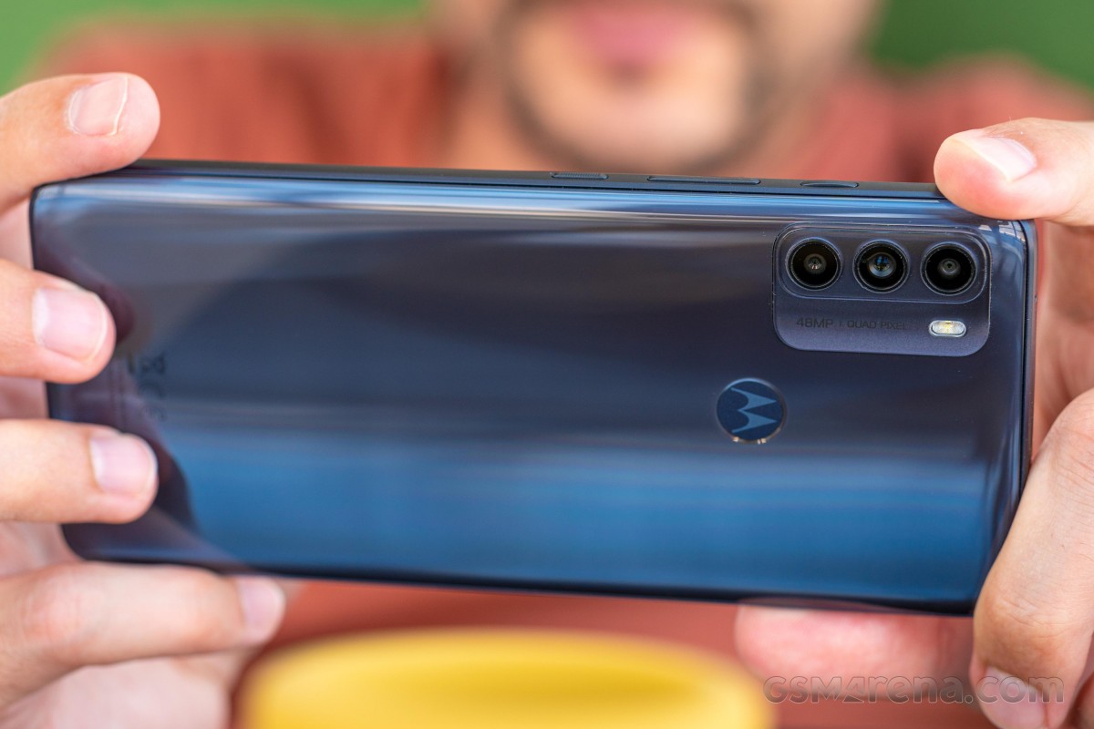
Now, instead of an ultrawide, the handset offers a relatively better 5MP camera for macro shots. The sensor is still tiny, though, measuring 1/5.0" and offering 1.12µm pixels. The lens aperture is f/2.4. As for the third camera, it's a 2MP unit used for depth information during bokeh photography.
One would argue that the Moto G50's missing ultrawide can be a big disadvantage compared to some of its rivals carrying a dedicated ultrawide snapper, but given the price range and the usual low-quality ultrawide cameras in this segment, we can't really say that this is a major drawback.
The front camera gets a decent upgrade over the Moto G10, however, bumping up the resolution to 13MP. The 1/3.1" sensor is paired with an f/2.2 aperture.
Camera menus
The default Motorola camera app has gone through some changes in the past couple of software versions, but the main way of navigating through the menus and camera modes remains the same. The modes are arranged in a customizable carousel formation, with the hamburger menu holding a couple of other shooting modes. There's also a Pro mode giving you almost full control over the camera's settings like white balance, ISO, autofocus, exposure and shutter speed.
Additional settings for each camera mode can be found by swiping up in the viewfinder. And the gear icon for the general settings menu can be found in the upper-right corner of the viewfinder. It holds several collapsable sub-menus. One thing we've noticed is that there's no way to change the video recording resolution, and the files are set to H.265/HEVC encoding by default, so you might want to revert to H.264/AVC if you want the best compatibility when playing those videos on other devices.
Daylight samples
Seeing how the Moto G10 and G50 share the same camera hardware and the ISP on the Snapdragon 480 has been ever so slightly improved upon the one found on the Snapdragon 460, we would expect almost identical processing. And we are right for the most part.
Just like the Moto G10, the G50 tends to present the colors lifelike without turning up the saturation. There are small traces of noise in the sky and uniform backgrounds that might put off a more critical eye. The dynamic range is pretty good, giving the images a more balanced look. Even the tiny highlights in the scenes are well-preserved.
The only noticeable difference between the G10 and the G50 is that the latter produces considerably sharper images overall. Fine detail pops more, the edges of the buildings look better, and the foliage isn't murky by any means. If you look close enough, you might spot some oversharpening halos here and there but we can let that one slide since it drastically improves the clarity of the photos.
And as expected, you stand to gain little to nothing switching to the 48MP mode. Using the full resolution of the sensor produces softer and considerably noisier images with a narrower dynamic range. Only fine detail is easier to spot in this mode.
Macro camera
The Moto G50 has one of the better macro cameras compared to most of its competitors. It leads the pack with a more competent 5MP sensor, so images are a bit more detailed and a tad sharper too. Colors are vivid, and noise is kept to a minimum. However, the lack of autofocus makes things a lot difficult when trying to snap a moving object, even if the movement is minimal. There's also no indication whether or not the subject is in focus, which is hard to tell by the viewfinder under direct sunlight.
Low-light samples
Come nighttime, the Moto G50 does a pretty good job for its class. The images do appear a bit soft, and some highlights are clipped, but the camera resolves a lot of detail.
The HDR algorithm is also doing a generally good job and creates an overall balanced exposure, despite missing some highlights in more challenging scenes.
If we had to point out just one thing that needs improvement the most, that would be sharpness as the nighttime photos come out soft. And here's where the Night mode steps in.


Low-light samples: default Photo mode
The Night mode improves upon the shots taken with the standard Photo mode and clears up the scene by introducing some contrast, brightening up the shadows while preserving the highlights and adds some much-needed sharpness.
Surprisingly, this mode lets in some extra noise, but we think it's a fair trade-off. Even then, images are sharper and clearer. With that being said, we suggest using the Night mode in any low-light scene. You don't have to wait much longer for the image stacking to take place either.
Time for some more pixel-peeping with our photo compare tool where you can see how the Moto G50 compares to its rivals in capturing our test posters.
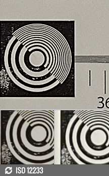


Motorola Moto G50 vs Xiaomi Poco X3 Pro and the Motorola Moto G 5G Plus in our Photo compare tool
Portraits
If you have sufficient ambient light in the scene, you can expect sharp-looking portraits with a rather convincing bokeh effect, even with more complex backgrounds. However, the software isn't as consistent with the skin tone as one would expect. Sometimes the subject's face looks more reddish than it should and sometimes a bit too pale.
On the other hand, the HDR algorithm seems to be doing a pretty good job, the rest of the colors are lively but not over the top, and the fine detail is there. Naturally, as the light drops, the device seems to struggle with the latter, and the noise starts to become much more apparent. And we are not talking about drastic changes in the lighting. Even small light reduction can change the end result.
Selfies
The selfies are unsatisfactory, considering the high-resolution 13MP sensor. We expected sharper-looking images, and even the slightest drop in the ambient light makes the pictures even softer.
The subject's skin often doesn't come out right, having a bit of a pale, yellowish tint in addition to the overall bland colors.
On a more positive note, the selfies contain a decent amount of detail and the dynamic range is pretty wide, with the subject always being prioritized and well-exposed.
The portraits often come out with lower exposure and are also a tad sharper since the HDR isn't allowed in this mode. Edge detection isn't ideal either.
Video
The Moto G50 caps its video recording at 1080p, and there's no way to change the resolution in the camera settings too. The overall quality, though, has been improved over the G10.
The Moto G50 is more generous with the colors, although they are still a bit bland to our taste. Sharpness is rather good for a Full HD video, noise is non-existent, and contrast is good. Perhaps the only minor issue is that the software goes for a higher contrast leaving some highlighted areas and bright cars clipped and some shadows too dark.
Once you are done with the real-world examples, take a closer look at our video compare tool to see how the Moto G50 stacks against the competition.


1080p: Motorola Moto G50 vs Samsung Galaxy A22 5G and the Realme 8 5G in our Video compare tool
Competition
There are plenty of similarly-priced options out there, even in Europe, so for the sake of fair comparison, we've picked almost exclusively 5G-enabled budget phones to go against the Moto G50. And unfortunately, it's having a hard time competing against Xiaomi and even its own siblings within Motorola's portfolio, too.
Let's take the Moto G 5G and the Moto G 5G Plus, for example. The former is even cheaper than the Moto G50, while the Plus variant asks about the same - around €210-220. And you get a much more capable Snapdragon 765G chipset, a bigger and better display, better cameras and faster charging. We are truly puzzled by Motorola's pricing as these two phones make the Moto G50 look inadequate on the day of its launch.

Motorola Moto G 5G Plus • Samsung Galaxy A22 5G • Realme 8 5G
The Samsung Galaxy A22 5G and the Realme 8 5G are both Dimensity 700-powered phones offering better screens, again faster charging and arguably better software and support. Motorola's track record of software updates has been relatively poor for the last couple of years, which is a big letdown given that the company's burden-less software approach would suggest otherwise. At the end of the day, Samsung and Realme's offerings aren't all that different from Motorola's, and they may win over someone used to Samsung's One UI and Relame's Realme UI.
5G isn't on top of your priority list for apparent reasons such as poor 5G coverage at this time and date? Look no further than Xiaomi's Poco X3 Pro. This phone is an easy recommendation to anyone looking for a €200-300 phone. This device makes the race look like it's rigged and smokes pretty much everyone out of the water. The Snapdragon 860 chipset is unrivaled in this segment, the camera experience is great for the price, the display is 120Hz (although still LCD), offers 128GB base storage and 6GB of RAM, faster charging and a set of good-sounding stereo speakers. This phone covers all the basics and goes beyond. It punches way above its class.
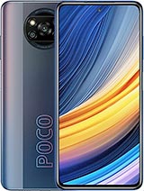
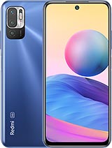
Xiaomi Poco X3 Pro • Xiaomi Redmi Note 10 5G
And in case 5G is of great importance and still looking for some recommendation from Xiaomi's portfolio? Well, we can't miss mentioning the Redmi Note 10 5G. It's another Dimensity 700-powered handset that can do pretty much everything the Moto G50 can but a tad better, especially in the display and charging department. The overall camera performance is also better.
Verdict
There's no denying that the Moto G50 is an excellent marathon runner thanks to its energy-efficient SoC and generous battery capacity. It takes very good photos - even during the night, and its internals are protected by a water-repellent design. The near-stock Android experience has always been one of Motorola's strongest suits, and in recent years, the company has found a way to enhance it even further with several Moto-specific features without ruining the vanilla feel.
Sadly, despite its low price in the 5G segment, the Moto G50 seems to be dragging behind the competition in some key aspects. The display is not very bright, making it hard to use outdoors, and it has a low 720p resolution in a 6.5-inch diagonal, which means it's spread quite thin. More powerful chipsets, 5G-enabled at that, are available for the same asking price, and the handset comes bundled with a slow 10W charger and a cable that doesn't support USB file transfers. Adding Motorola's poor track record of updating its phones to the cons list makes it even harder for us to recommend.
You've probably already guessed our verdict just by reading about the rivals we've picked to go against the Moto G50, but it's worth driving the point more clearly. Even if you are on the market for the cheapest possible 5G handset - which doesn't make much sense to us - we think that there are better alternatives, including options from Motorola's own portfolio.
Perhaps a few months down the road, when the dust settles, and the price goes down, the Moto G50 may actually become a good deal, but this is not the case right now.
In fact, this conclusion applies to pretty much all of the phones in the new crop of "affordable 5G handsets". The addition of 5G to cheap phones brings little value to the end-users. In fact, the manufacturers' push to bring 5G to the lowest price tiers is counter-productive for consumers as it results in having devices with severe drawbacks in other areas.
We feel like these cheap 5G phones are merely intended to bolster carrier portfolios around the world and help promote their budding 5G networks rather than meeting any practical consumer needs and we find them hard to recommend over their LTE-only counterparts.
Pros
- High refresh rate screen.
- Water-repellent design.
- Excellent battery life.
- Good overall camera performance.
- Burden-less Android experience.
Cons
- Screen is low resolution and that doesn't get very bright.
- Slow charging with the provided charger.
- The USB cable can't be used for USB data transfer.
- Pricing is not very competitive, you can get faster phones.




No comments:
Post a Comment