After gaining a beachhead in the 80s, personal computers invaded homes en masse in the 90s. Then in the 2000s smartphones were trying to do the same to people's pockets. By that time people had gotten used to document editors, spreadsheets, email and web browsing. Feature phones weren't great at that - for example, the famous Nokia 3310 (which came out in late 2000) could do none of that.
But soon a new breed of phones appeared, phones that were like mini laptops. We've talked about the Nokia Communicator before, today we will focus on the Sony Ericsson P910. The third model in the series, it arrived in 2004 (after the P900 in 2003 and P800 in 2002) and it could do everything on the list. It ran Symbian with a front end that may be unfamiliar to some of you - UIQ, aka User Interface Quartz.
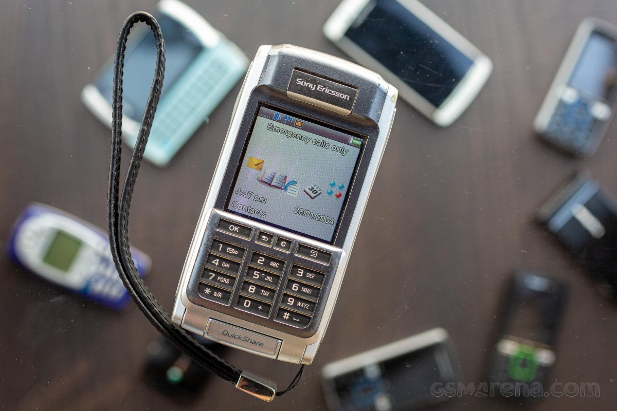
This was long before Nokia's Series 60 made the ill-fated switch to touch UI, its real rival at the time were Pocket PCs running Windows Mobile. The system supported a touchscreen and could multitask, and it made installing apps a breeze. And there were quite a few apps, even though without an apps store finding them wasn't that easy.
Okay, enough prologue - now that we have such an all-capable device in our hands, let's try to do everything with it and see how it goes.
Can we use the P910 to type up a review of itself? It has a hardware QWERTY keyboard after all! This was one of the major upgrades over the P900 - the inside of the flip out has a three row QWERTY keyboard.
However, the phone measures only 58 mm wide (and the keyboard itself is narrower than that), so the keys are pretty cramped. And there's no autocomplete or even spellchecking to speed things along. A bigger worry is that this is a physical keyboard, so you have to press on the keys (not just touch them) and after a while we started to get worried that we'll snap off the thin, plastic flip-out that holds the keyboard.
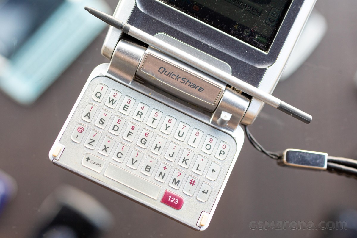
Still, after some practice, we could type at a decent speed. Certainly faster than we can manage on the keypad, which lacks T9 or similar system for faster typing. An alternative is to use the touchscreen and stylus, which do Graffiti-like text recognition. Maybe we needed more patience to learn, but in our (admittedly short) experience, the recognition is more miss than hit. You have to be very precise, otherwise trying to write an "o" might result in an "O" or a "u".
Even so, if you rely on constant text-based communication - be it SMS or email - the P910 is a capable communicator (if not quite as good as a certain Finnish phone, which has a much larger keyboard).
There is an on-screen keypad too, which turns into an on-screen QWERTY in a text editor. However, the small display and imprecise nature of the resistive touchscreen practically mean we were limited to pecking out individual letters with the stylus. Two thumb typing is a no go. At least you can use this if you choose to remove the flip and use the P910 as a purely touch-driven phone.
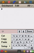
Trying to type a review on the Sony Ericsson P910
Okay, new plan - this is an advanced smartphone with cutting edge Bluetooth connectivity. Well, cutting edge for the early 2000s. We can connect a Bluetooth keyboard and use that to type on the roomy 2.9" display. Oh, the phone doesn't recognize the keyboard at all.
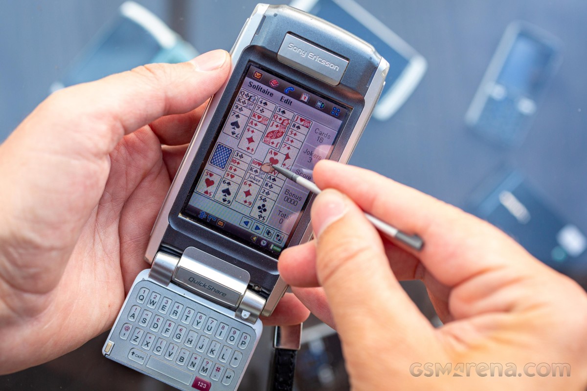
Alright, that's not going to work. While we think of what to try next, we'll play a quick game of solitaire. Have you heard the story of how Solitaire came bundled with Windows so that people will have a fun way to practice using the mouse? Early home computers operated with text commands, but wide-spread adoption would only come with the arrival of the graphical user interface (which is tough to use with only a keyboard).
The stylus is the smartphone version of a mouse. It is faster and more precise than using a D-pad to highlight an item. And it allows you to drag stuff, like in the Chess game, for example. A touchscreen and stylus make navigating complex menu and multiple shortcuts easier.
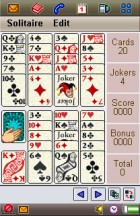
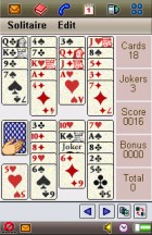
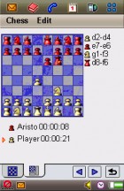
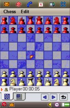
Solitaire wouldn't really work without a stylus • Chess would be tricky too
But the stylus is very limited in its mouse duties - it is like a single button mouse with no scroll wheel. This means that scrolling is done using the scrollbar on the side or tapping the up/down buttons in the corner.
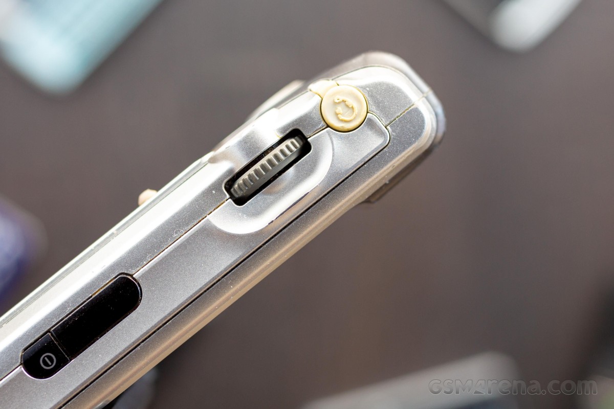
The Jog Dial, carried over from early Sony phones, is a better way. It is the missing scroll wheel and can even be clicked to activate the selected item. The dial on our unit has gone a little wonky after all these years, but it is still a very convenient way to operate the user interface without touching the screen.
While the 2.9" display is small enough that one can easily reach all four corners, one-handed operation isn't perfect because of how the UI is built. Using the Jog Dial and some keypad shortcuts is the better option when you have only one hand to spare.
Funnily enough, the Sony Ericsson P910 suffers from an issue that faces the first foldable phones - what should an app do when the screen size suddenly changes? In this case because you opened or closed the flip keyboard.
Some apps have separate UIs for both cases, however most do not. This means that when you go to launch an app with the flip closed - using the Jog Dial, of course - only some apps are available. In fact, the touch functionality of the display is disabled completely when the flip is closed.
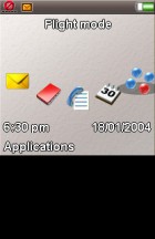
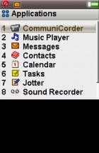
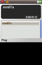
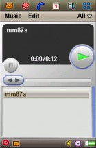
Jog Dial menu • Available apps in closed flip mode • Music player (with flip opened/closed)
Note: the black area is covered by the flip.
This makes the P910 feel like two phones in one - a classic keypad-driven Symbian smartphone and a touch-driven smartphone that has a lot of rough edges.
For one, the Symbian 7.0 OS that is at the heart of the phone isn't great at multitasking. You can put five shortcuts on the top row and use them to switch between those five apps easily enough.
Yet, for all the rest you have to go through the app drawer. By default, it is a list with a small font designed to be used with the stylus. You can switch to a mode with 2x3 icon grid, which is a lot more finger-friendly, but those damned up/down buttons in the corner remain tiny and barely usable if you manage to hit them with your fingernail.
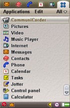
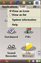
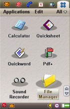
The list mode is so tiny that you need the stylus • The grid view is more thumb friendly
There are some icons on the bottom row that allow you to toggle some phone controls without leaving the currently active app. It's not quite a notification area, but it is a precursor. And there are sort-of quick toggles in here too.
These controls (like the shortcuts on the top row) are again rather tiny and hart to hit with a finger. This isn't a story about the iOS, but the clunky Symbian UIQ interface made us appreciate just how well-designed iOS was for finger-only operation.
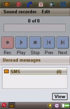
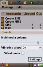
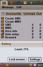
Some basic phone features can be accessed without leaving the app
Anyway, how about we play some tunes? The P910 has 64MB of internal memory and a 32MB MemoryStick Duo included. That's one of the upgrades over the P900, which had only 16MB internal storage (and the same memory card).
The phone supported MP3 playback, though the annoying proprietary port limited the selection of headphones you can use. The Jog Dial comes in again, this time used to change the volume. The phone can also play MP4 videos, which worked well enough on the 4.6:9 display (remember, this was back in 2004, so wide-screen adoption was only just starting).
The 208 x 320 px resolution doesn't make for the sharpest image, but it's fine considering the limited storage available (even if you are willing to spend extra the MemoryStick Duo format topped out at 128MB). While Sony had a large music studio, managing the multimedia on the phone was left to the user - there was no iTunes alternative.
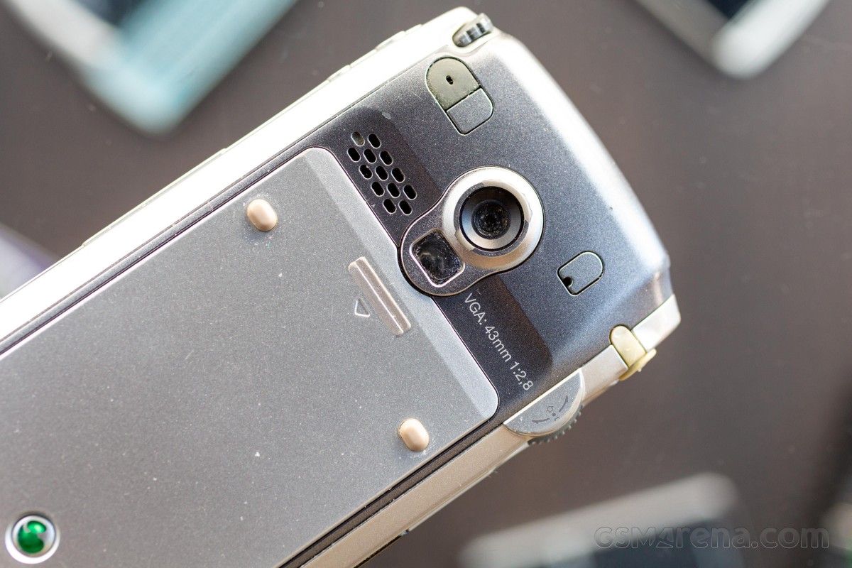
The Sony Ericsson P800 came with a VGA camera, that is 640 x 480 px resolution or about one third of a megapixel. This same camera module was used in the P900 and P910. Being nearly two decades old at this point we didn't expect much and that is what we got.
The camera is meant to be used in portrait orientation and there's a dedicated button on the side. Press it once to launch the camera app and again to take a photo. Or you can use the on-screen controls.
The camera has several modes (Auto, Outdoors, Indoors, etc.) plus presets for shooting photos and videos for MMS. Since MMS messages are limited to just several tens of kilobytes, the photos and videos need to be smaller.
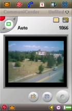


The camera app works with the flip opened and closed
One issue we had is that the screen is rather dim and its plastic touch layer rather reflective. That made it hard to frame outside shots. Also, the viewfinder takes up only a small part of the screen, even when the flip is opened.
Anyway, here are the camera samples we took, jutst manage your expectations before clicking.


Sony Ericsson P910 camera samples
Besides the dedicated camera key (which is a simple button, no half press, if you were wondering) is a custom button. You can set it to launch an app of your choosing, which is quite handy.
Maybe we do some research on the Internet, we thought. Trying to do that on the phone, we quickly ran into an issue. The Sony Ericsson P910 (and previous models) is a 2G-only phone. And even if you still have 2G service in your area, there is a larger issue - most sites have moved to serving pages over HTTPS for security, but the P910 just couldn't handle the newer protocols. We only managed to connect to a handful of websites and the GPRS connection felt excruciatingly slow, taking up to 30 seconds to load even relatively simple pages.
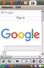
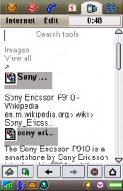
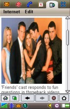
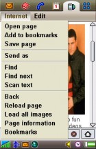
Browsing over GPRS is slow • Only some sites work • Have you heard of this new show?
In its heyday the Sony Ericsson P910 was a Swiss army knife - it had tools for messaging, office work, web browsing, photography and the thing that makes smartphones better than feature phones, the ability to easily add new tools by installing apps.
It is really showing its age in 2021, but to be fair the Internet was a digital Wild West in the early days and digital cameras improved by leaps and bounds early on. This makes the P910 feel older than it is.
And it is old, having come out in 2004 it is almost old enough to vote now. Alas, it is less a young'un and more a veteran of a lost war - all its Symbian compatriots are gone, especially the UIQ squad.
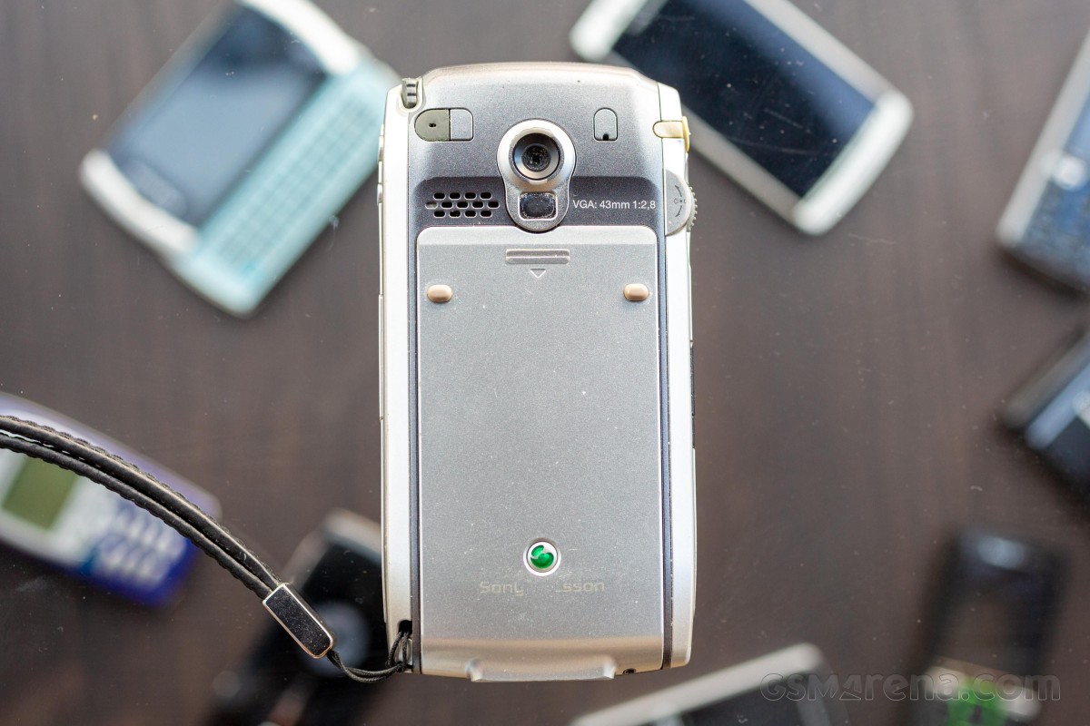
The hardware is impressively capable for its age, its software is really of its era. The graphical style with the grayish pseudo 3D elements and tiny icons hit us with a dose of CRT-tinted nostalgia.
It's easy to criticize the UI now, but getting a user interface right is a momentous task. Over three decades later Microsoft is still fiddling with the concept. And it was fascinating to see the glimpses of OSes yet to come - smartphones have gone a long way and the P910 is a milestone along the way.
No comments:
Post a Comment