Introduction and specs
Before the pandemic struck, everyone thought that the days of the Android tablet are numbered. However, with people staying at home, tablet sales saw a resurgence that's continuing in 2021, too. It was a natural move for Huawei to continue its efforts in the space. Especially since the company was among the few manufacturers to continue pouring resources into making Android tablets when no one else would.
The challenge ahead of Huawei is two-fold. Not only do they face increasing competition with everyone warming up to tablets all over again, but they also need to prove that their brand new HarmonyOS is a complete replacement for Google-powered Android as we know it.
And they have their newest Matepad lineup to spearhead this mission. We already checked out the MatePad Pro 12.6 in detail and now it's time to have a look at the 2021 edition of the vanilla MatePad 11, which seems to be a well-rounded device and asks a more reasonable €400 (6GB/64GB) .
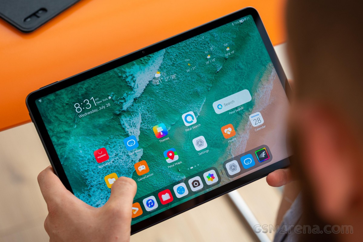
We have not reviewed the Matepad Pro 10.8 but it seems the vanilla Matepad 11 shares several features with - like the Snapdragon chipsets or the LCD panel. The Matepad Pro 10.8 prioritizes color accuracy and higher max brightness, but the Matepad 11 makes up for these deficiencies by offering a 120Hz refresh rate, which is something quite nice.
Huawei MatePad 11 (2021) specs at a glance:
- Body: 253.8x165.3x7.3mm, 485g; plastic frame and back; Stylus support (magnetic).
- Display: 10.95" IPS LCD, 120Hz, 2560x1600px resolution, 5.63:9 aspect ratio, 276ppi.
- Chipset: Qualcomm SM8250 Snapdragon 865 5G (7 nm+): Octa-core (1x2.84 GHz Kryo 585 & 3x2.42 GHz Kryo 585 & 4x1.8 GHz Kryo 585); Adreno 650.
- Memory: 64GB 6GB RAM, 128GB 6GB RAM, 256GB 6GB RAM; microSDXC (dedicated slot).
- OS/Software: HarmonyOS 2.0.
- Rear camera: 13 MP, f/1.8, PDAF.
- Front camera: 8 MP, f/2.0.
- Video capture: Rear camera: 4K@30fps, 1080p@30fps; Front camera: 1080p@30fps.
- Battery: 7250mAh; Fast charging 22.5W, Reverse charging 5W.
- Misc: Accelerometer, gyro, proximity, compass.
The battery is also the same as on the Pro at 7,250 mAh but charging speeds are considerably lower and doesn't support wireless charging. After all, there had to be some cost-cutting to get reach the target price. For instance, there's no cellular variant and the base storage is twice as low.
On the other hand, the vanilla MediaPad 11 is the only one from the series using a standard microSD card slot instead of Huawei;'s proprietary NM cards that are harder to find and pricier per GB. So if storage matters, the MediaPad 11 might be the more reasonable option to pursue.
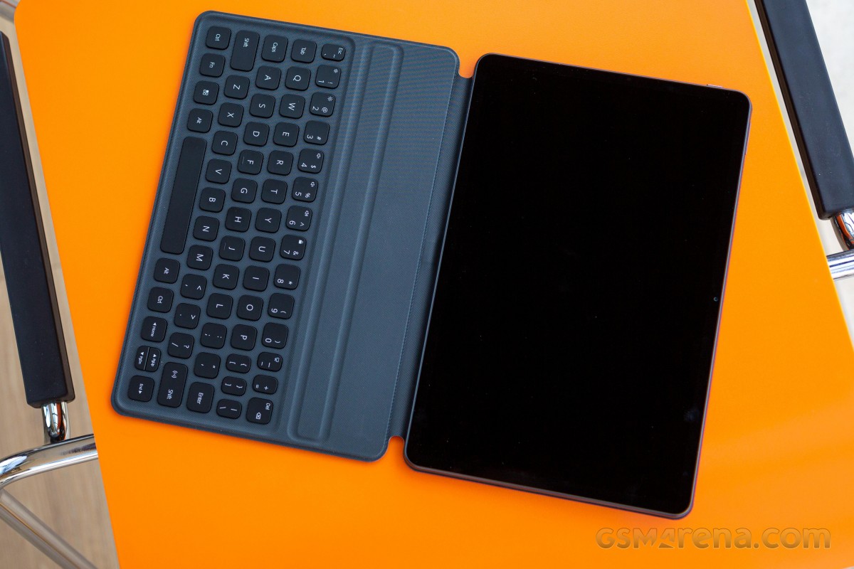
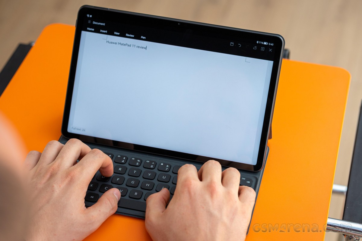
Surely, the review doesn't end with the specs sheet. Ultimately, we think the MediaPad 11 is a sensible solution as it offers the majority of the features and offers a similar user experience compared to its much pricier siblings - the MediaPad Pro 12.6 and the Pro 10.8. Еspecially since it supports accessories like Huawei's M-Pencil and the Smart Magnetic Keyboard. And the latter is currently bundled with the device itself, but you still might have to check if the offer stands in your region.
Unboxing the Huawei MatePad 11
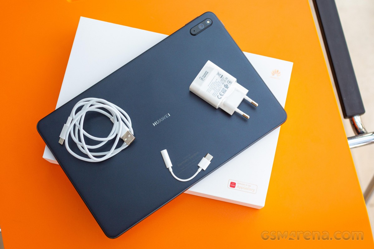
The Huawei MatePad 11 comes in a standard box with a compatible 22.5W charger and a USB-A to USB-C cable used for data transfer as well. Since there's no 3.5mm audio jack, Huawei is bundling a dongle.
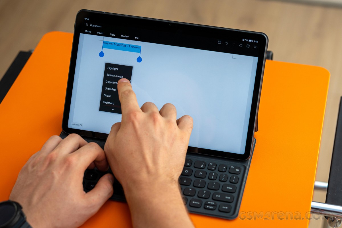
We got our review unit with the so-called Huawei's Smart Magnetic Keyboard, which is compatible only with the MatePad 11, but you have to buy it separately. We saw a couple of offers in some countries that include the keyboard if you go for the higher storage variant.
Bright LCD panel ticking at 120Hz
As we already mentioned, the MatePad 11 "settles" for an IPS LCD panel instead of OLED, which is found on the MediaPad Pro 12.6. But we can definitely say that the overall user experience is excellent, nonetheless. We've got a productivity-friendly 16:10 aspect ratio (QHD+, 2560 x 1600px resolution) and the exact diagonal is 10.95". The first thing we noticed about the display is the excellent uniformity - no backlight bleeding or air gaps around the edges, which speaks of a high-quality LCD panel, which has been laminated with the front glass.
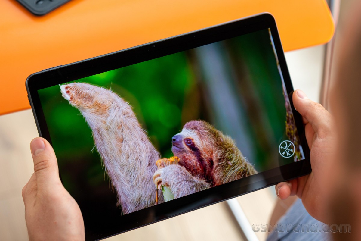
And even though it's not OLED, our tests show pretty good performance when it comes to brightness and contrast. The maximum luminosity is 497 nits, and the contrast ratio is 1200:1. When put into context, these numbers are great for a big 11-inch display, let alone LCD.
The only downside of the tablet is that there is a significant color shift to blue or green as soon as you deviate from the front and central viewing position.
| Display test | 100% brightness | ||
| Black, |
White, |
||
| 0 | 382 | ∞ | |
| 0.414 | 497 | 1200:1 | |
| 0 | 388 | ∞ | |
| 0 | 484 | ∞ | |
Brightness boost in Auto mode doesn't seem to work the usual way. We didn't see any change in peak brightness, but shining bright light into the ambient light sensor triggers a solid drop in contrast, which is a desired effect. While high contrast ratio is a good thing, it cripples sunlight legibility and lowering the contrast helps with that. That's a neat way to improve the legibility without having to boost the screen's brightness. Supposedly, 500 nits is pretty much the upper limit of the presented panel.
Unfortunately, color accuracy isn't its strongest suit. In both, Vivid and Natural modes, the average dE2000 is a bit too high to our taste with the main issue being the whites, grays and cyans. The latter is boosted a little too much while whites and grays appear downright blue.
The good news is that Huawei has included a granular control over the color temperature so you can adjust it manually in case you are planning to do color-sensitive work.
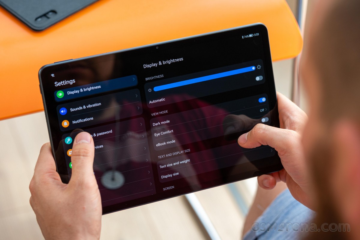
Other neat features include the usual Eye Comfort mode that brings down the color temperature when the sun goes down to battle blue light emissions. There's also an eBook mode for reading that turns the screen into plain black and white, imitating the look of E Ink displays.
There are three Refresh rate modes available - Dynamic, Standard and High. The latter sets the refresh rate at 120Hz at all times while the Standard caps it at 60Hz. The Dynamic, of course, lets the system adjust the refresh rate accordingly so you can benefit from the smooth animations and save some power along the way.
Anyway, the Dynamic mode provides a simple yet effective solution. If you are not interacting with the display, it limits the refresh rate to 60Hz, and as soon as you touch it, it shoots back up to 120Hz. This works in browsers when watching videos, and we've also tried this while using the keyboard - it goes down to 60Hz even when you type. We strongly recommend that you leave the HRR control to Dynamic as you will get the best of both worlds.
Battery life
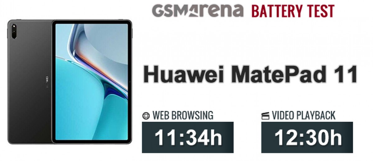
The tablet runs on a power-hungry Snapdragon 865 chipset and is supplied by a 7,250 mAh battery and managed to score higher than the MatePad Pro 12.6 in the web browsing test but falls short in the video playback one since it uses an LCD IPS panel and those usually get lower video playback runtimes.
On the other hand, the device scores considerably better than the more expensive Galaxy Tab S7+, for example, particularly in the web browsing test. We can say the overall battery endurance is not just reliable but pretty good too.
Charging speed
Even though the tablet is supplied by a 22.5W-capable charger, it's rather slow to charge from 0 to 100%. After all, the device carries a massive 7,250 mAh which is a lot more than your average smartphone that can do 0 to 100% pretty quickly with the same 22.5W brick. It took approximately 1 hour and 50 minutes to fill up the cell from flat, while a 30-minute charging cycle would give you about 36%.
30min charging test (from 0%)
Higher is better
- Huawei MatePad 11
36% - Huawei MatePad Pro 12.6
33% - Samsung Galaxy Tab S7+
18%
Time to full charge (from 0%)
Lower is better
- Huawei MatePad 11
1:50h - Huawei MatePad Pro 12.6
2:10h - Samsung Galaxy Tab S7+
3:35h
Loudspeakers
Despite being the cheapest of the bunch, the MatePad 11 offers a set of four stereo speakers - two on each side. They have left and right-facing grilles, so you may obstruct some of them when holding the device with your hands. The speakers are tuned by Harman Kardon, and to be honest, they sound great. The bass is full, vocals are clear, and distortion is barely noticeable only on high-pitched sounds at maximum volume. Pretty niche case. They are perfectly suitable for watching a movie, even.
As you'd expect from four speakers, loudness is great too. You can even feel the bass throughout the whole chassis when playing something.
Use the Playback controls to listen to the phone sample recordings (best use headphones). We measure the average loudness of the speakers in LUFS. A lower absolute value means a louder sound. A look at the frequency response chart will tell you how far off the ideal "0db" flat line is the reproduction of the bass, treble, and mid frequencies. You can add more phones to compare how they differ. The scores and ratings are not comparable with our older loudspeaker test. Learn more about how we test here.
Bright LCD panel ticking at 120Hz
As we already mentioned, the MatePad 11 "settles" for an IPS LCD panel instead of OLED, which is found on the MediaPad Pro 12.6. But we can definitely say that the overall user experience is excellent, nonetheless. We've got a productivity-friendly 16:10 aspect ratio (QHD+, 2560 x 1600px resolution) and the exact diagonal is 10.95". The first thing we noticed about the display is the excellent uniformity - no backlight bleeding or air gaps around the edges, which speaks of high-quality LCD panel.

And even though it's not OLED, our tests show pretty good performance when it comes to brightness and contrast. The maximum luminosity is 497 nits and the contrast ratio is 1200:1. When put into context, these numbers are actually great for a big 11-inch display, let alone LCD.
| Display test | 100% brightness | ||
| Black, |
White, |
||
| 0 | 382 | ∞ | |
| 0.414 | 497 | 1200:1 | |
| 0 | 388 | ∞ | |
| 0 | 484 | ∞ | |
Brightness boost in Auto mode doesn't seem to work the usual way. We didn't see any change in peak brightness but shining bright light into the ambient light sensor triggers a solid drop in contrast, which is a desired effect. While high contrast ratio is a good thing, it cripples sunlight legibility and lowering the contrast helps with that. That's a neat way to improve the legibility without having to boost the screen's brightness. Supposedly, 500 nits is pretty much the upper limit of the presented panel.
Unfortunately, color accuracy isn't its strongest suit. In both, Vivid and Natural modes, the average dE2000 is a bit too high to our taste with the main issue being the whites, grays and cyans. The latter is boosted a little too much while whites and grays appear downright blue.
The good news is that Huawei has included a granular control over color temperature so you can adjust it manually in case you are planning to do color-sensitive work.

Other neat features include the usual Eye Comfort mode that brings down the color temperature when the sun goes down to battle blue light emissions. There's also an eBook mode for reading that turns the screen into plain black and white imitating E Ink displays.
There are three settings in the menu - Dynamic, Standard and High. The latter sets the refresh rate at 120Hz at all times while the Standard caps it at 60Hz. The Dynamic, of course, lets the system adjust the refresh rate accordingly so you can benefit from the smooth animations and save some power along the way.
Anyway, the Dynamic mode provides a simple, yet effective solution. If you are not interacting with the display, it limits the refresh rate to 60Hz and as soon as you touch it, it shoots back up to 120Hz. This works in browsers, when watching videos and we've also tried this while using the keyboard - it goes down to 60Hz even when you type. We strongly recommend that you leave the HRR control to Dynamic as you will get the best of both worlds.
Battery life
The tablet runs on a power-hungry Snapdragon 865 chipset and is supplied by a 7,250 mAh battery and managed to score higher than the MatePad Pro 12.6 in the web browsing test but falls short in the video playback one since it uses an LCD IPS panel and those usually get lower video playback runtimes. On the other hand, the device scores considerably better than the more expensive Galaxy Tab S7+, for example, particularly in the web browsing test. We can say the overall battery endurance is not just reliable but pretty good too.

Charging speed
Even though the tablet is supplied by a 22.5W-capable charger, it's rather slow to charge from 0 to 100%. After all, the device carries a massive 7,250 mAh which is a lot more than your average smartphone that can do 0 to 100% pretty quickly with the same 22.5W brick. It took approximately to 1 hour and 50 minutes to fill up the cell from flat while a 30-minute charging cycle would give you about 36%.
30min charging test (from 0%)
Higher is better
- Huawei MatePad 11
36% - Huawei MatePad Pro 12.6
33% - Samsung Galaxy Tab S7+
18%
Time to full charge (from 0%)
Lower is better
- Huawei MatePad 11
1:50h - Huawei MatePad Pro 12.6
2:10h - Samsung Galaxy Tab S7+
3:35h
Loudspeakers
Despite being the cheapest of the bunch, the MatePad 11 offers a set of four stereos speakers - two on each side. They have left and right-facing grilles so you may obstruct some of them when holding the device with your hands. The speakers are tuned by Harman Kardon and to be honest, they sound great. The bass is full, vocals are clear and distortion is barely noticeable only on high-pitched sounds at maximum volume. Pretty niche case. They are perfectly suitable for watching a movie, even.
As you'd expect from four speakers, loudness is great too. You can even feel the bass throughout the whole chassis when playing something.
Use the Playback controls to listen to the phone sample recordings (best use headphones). We measure the average loudness of the speakers in LUFS. A lower absolute value means a louder sound. A look at the frequency response chart will tell you how far off the ideal "0db" flat line is the reproduction of the bass, treble, and mid frequencies. You can add more phones to compare how they differ. The scores and ratings are not comparable with our older loudspeaker test. Learn more about how we test here.
Brand new HarmonyOS 2.0 that feels familiar
MatePad 11 is one of the first Huawei devices to officially launch with the latest iteration of the company's in-house HarmonyOS 2.0. There are some phones currently getting the OS in China, and most of them are still in the beta stage. And although Huawei wants you to believe that HarmonyOS has nothing to do with Android, which has a legal side, that's not actually the case. Digging deeper reveals that the software is based on Android 10, and even Huawei representatives say that there's a Linux kernel beneath HarmonyOS, among others.
But that's not a bad thing by any means. Seemingly, the company worked really hard to bring advanced features, re-design the UI and even implement its own services into HarmonyOS to make a self-sufficient and rich ecosystem. And perhaps the most important thing here is that it runs standard Android APKs, unless those apps rely on Google Services, in which case you can't run them normally. For instance, you can install Google's Chrome browser for Android, but syncing your account with other devices won't work.
Since we are on the topic of apps, let's get this out of the way. The default way to get apps on HarmonyOS is to download them via the official AppGallery store, but in case you can't find the apps you are looking for, the so-called Petal search engine will redirect you to other APK stores like APKPure, Aptoide, APKMirror, etc. What we found annoying with AppGallery are the obligatory ads whenever you open up the app. We understand that those ads are about apps, and Huawei is trying to promote developers' apps.
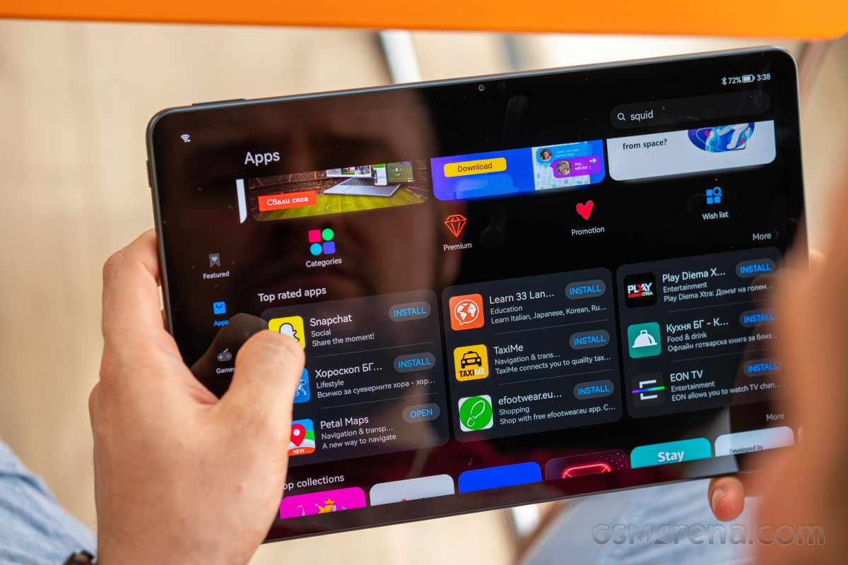
And for Google's alternatives, HMS-powered apps should have you covered like Petal Maps, Petal Search and Celia, Huawei's virtual assistant. For maximum convenience, searching for an app using Huawei's default Browser will offer you suggestions and a button for direct installation.
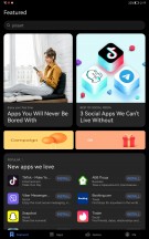
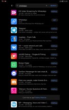
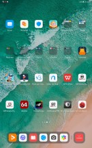
Huawei AppGallery, Petal search and app suggestions
Once you start up the device, you will be greeted with numerous folders on the home screen, and each one represents a different category with suggested apps that you can download from AppGallery. These apps are not actually installed, and the suggestions are based on the region you've selected. We found a couple of useful suggestions relevant to our country, such as local banking apps. Unfortunately, we didn't find a way to remove the suggested folder and apps.

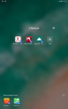
App suggestions on the home screen
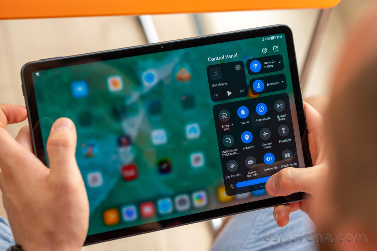
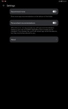
As far as user experience goes, it will feel most familiar to those used to Huawei's EMUI, but it's still essentially Android. You may also find some similarities between Apple's iPadOS and iOS when it comes to navigation and UI. For instance, the notification shade and the quick toggles are separated from one another (Xiaomi is doing this too with its MIUI). Imagine the top bar is divided into two halves - swiping from the left one opens up the notification cards while swiping from the right side will summon the quick toggles along with the brightness slider.
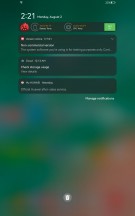
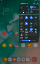
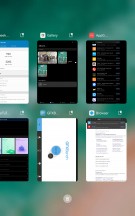
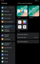
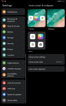
Notification shade, quick toggles, recent apps, general settings menu
We were also pleasantly surprised by the keyboard shortcut support that makes the navigation so much easier and similar to that of Windows. Alt+Tab and Ctrl+C/Ctrl+V among others are supported while the keyboard's layout allows you to control things like sound and display brightness using the shortcut keys.
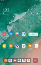
All apps are positioned on the home screens but the app drawer is still an option. The home screen has a dock on the bottom with your favorite apps and on the other side of the divider you will find three app shortcuts for the apps you've used last. Recent apps menu doesn't bring anything out of the ordinary, though.
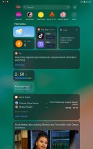
Going left from the main home screen opens up the Assistant Today section, which is basically a customizable infotainment corner. You can put widgets there, get your daily dose of specifically tailored to your reading habits news, AppGallery suggestions, etc.
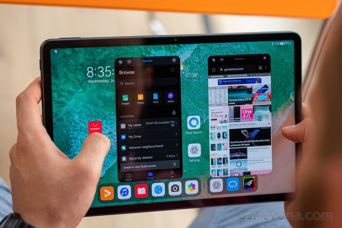
Multitasking on this thing is a joy. It's not just split-screen apps, floating windows are also supported as long as the apps you are using play well. In either case, you are limited to just two apps opened at the same time but there's a neat feature in the floating windows mode. As you start opening up apps in windows, those that are opened last will dock in on the left edge so you can quickly jump back to those windows if needed.
Navigation is simple - you can go with software buttons or gestures that are well-known for a couple of years now. Swiping from the bottom bezel brings you back home, swipe and hold opens up the recent apps and swiping from the left or right side serves as a back button. Swiping down anywhere from the home screen opens up the global search, again like Apple's iPadOS.
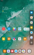
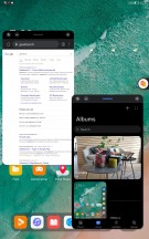
Multitasking with floating windows and sidebar
Keep in mind, though, that swiping from the left or right edge and holding for a second will open up a pop-up containing the apps that support floating window mode. The support is rather limited for now, mostly to system apps but should expand over time.
Arguably the more impressive features of them all are the ones related to the Multi-Screen Collaboration. You have three modes to choose from - Mirror, Extend and Collaborate modes. Those are available as long as you are invested into Huawei's ecosystem, of course and that includes not just a smartphone but a laptop too. Sadly, the MatePad 11 seems to support only the Collaborate with a Huawei laptop where you can share files seamlessly.
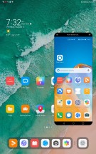
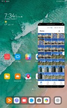
MatePad 11 paired with Huawei P40 Pro+
Screen mirroring is possible only when paired to a compatible-Huawei phone. The rest are exclusive to the MatePad Pro tablets..
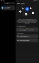
For a complete ecosystem experience, Huawei has also included a feature called Super Device. Turning your tablet into Super Device would grant access to all Huawei smart devices - TV, smart speakers, FeeBuds, your Huawei smartwatch,, etc. You can control pretty much everything from the command center on your MatePad 11.
A simple example would be to switch the audio source coming to your FreeBuds from your Huawei phone to the TV with a single touch. That's a really nice alternative to having to pair your headphones with the TV.
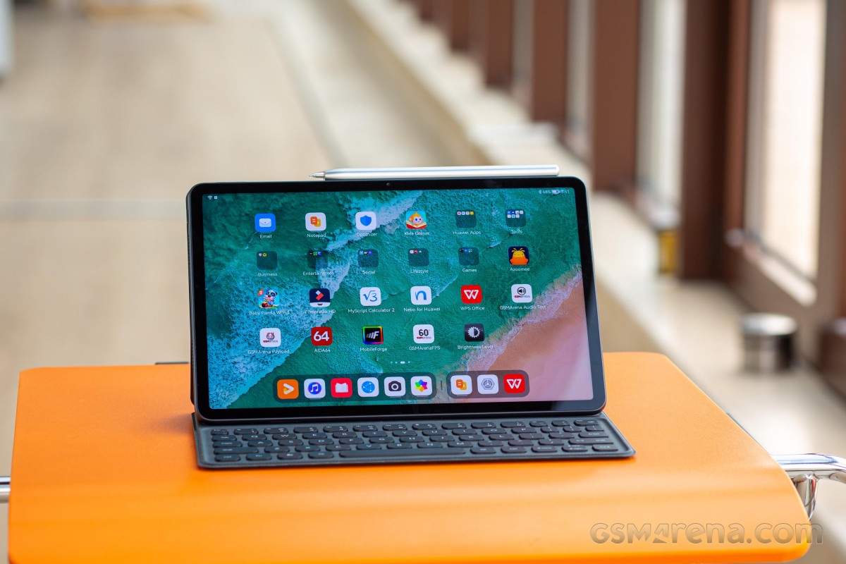
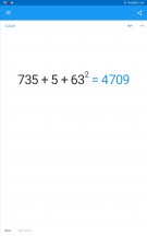
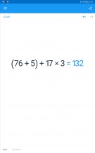
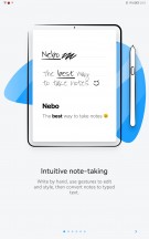
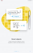
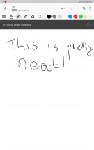
About three apps are specifically optimized to work with Huawei's M-Pencil - Notepad, Nebo for Huawei and My Script Calculator 2. They can work with M-Pencil's low-latency of 9ms and it feels like you are writing on an actual paper. Response-wise, that is.
The Notepad is pretty self-explanatory, Nebo comes as a more advanced alternative also used for drawing and My Script Calculator 2 can come in handy to those of you solving math problems. The system recognizes the equation or the given math problem and calculates it.
Performance
The MatePad 11 comes with last year's Qualcomm flagship SoC, the Snapdragon 865 without the 5G connectivity. Perhaps the modem is still inside the chip but it's disabled. Anyway, the SoC is based on the TSMC's 7nm+ manufacturing process incorporating an Adreno 650 GPU and an octa-core CPU in a 1+3+4 core cluster configuration. The main Kryo 585 core (Cortex-A77 derivative) ticks at 2.84 GHz, the other three Kryo 585 Gold cores (again based on the Cortex-A77) run at 2.42 GHz and the energy-efficient cluster of four Kryo 585 Silver cores (Cortex-A55 derivatives) are clocked at 1.80 GHz.
Memory-wise, the tablet offers 6GB/64GB combo as a standard but can go as high as 6GB/256GB while the storage remains expandable via a standard microSD card.
One on the back, one on the front
It's not much of a surprise that the MediaPad 11 has a simple camera setup without much fluff. The back holds a 13MP, f/1.8 camera with just PDAF joined by a single LED flash. The front houses an 8MP f/2.0 shooter and supports up to 1080p video recording.
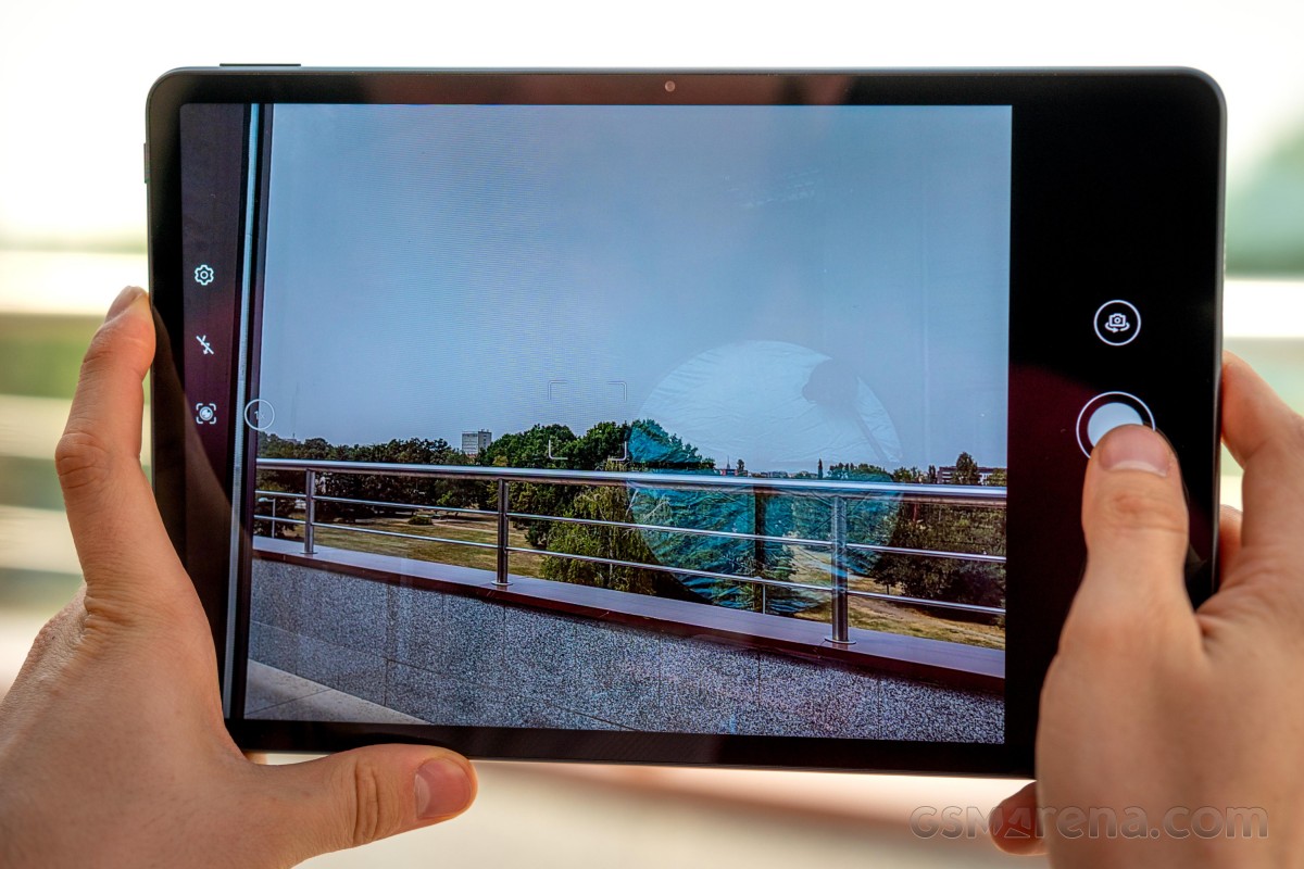
The camera menu is rather simple as well - it doesn't support most of the features a smartphone does, and it doesn't go as far as the MatePad Pro 12.6 too. Since there's no depth sensor, portrait mode isn't available, and there are only a couple of additional modes.
Daylight samples
Using the back camera during the day produces consistent results and, quite honestly, better than some mid-range smartphones in some aspects. Images are sharp, with good contrast (maybe even a bit higher than usual), good enough dynamic range, and the camera is able to resolve quite a bit of fine detail. Some may say that colors are muted, and we tend to agree, but they are still pretty close to real-life. The overall color temperature looks a bit warmer than it should, and the software leans towards a darker exposure overall. Noise is usually kept at bay even in the dark areas of the photos, and it's a non-issue indoors as well.
Low-light samples
No one actually expects the tablet to shoot great photos at night, but for the purpose of this review, we snapped a couple of nighttime samples to see if you can rely on it. Unfortunately, the photos after dusk are rather muddy, noisy and lack dynamic range and contrast. No dedicated Night mode to improve quality either.
However, despite the rather unsatisfactory nighttime performance, this won't reflect on our verdict.
Selfies
Although with muted colors, the front-facing camera photos are looking pretty sharp and detailed. Maybe a bit too noisy indoors. The only big issue with the selfie mode is that it doesn't do HDR, hence why the subject in the third photo is underexposed. Tapping on the viewfinder didn't change the exposure.
Video
The 13MP camera is able to record 4K videos at 30fps, but it leaves a bit more to be desired in terms of overall quality. Sharpness is okay, but colors are muted, and highlights are clipped - notice the buildings in the distance as well as the white cars passing by. Colors are a bit washed out, too - trees and grass should be greener, and even bright red cars appear muted.
Competition
There aren't many alternatives to the MatePad 11 if you equate for the size and price. In fact, aside from the aged and significantly cheaper Samsung Galaxy Tab S6 Lite, we were able to think of only two options - the MatePad Pro 10.8 and Apple's iPad 10.2 (2020). After all, if you are in the market for a compact tablet and you found the MatePad 11 intriguing, there's no reason to skip the Pro version as well.
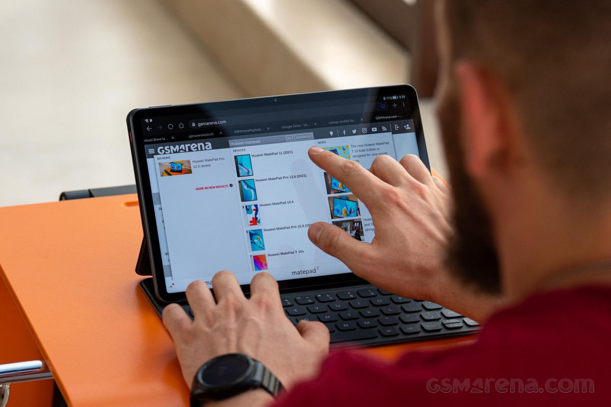
Sure, it doesn't have an HRR display, but it's potentially brighter (as per its specs) and supports the full array of essential Pro Multi-screen Collaboration features. It also runs on a slightly more powerful Snapdragon 870 chipset and utilizes its 5G modem too. The build is all aluminum (except for the front glass, of course), and it goes all the way up to 40W wired and 27W wireless charging. Not to mention that it can reverse charge other devices using the cable or its own wireless charging coils. That's a pretty cool feature to have when on the road, and you could use the extra juice remaining in the massive 7,250 mAh battery inside. And for those extra features, the Pro model asks at least €600.
On the other hand, the vanilla MatePad 11 offers a similar user experience, adds a 120Hz panel into the mix and uses a standard microSD card slot instead of Huawei's proprietary NM standard. And it does that for less than €500 or even close to €400 depending on your region. It has the M-Pencil support and pairs with the smart magnetic keyboard too, which makes it an even more lucrative offer. We can even argue that it's the more sensible option of the two.
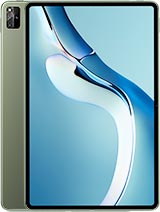
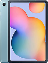
Apple iPad 10.2 (2020) • Huawei MatePad Pro 10.8 (2021) • Huawei MatePad Pro 12.6 (2021) • Samsung Galaxy Tab S6 Lite
Now getting into enemy waters, things start to get really rough for the MatePad 11. Apple reigns the tablet market, and the main reason for this is the strong ecosystem and its portfolio covering all the popular sizes. That's not to say Huawei's newly built HarmonyOS offers a bad ecosystem, but it's definitely less mature. You just can't argue with the level of iPadOS, iOS and macOS integration and the available apps on the Appstore.
Let's face it, you are much more likely to have a non-Huawei Android phone, which wouldn't get along all that well with the MatePad 11, whereas iPad owners most probably have an iPhone in their pocket already.
Aside from that, Apple's solution has a more proficient IPS LCD panel, a more efficient A12 Bionic chipset and a nicer build. Support for a keyboard and stylus are on the menu as well. The downsides are the sub-par front-facing camera, the lack of a microSD card slot and the 32GB base storage variant. Still, you can find Apple's solution a tad cheaper than the MatePad 11.
Verdict
Huawei's MatePad 11 is a solid all-rounder and offers high-end features and experience for a reasonable €400-500 price tag, depending on the region and storage variant. A bright, HRR display, good battery life, excellent accessory support, powerful SoC and an array of four nice-sounding loudspeakers.
With all being said, it's hard to get over that HarmonyOS doesn't support Google Mobile Services and relies on its HMS core that still has a long way to go in terms of app support and maturity. It's evident that Huawei has done a pretty good job with its in-house device integration, but it's not enough to persuade most Android users that are already reliant on so many GMS-powered apps. In a perfect world, this tablet would support GMS, and it would be such an easy recommendation.
Pros
- Good and comfortable build.
- Bright and fast (120Hz) IPS LCD panel.
- Good battery life.
- Plays well with accessories such as keyboards, mice and Huawei's M-Pencil.
- Impeccable sound quality and clarity.
- HarmonyOS feels familiar and adds a couple of neat features.
- Uses standard microSD card slot.
Cons
- Although good, HarmonyOS still has a long way to go when it comes to app variety.
- No fingerprint scanner.
- No 3.5mm jack (adapter provided).
- AppGallery has full-screen ads, can't get rid of app suggestions on the Home screen.
- Limited functionality of the Multi-screen Collaboration feature.











No comments:
Post a Comment